- Item Name : Craftesty
- Item Version : v2.0.3
- Author : Dreams Technologies
- Support via email: support@dreamstechnologies.com
- Support via codecanyon: Take me there

 Craftesty
Craftesty is a Laravel-based multi-vendor marketplace for both products and services. Vendors create branded shops, upload listings with prices and photos, and accept online or offline payments. Customers enjoy a smooth shopping/booking flow with end-to-end order tracking and timely updates. A powerful Super Admin panel gives the platform owner full control over vendors, categories, commissions, payouts, and policies. Built for speed, security, and scalability, Craftesty is the easiest way to launch a modern marketplace that works for everyone—customers, vendors, and admins.
Admin Login
URL: https://craftesty.dreamstechnologies.com/admin/login
Email: demoadmin@example.com
Password: 12345678
User Login
URL: https://craftesty.dreamstechnologies.com/login
Email: demouser@example.com
Password: 12345678
Multi-language Support: Supports unlimited languages for both frontend and backend.
RTL Support: Full support for Right-to-Left languages.
Modular Content Management: Includes modules for pages, blogs, menus, contact forms, newsletters, etc.
Advanced Media System: Robust media management with Amazon S3 integration.
SEO & Sitemap: SEO-optimized with sitemap.xml generation.
Easy Language Translation: Translate both frontend themes and the admin panel with ease.
Advanced Permission System: Manage users and roles through a powerful permission system. Role-based access control makes user management easy.
Fully Responsive Design: Optimized for all screen sizes and resolutions.
PSR-12 and Laravel 12 Structure: Clean, modular, and maintainable code following modern industry standards.
Service/Repository Pattern: Separates business logic and data access layers, improving scalability and testability.
Security Best Practices: Covers Command Injection prevention, Path Traversal safeguards, SSRF mitigation, XSS protection, secure file uploads, and input validation.
Install SSL certificate on your hosting/VPS: You need to install an SSL certificate on your hosting/VPS first. You can purchase an SSL certificate or use free SSL, for example Let's Encrypt.
Redirect http to https: Change the
following
code in
.env file from APP_URL=http://domain.com to
APP_URL=https://domain.com.
Option 1: Add
ENABLE_HTTPS_SUPPORT=true to
.env file
Option 2: Add to .env
file
following code:
FORCE_SCHEMA=https
FORCE_ROOT_URL=https://domain.com
ENABLE_HTTPS_SUPPORT=false
Server Requirements
-
PHP 8.4x
-
Operating System : Linux or Windows
-
Shared, VPS or Dedicated Server
-
MySql: 5.7+
Required Upgrades
Those settings to upload 1GB file, you need to change them besides on your needs and your server specifications.
-
allow_url_fopen = on
-
max_execution_time = 300
-
max_input_time = 300
-
post_max_size = 100M
-
memory_limit = 100M
-
upload_max_filesize = 100M
PHP Extensions
-
BCMath
-
bz2
-
curl
-
fileinfo
-
gd
-
intl
-
mbstring
-
mysqli
-
openssl
-
pdo_mysql
-
sodium
-
zip
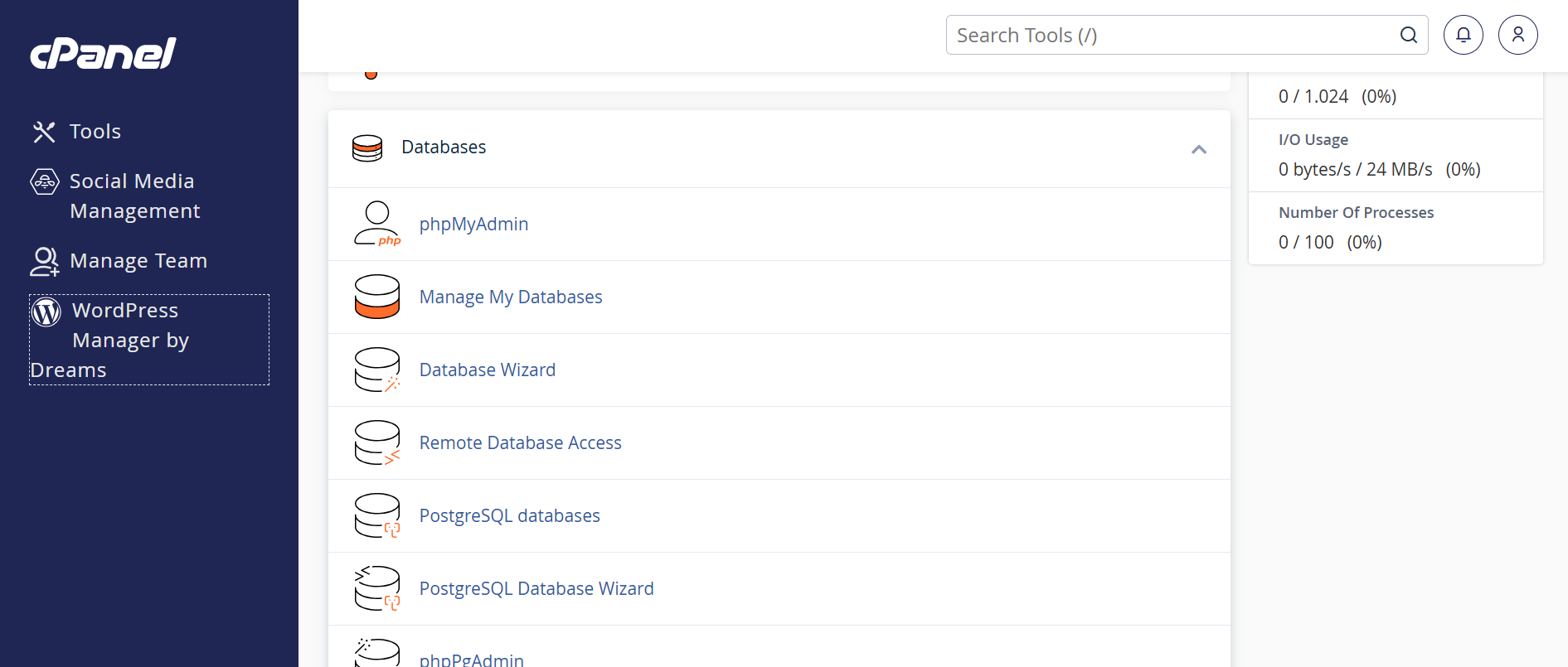
1. Login to your hosting server. 2. Go to cPanel Dashboard. 3. Click on MySQL®
Databases under the
Databases section.
Accessing cPanel:
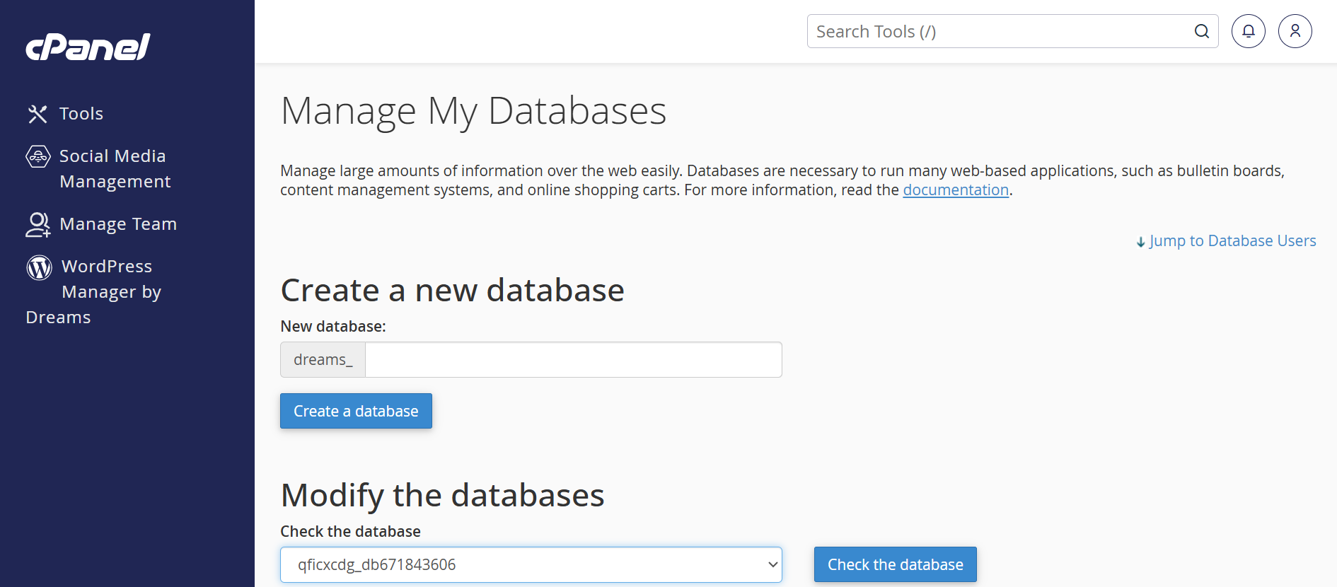
1. Find the "Create New
Database" section. 2. Enter a database name (e.g.,
3. Click "Create
Database" to finalize.
Creating a New MySQL
Database:
craftesty_db).
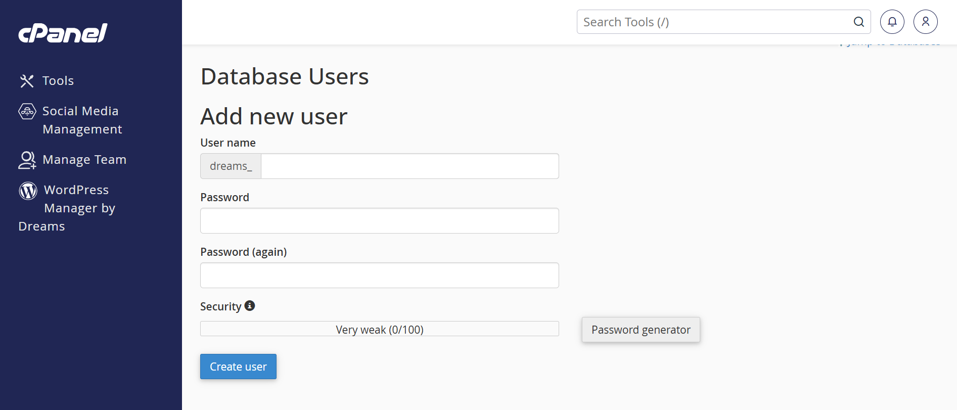
1. Scroll to the MySQL
Users section. 2. Enter a username (e.g.,
3. Enter a strong password (twice). 4. Use the Password
Generator for added security. 5. Click "Create
User".
Creating a MySQL User:
dreams_user).
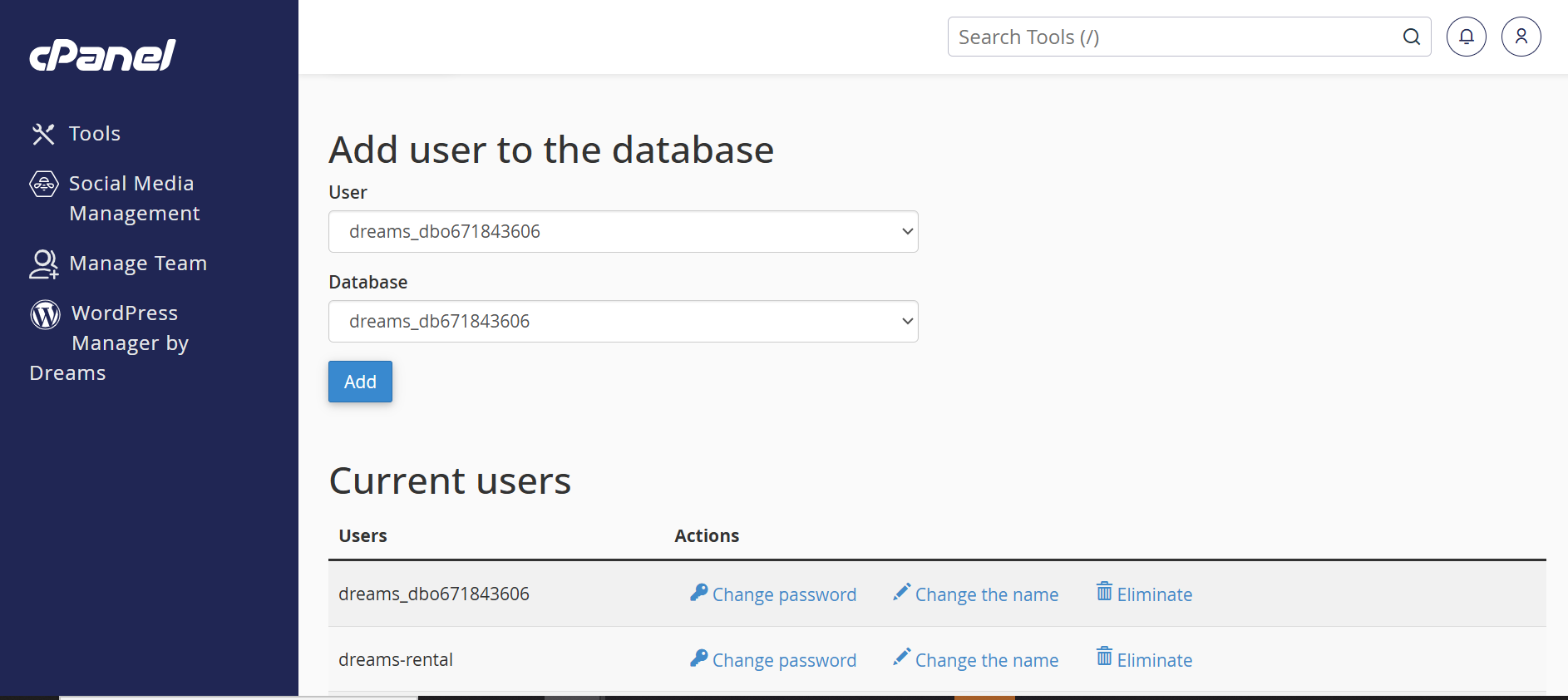
1. Under "Add User to
Database", select the user and the database you created.
2. Click "Add".
3. On the next screen, select "All Privileges". 4. Click "Make
Changes" to apply the permissions.
Assigning User to
Database:
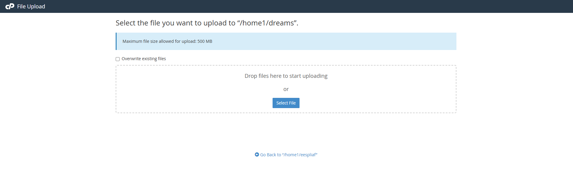
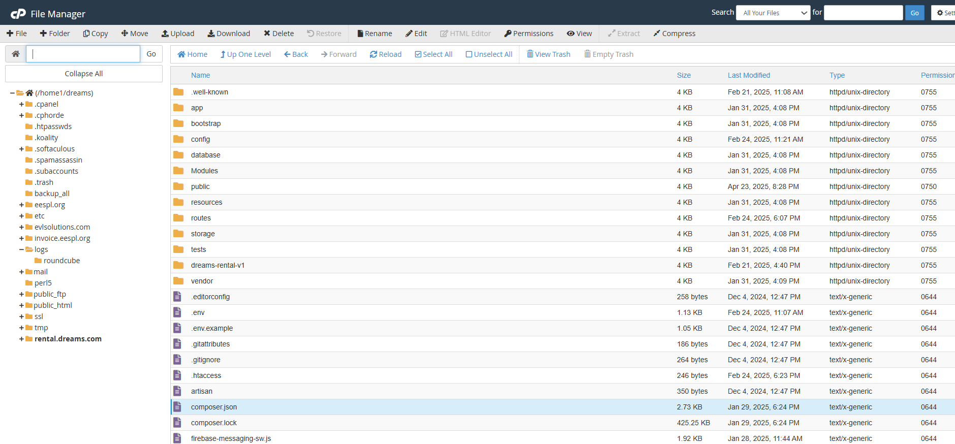
1. In cPanel, open File Manager. 2. Navigate to the desired directory (usually
3. Click "Upload"
in the top menu. 4. Select your application's ZIP file and wait for
the upload to finish.
Uploading Files:
public_html).
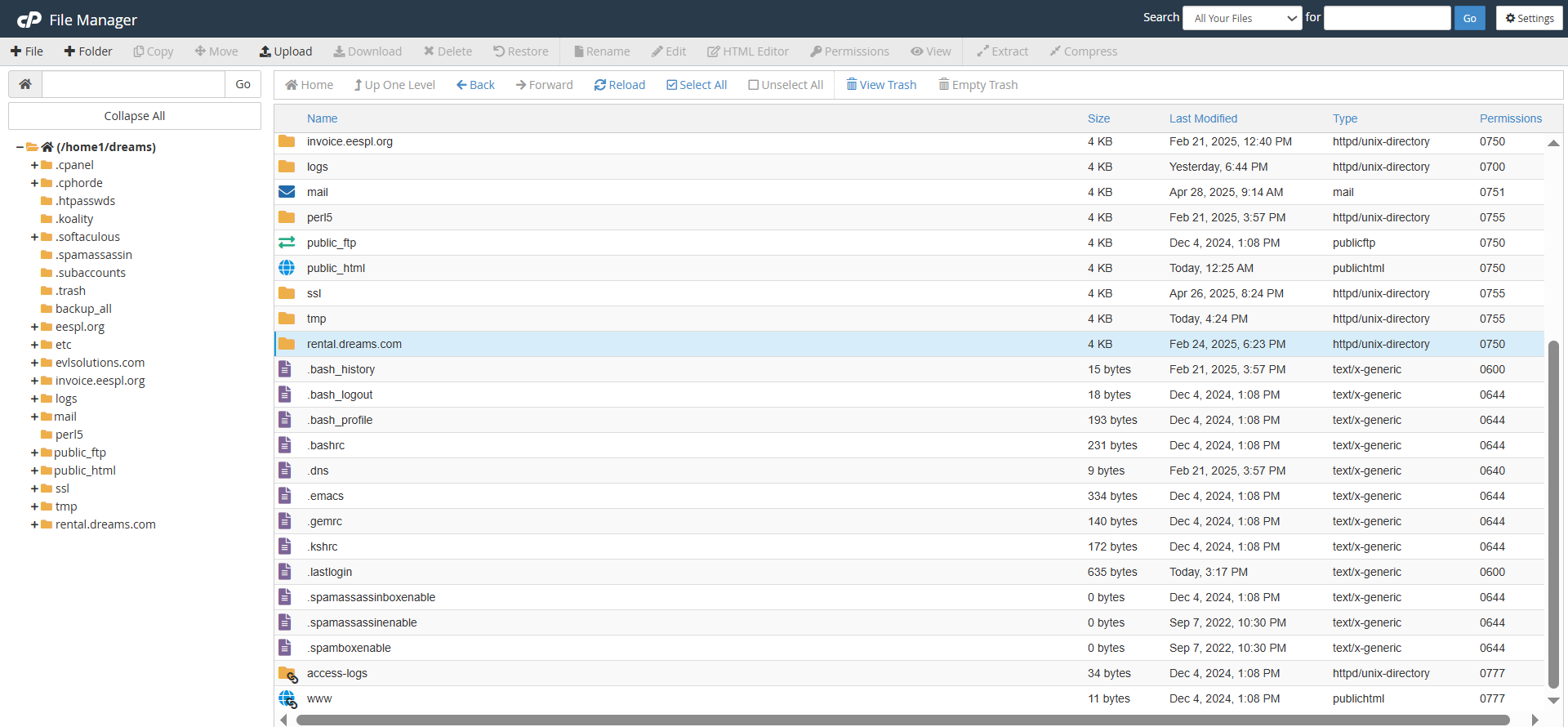
1. Once uploaded, select the ZIP file. 2. Click "Extract"
to unpack the files. 3. Ensure all files are in the correct public
directory (typically
Extracting Files:
public_html).
Setup Laravel Environment File
1. Copy the example environment
file
Run this command in your project folder:
cp .env.example .env2. Generate the application key
Run:
php artisan key:generateCheck Composer Installation
1. Ensure Composer is installed
Download Composer: https://getcomposer.org/download/
To verify installation, run:
composer -VInstall Laravel Dependencies
1. Navigate to your Laravel project folder
cd your-project-folder2. Install required packages
composer installOptional (Production): Use optimized install
composer install --no-dev --optimize-autoloadercomposer install
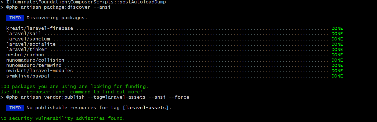
Installs all the dependencies listed in the
Description:
composer.json file. This command is used when
setting up a project for the first time or when a team member
clones the repository.
Ensures all necessary PHP packages required for the Laravel
application are downloaded and installed in the vendor
directory.
Purpose:
Composer update (If you already have a vendor file. You can use this command.)
Updates all installed dependencies to the latest versions
allowed by the constraints defined in the
Description:
composer.json file. Use this when you want to bring
packages up to date while staying within specified version
ranges.
Keeps the project dependencies updated and ensures compatibility
with the latest versions.
Purpose:
php artisan storage:link
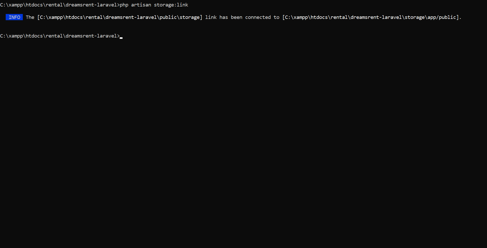
The
Description:
php artisan storage:link command creates a
symbolic link from public/storage to
storage/app/public, making files in the storage
folder accessible via a public URL.
php artisan serve
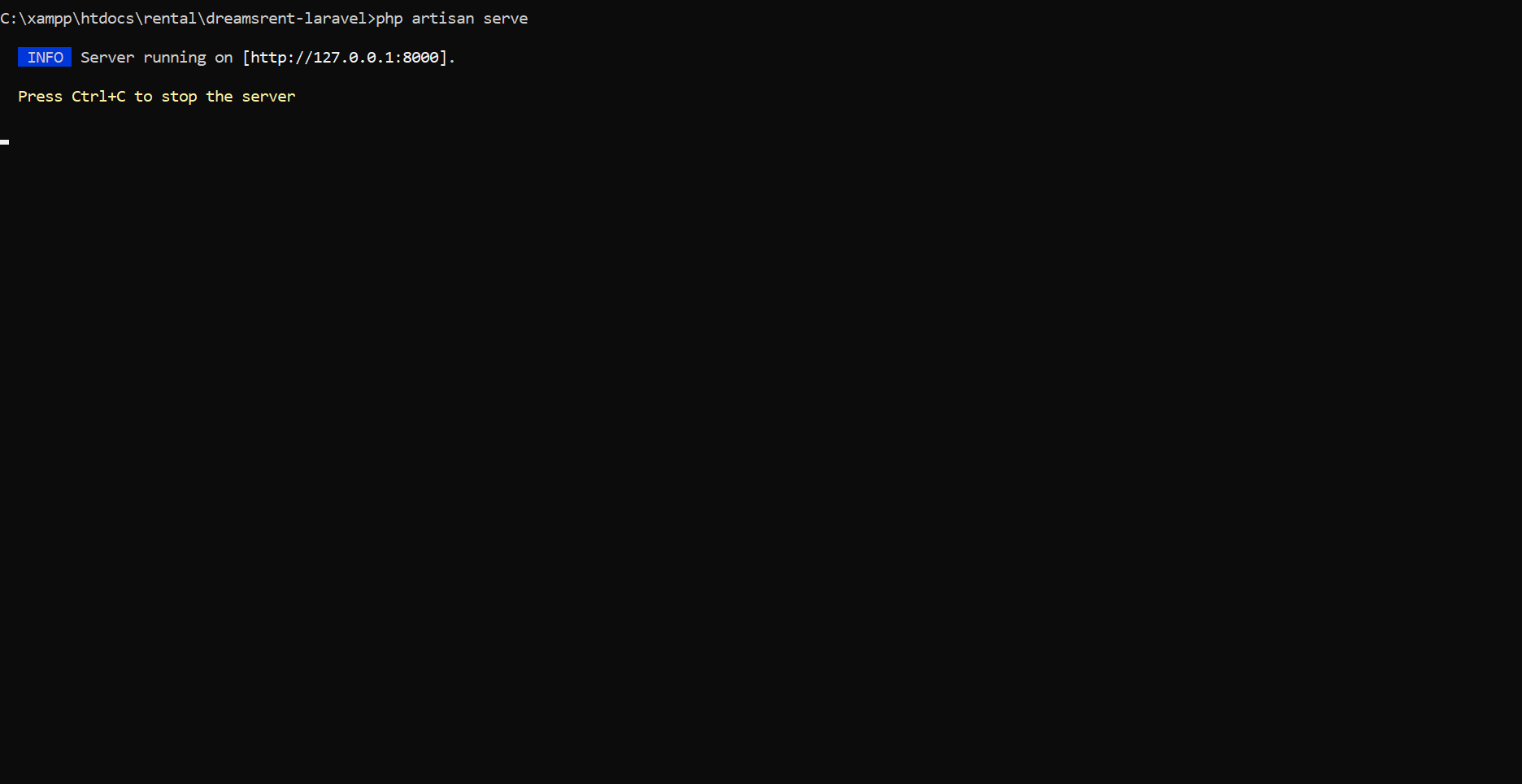
Starts a built-in development server for running the application
locally.
Description:
No need for an external web server like Apache or Nginx during
development.
Purpose:
php artisan cache:clear
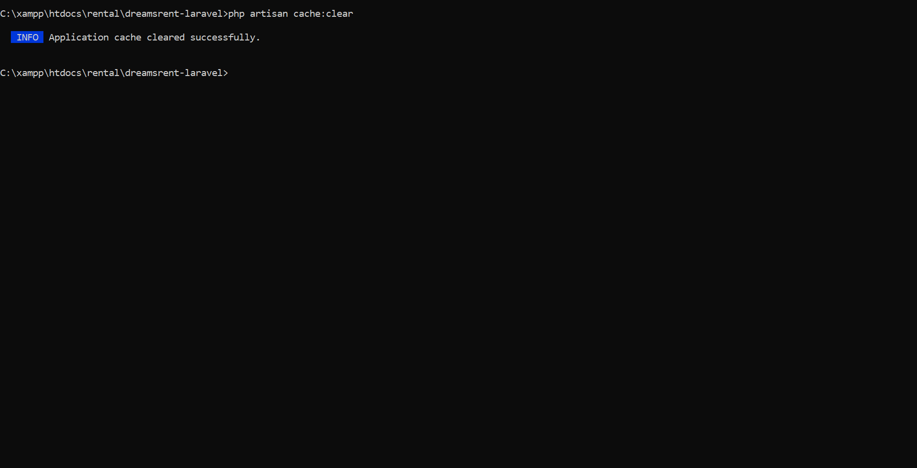
Clears all application caches, including data cached via the
cache()
Description:
helper or Cache facade.
php artisan config:clear
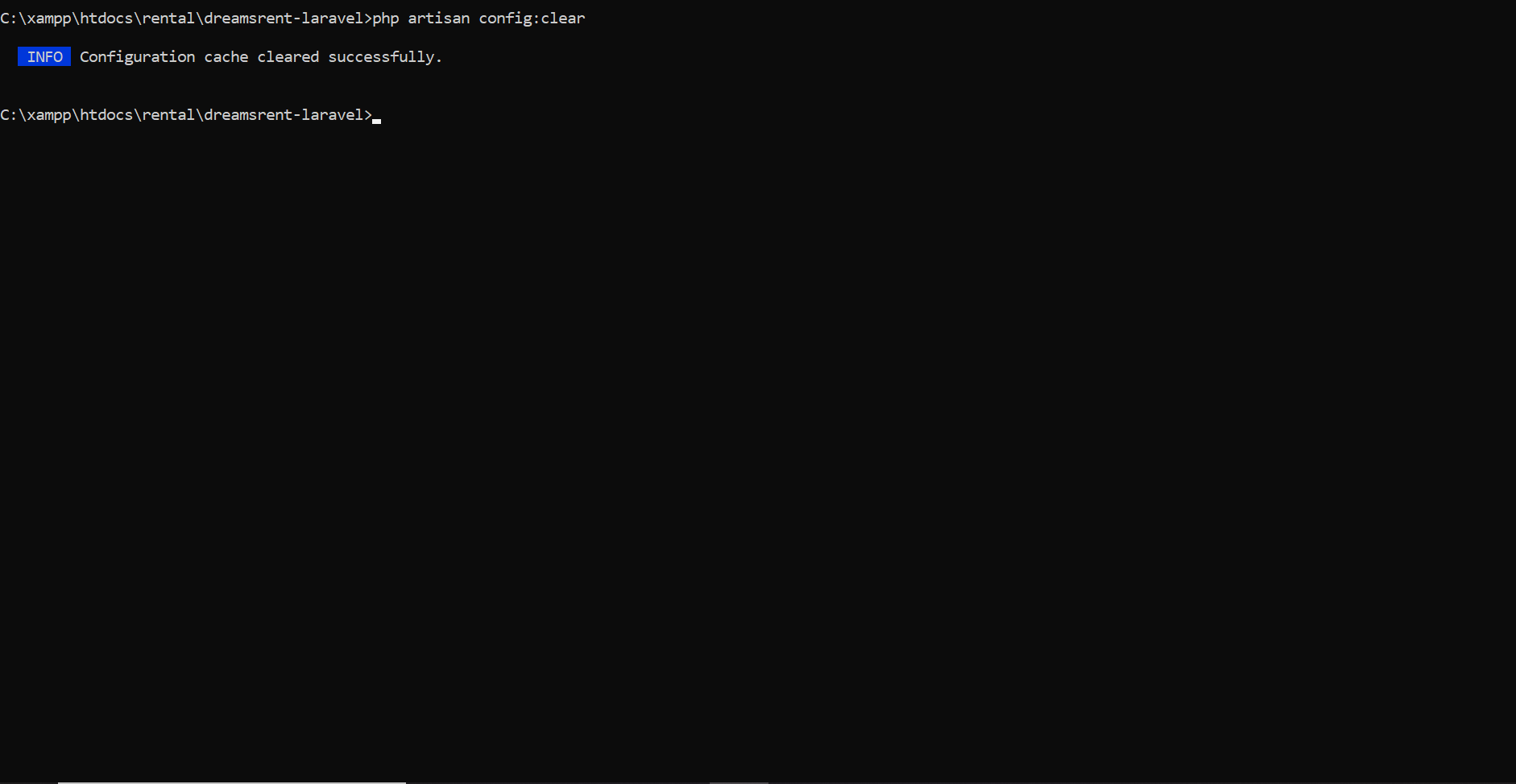
Clears the configuration cache, ensuring that updates to
Description:
.env or config
files take effect.
php artisan route:clear
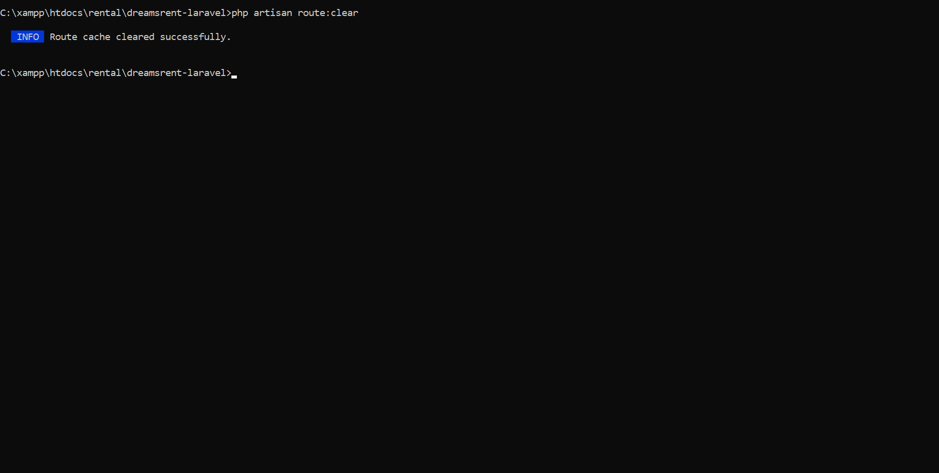
Removes the cached routes to reflect new or updated routes in
the
Description:
application.
php artisan view:clear
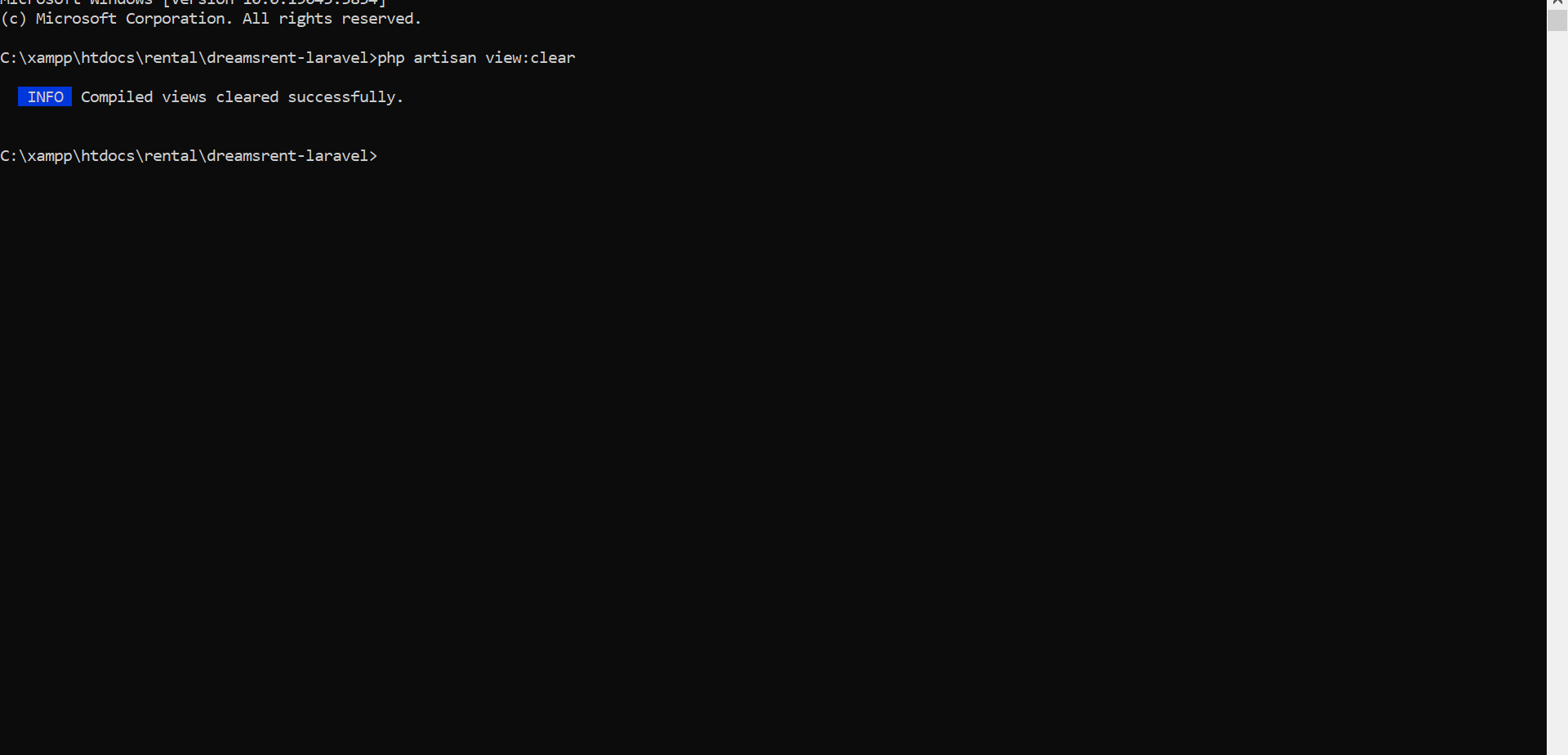
Clears compiled Blade templates, forcing the framework to
regenerate them.
Description:
Verification
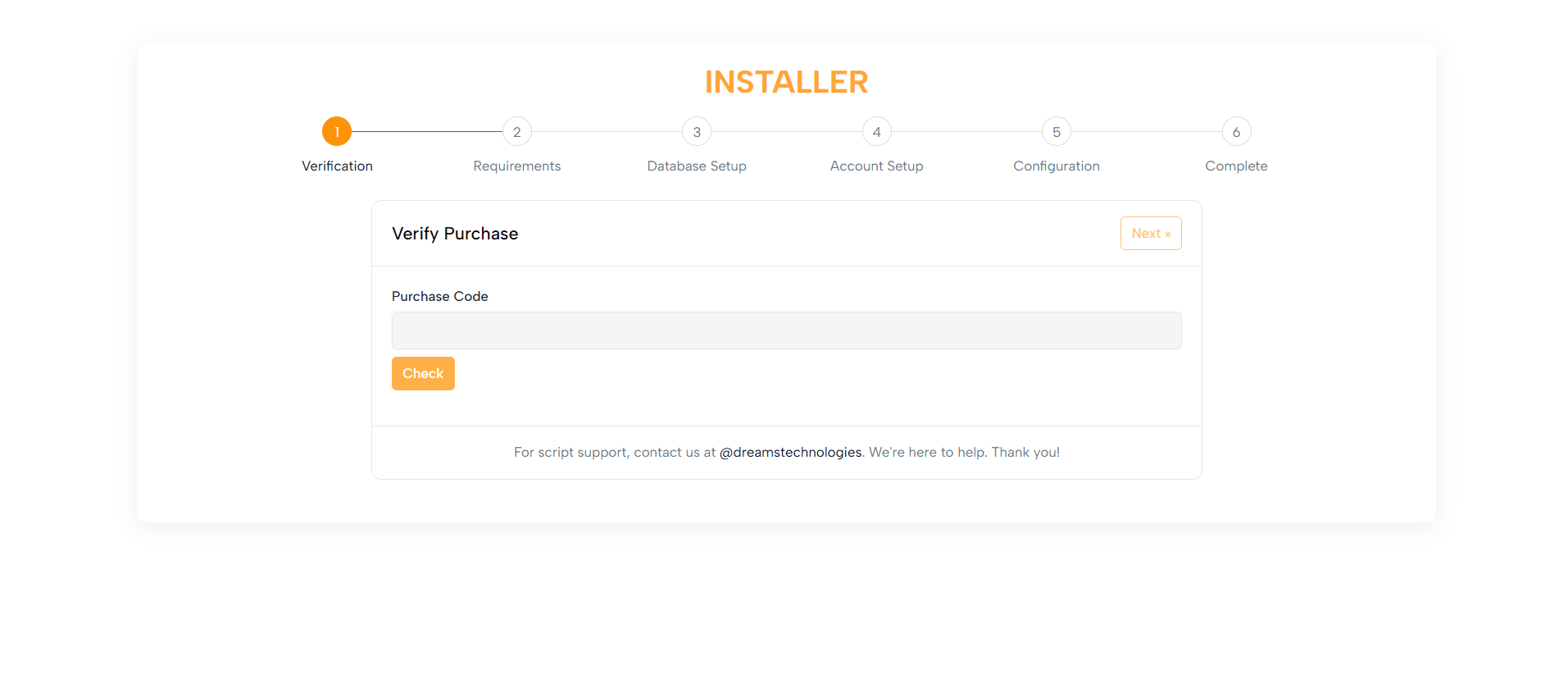
The Verify Purchase form ensures the legitimacy of the installation
by validating your purchase code.
For demo mode, this step can be skipped, providing flexibility for
testing and development.
Purpose:
1. A clean, intuitive form layout featuring: - A heading - An input field for your purchase code - Action buttons (Check and Continue) 2. Clear guidance messages and a loading spinner
for
feedback 3. A footer with support information for assistance
Layout:
Built with Bootstrap classes, ensuring optimal usability on
desktops, tablets, and mobile screens.
Responsive Design:
Requirements
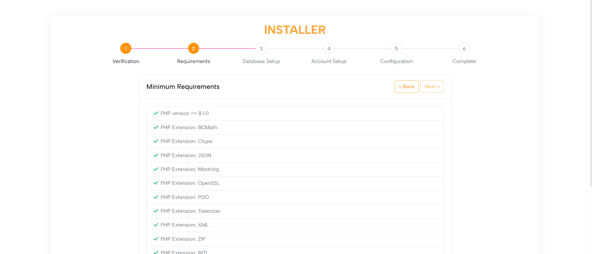
The Minimum Requirements step checks system compatibility,
including:
Purpose:
1. PHP version
2. Required extensions
3. File permissions
1. A user-friendly list of checks with indicators:
Layout:
- Green checkmarks for passed items
- Red icons with informative messages for failed
items
2. Failed checks include links for guidance.
3. Navigation buttons to Go Back or Proceed once all checks are
successful.
Built with Bootstrap classes, ensuring optimal usability on
desktops, tablets, and mobile screens.
Responsive Design:
Database Setup
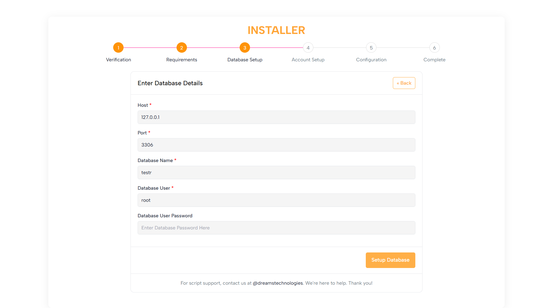
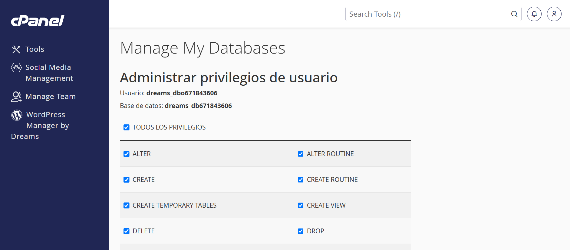
Allows users to configure the database by entering:
Purpose:
1. Hostname
2. Database name
3. Username
4. Password
This step ensures database connectivity and smooth operation.
1. Clean form fields with helpful placeholders and tooltips
Layout:
2. Clear error messaging for invalid or missing details
Optimized with Bootstrap for use on desktops, tablets, and mobile
devices.
Responsive Design:
Account Setup
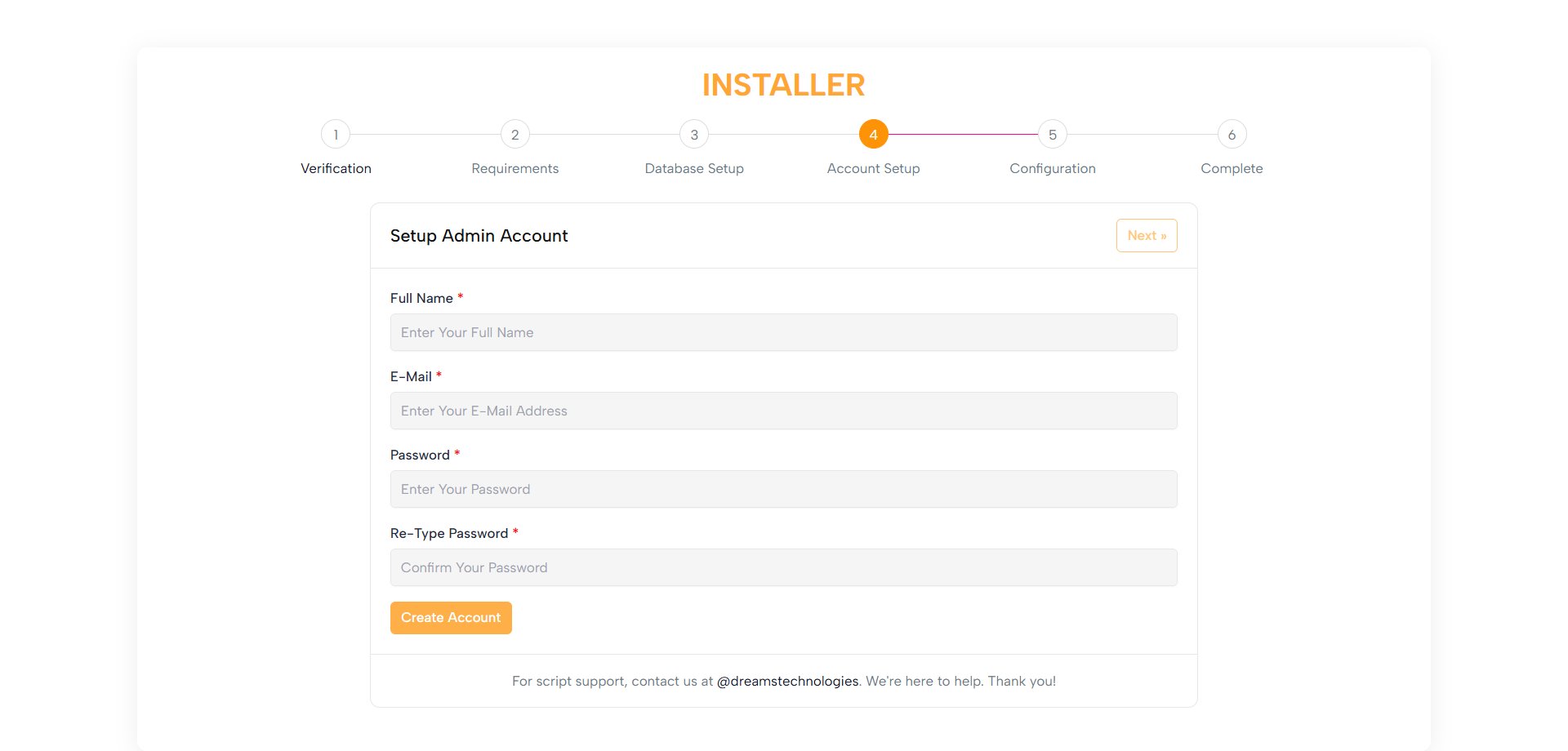
Enables users to create an Admin Account with:
Purpose:
1. Username
2. Email
3. Password
1. Straightforward form fields with labels and placeholders
Layout:
2. Password strength indicator (optional)
3. Clear instructions and validation messages
Built with Bootstrap to work seamlessly on all screen sizes.
Responsive Design:
Configuration
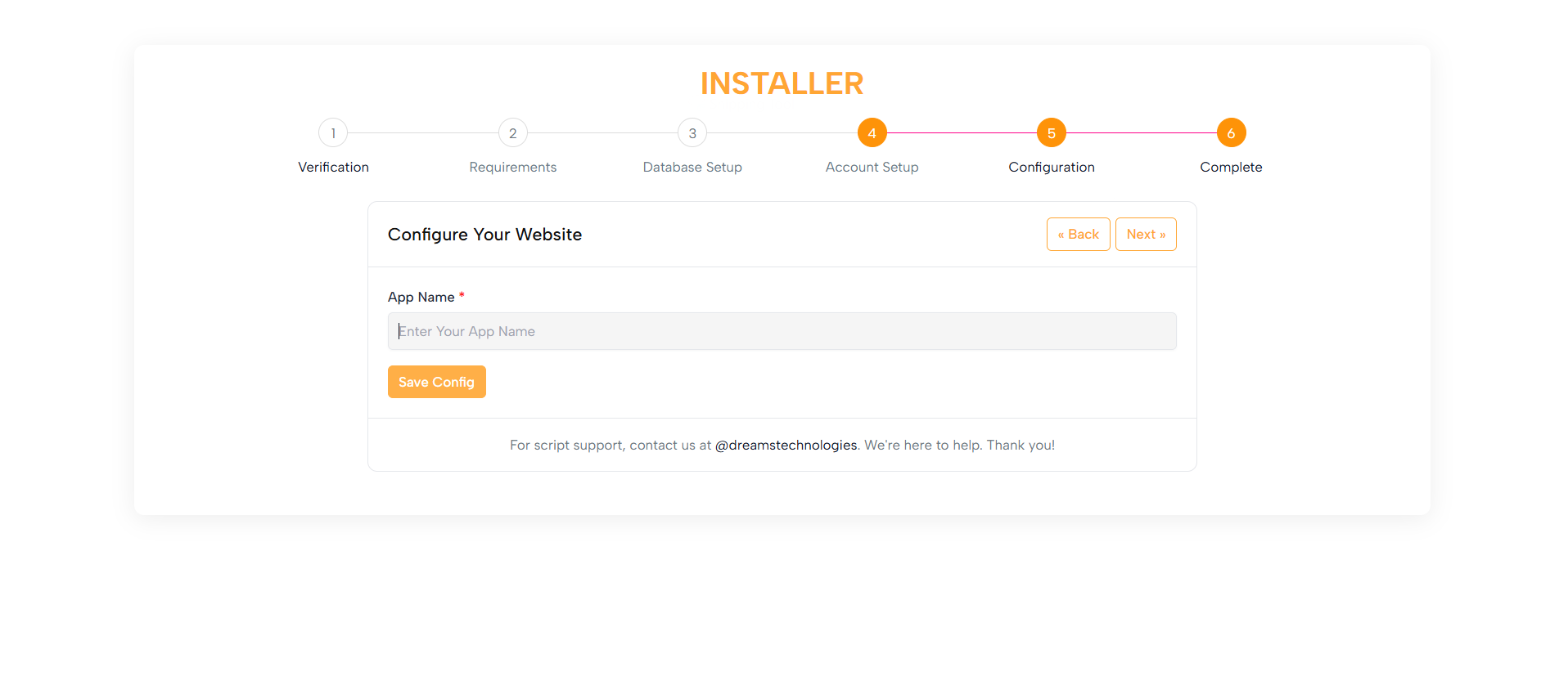
Allows users to configure additional system settings, such as:
Purpose:
1. App URL
2. Mail settings
3. Other essential configurations
1. Organized sections with labels, fields, and tooltips
Layout:
2. Clear instructions for each field
Bootstrap ensures the layout adapts for all devices.
Responsive Design:
Completed
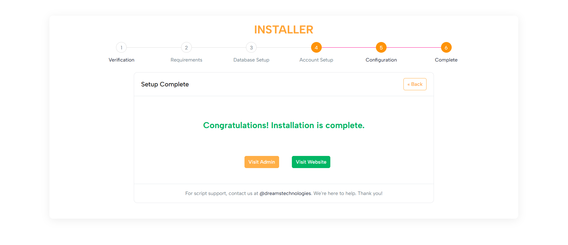
Confirms that the installation is complete and the application is
ready to use.
Purpose:
1. A friendly success message
Layout:
2. Direct links to the Admin Panel and Front-end
3. Optionally, a link to the documentation
Optimized with Bootstrap for consistency across all devices.
Responsive Design:
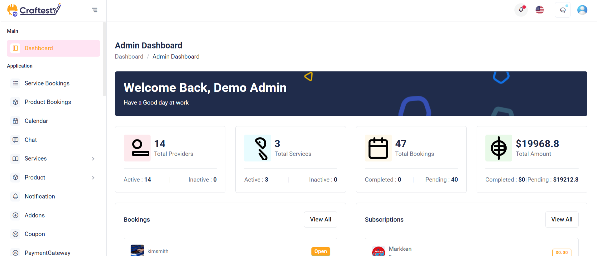
Purpose:
The purpose of this layout is to provide an intuitive and user-friendly interface for users to interact with their booking, wallet, transaction, and wishlist data. It is designed to give users quick access to key information like total bookings, wallet balance, transactions, and wishlist, with the ability to view more details through simple navigation links. This layout is particularly useful for dashboards in applications like booking systems, e-commerce platforms, or user management systems.
Layout:
The layout is composed of multiple widget items and tables, each displaying essential user information in a clean and structured manner. It includes sections like the "Last 5 Bookings" and "Recent Transactions," which show recent data with filters for customizing the view based on time ranges like the last 30 days or last 7 days. Each widget item has a header with a title and a count (e.g., total bookings or wallet balance), accompanied by an icon for quick visual recognition.
Responsive Design:
The design is responsive, adjusting to various screen sizes to ensure usability across devices. The widgets are displayed in a grid layout with flexible column widths, ensuring that content remains legible and accessible on both desktop and mobile views. The tables containing user data are made scrollable on smaller screens to avoid content overflow. Additionally, the layout uses collapsible elements and dropdowns for better space management on smaller devices. The use of skeleton loaders also ensures a smooth experience during data loading, especially for dynamic content.
Purpose:
This component manages and displays a list of vehicle reservations. Admins can view details such as vehicle info, customer name, pickup/drop-off details, and status. It also provides batch selection via checkboxes and an action column to manage each reservation, including deletion through a confirmation modal.
Layout:
The table is wrapped in a Bootstrap table-responsive div for horizontal scrolling on small screens. Table headers use translations for multilingual support and are styled in uppercase for emphasis. The delete modal is compact (modal-sm), centered on the screen, and uses a form to handle the delete action securely with a hidden delete_id.
Responsive Design:
Using Bootstrap's grid and utility classes, the design adapts seamlessly across devices. The table scrolls horizontally when needed, and the modal remains accessible on mobile and desktop. Buttons are properly spaced using me-3 and justify-content-center to ensure consistent alignment and spacing.

Purpose:
This HTML code represents an Order Management Page for administrators. It displays all product orders in a structured table format with support for filtering by status (e.g., Pending, Confirmed, Shipped, Delivery, Canceled, Refund). The page helps admins easily track, manage, and take action on orders while maintaining a clear overview of customer and provider information.
Layout:
The layout follows a card-based design:
- Header Section: Displays the page title ("Product Orders") and breadcrumb navigation for quick access to other pages.
- Tab Navigation: A set of tabs allows switching between different order statuses (All Orders, Pending, Confirmed, Shipped, Delivery, Cancellations, Refunds).
- Table Section: Shows detailed order data in columns such as Order ID, Date, Customer, Provider, Product, Amount, Status, and Action.
- Skeleton Loader: Placeholder rows with skeleton loading effects provide a smooth user experience while real order data is being fetched.
Responsive Design:
The table and navigation use Bootstrap’s responsive grid system to ensure usability across devices.
On smaller screens, the tab navigation remains scrollable, and the order table becomes horizontally scrollable within its container.
The .table-responsive wrapper ensures the content adapts to available space, while icons, actions, and text remain accessible.
The design prioritizes clarity and ease of management for administrators on both desktop and mobile views.

Purpose:
This Blade template represents the Customer Details step in a multi-step vehicle reservation form. Its main purpose is to allow users to select a customer and optionally a driver while displaying a dynamic summary of the reservation. It helps streamline the booking process by providing user-friendly selection fields and contextual customer/driver information.
Layout:
The layout uses Bootstrap's grid system with a row split into two col-lg columns: the left for the form (col-lg-8) and the right for a live booking summary (col-lg-4). Inside the form, there are cards for content organization, headings with icons for clarity, and a progress bar to show multi-step navigation.
Responsive Design:
The design is responsive and mobile-friendly. It uses Bootstrap's flex, row-gap, and utility classes to maintain layout integrity across screen sizes. Elements stack vertically on smaller devices, ensuring usability without horizontal scrolling or content cutoff.
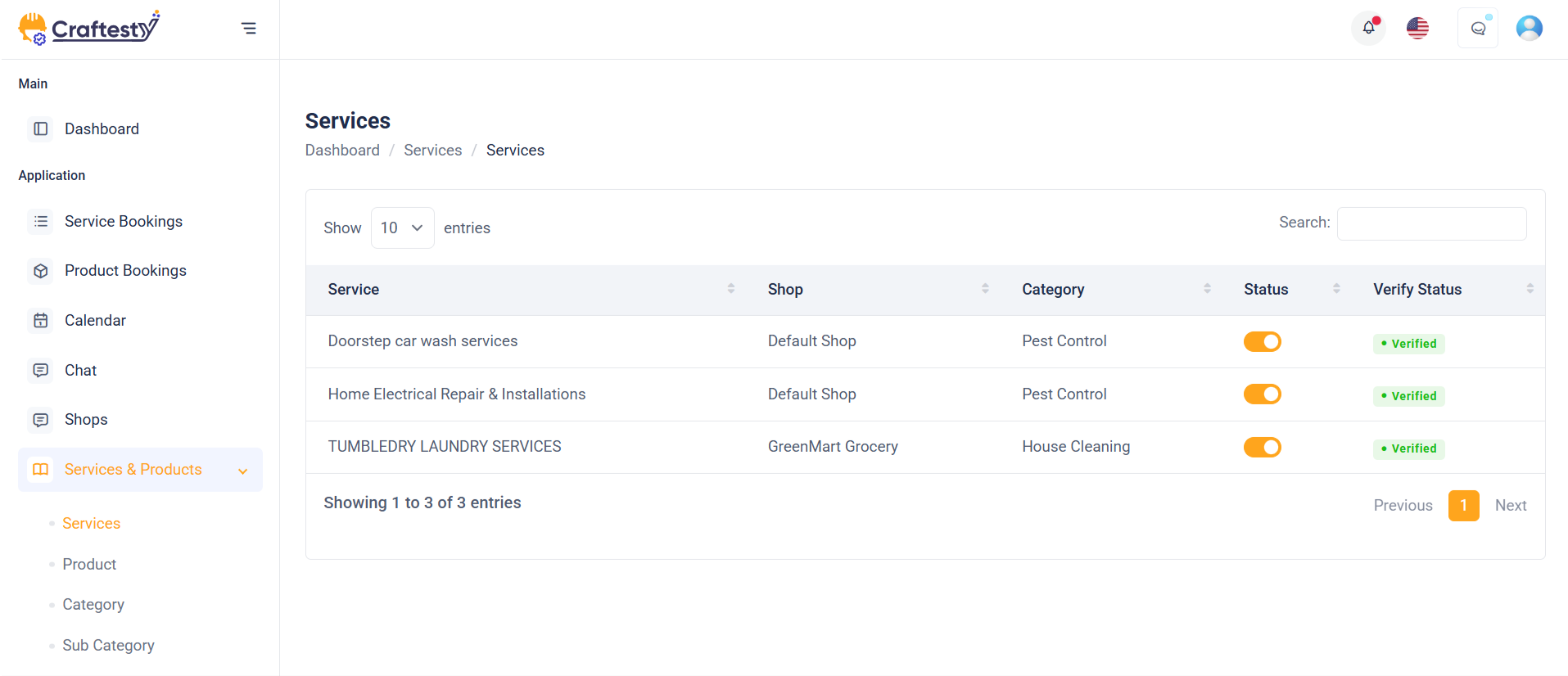
Purpose:
This HTML code represents a Service List Management Page for administrators. It provides a central interface to view, filter, and manage services offered by vendors or shops. The page includes a skeleton loader for better UX while data is being fetched, a main service table with pagination, and modals for adding, editing, verifying, or deleting services. It ensures streamlined management of categories, service details, and verification workflows.
Layout:
The page follows a card-based tabular layout combined with modals:
- Table Section: - Initially displays a skeleton loader table to simulate loading state. - Once data loads, the service table shows columns like Service, Shop, Category, Status, and Verification. - Supports pagination for handling large data sets.
- Category Modal: Allows admins to add or edit categories with fields for parent category, name, slug, image, icon, description, and toggle switches for status and featured flag.
- Delete Confirmation Modal: Displays a warning prompt before permanently deleting a service or category.
- Verification Modal: Enables administrators to confirm service verification with a confirmation prompt.
Responsive Design:
The table and modals use Bootstrap’s grid system to adapt across devices.
- On larger screens, the service data table is fully visible, while on smaller screens it becomes horizontally scrollable within a responsive container.
- Forms inside modals are structured with .row and .col-md-* classes to ensure input fields stack neatly on mobile devices.
- Pagination remains functional and accessible across all device sizes.
- Image and icon upload sections are designed to scale, ensuring the preview remains readable.
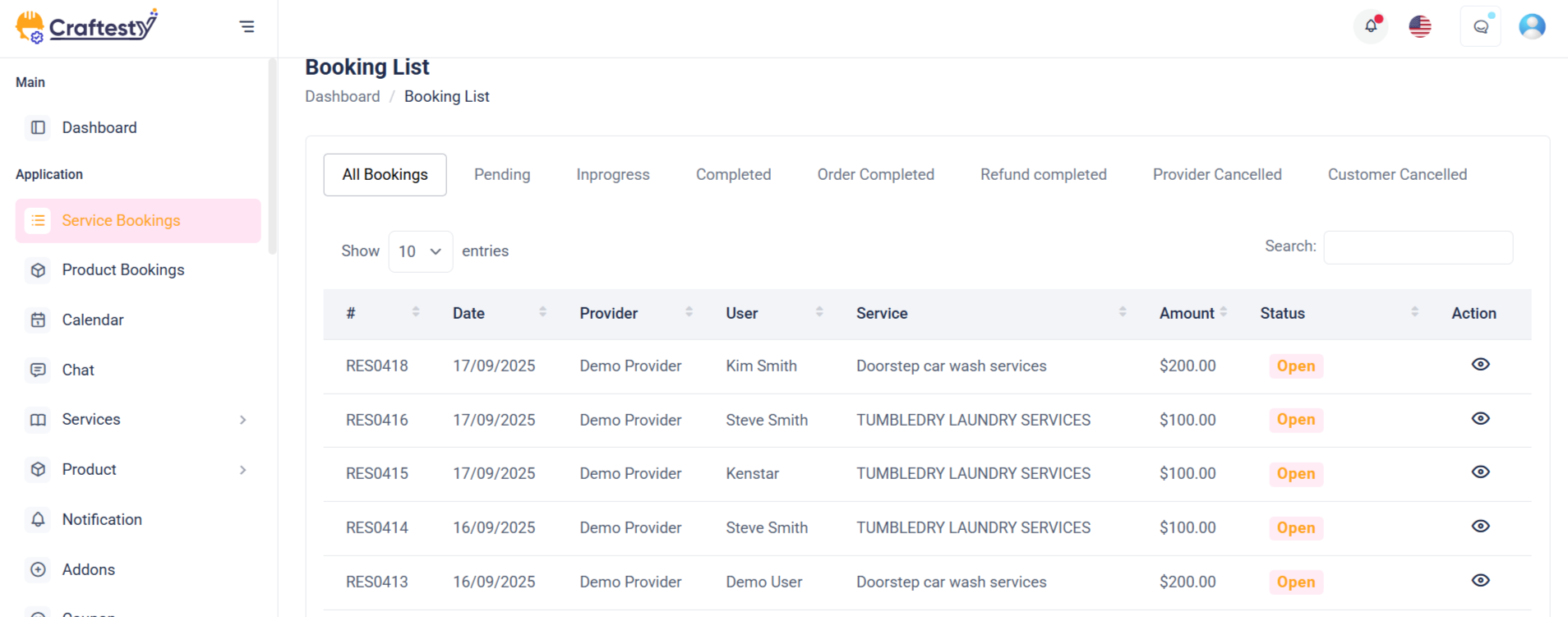
Purpose:
This HTML code represents an Order List Management Page for administrators. It provides a centralized interface to monitor, review, and manage customer orders placed through the platform. The page includes a skeleton loader for better UX during data fetch, a structured order table with pagination, and modals for updating order status, viewing details, and handling deletions. It ensures smooth management of order tracking, customer details, and operational workflows.
Layout:
The page follows a card-based tabular layout combined with interactive modals:
- Table Section: - Displays a skeleton loader table while orders are being fetched. - Once data loads, the table shows columns like Order ID, Customer, Shop, Total Amount, Payment Status, and Delivery Status. - Supports pagination to navigate large sets of order records.
- Order Detail Modal: Allows admins to view complete order information including product details, customer info, payment type, and shipping address.
- Status Update Modal: Enables administrators to change the order’s payment or delivery status (e.g., Pending, Processing, Completed, Canceled).
- Delete Confirmation Modal: Displays a warning prompt before permanently removing an order record.
Responsive Design:
The order list leverages Bootstrap’s grid system to ensure usability across devices. - On desktops, the full order table is visible, while on mobile devices it becomes horizontally scrollable within a responsive container. - Modals adapt seamlessly to different screen sizes, with form elements stacking neatly on smaller screens. - Pagination and filtering remain accessible on all devices. - Order detail views and status toggles are optimized for both admin desktops and mobile management.
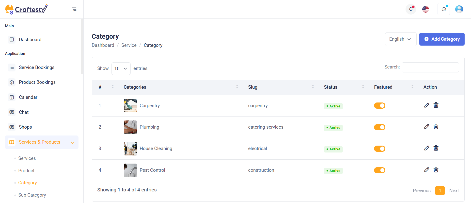
Purpose:
This HTML code represents a Category List Management Page for administrators. It allows admins to create, edit, organize, and delete categories used across the system. With search, sorting, and pagination options, the page ensures efficient management of large category sets. Additionally, image and icon upload features help maintain a visually clear and branded catalog structure.
Layout:
The page is designed with a table-based layout and modal-driven forms:
- Filter & Search Section: - Includes keyword search for quick lookups. - Allows sorting categories in ascending/descending order. - Provides pagination control (10, 25, 50, 100 records). These tools make navigation simple when managing many categories.
- Category Table Section: - Displays category records with columns: Parent Category, Title, Slug, Status, Featured, and Action. - Dynamically populated list with pagination for smooth navigation. - Action column provides edit and delete options.
- Category Save Modal: - A popup form for adding or editing categories. - Fields include Parent Category, Name, Slug, Image, Icon, Description, Status, and Featured toggle. - Image/Icon upload sections allow drag-and-drop or manual selection with preview.
- Delete Confirmation Modal: - Provides a confirmation dialog before deletion to prevent accidental removals. - Includes Cancel and Delete buttons for safe action handling.
Responsive Design:
The page is fully responsive using Bootstrap’s grid system: - On desktops, the full table and filters are visible in a row. - On tablets and mobile devices, filters stack vertically for easy access. - The table becomes horizontally scrollable on smaller screens to avoid layout breaking. - Modals automatically adapt to the viewport size, ensuring usability across all devices.

Purpose:
This collapsible filter section provides users with advanced filtering options for managing and narrowing down vehicle reservations or records. It enhances user efficiency by enabling precise selections based on multiple parameters like car, customer, driver, and car type. The "Apply" and "Clear All" actions further streamline the search experience.
Layout:
The layout uses a horizontal row of dropdowns inside a flex container (d-flex align-items-center). Each dropdown (Cars, Customer, Driver, Car Type) includes a searchable input at the top and dynamically generated checkbox items from the backend collections. This allows users to select multiple options per category easily. Two additional links, "Apply" and "Clear All", are positioned at the end for filter actions.
Responsive Design:
Built with Bootstrap classes like dropdown-menu-lg and responsive spacing utilities (me-2, mb-3), the layout is mobile-friendly. On smaller screens, the filters stack or wrap using flex-wrap, ensuring accessibility without breaking the layout or usability.
Purpose:
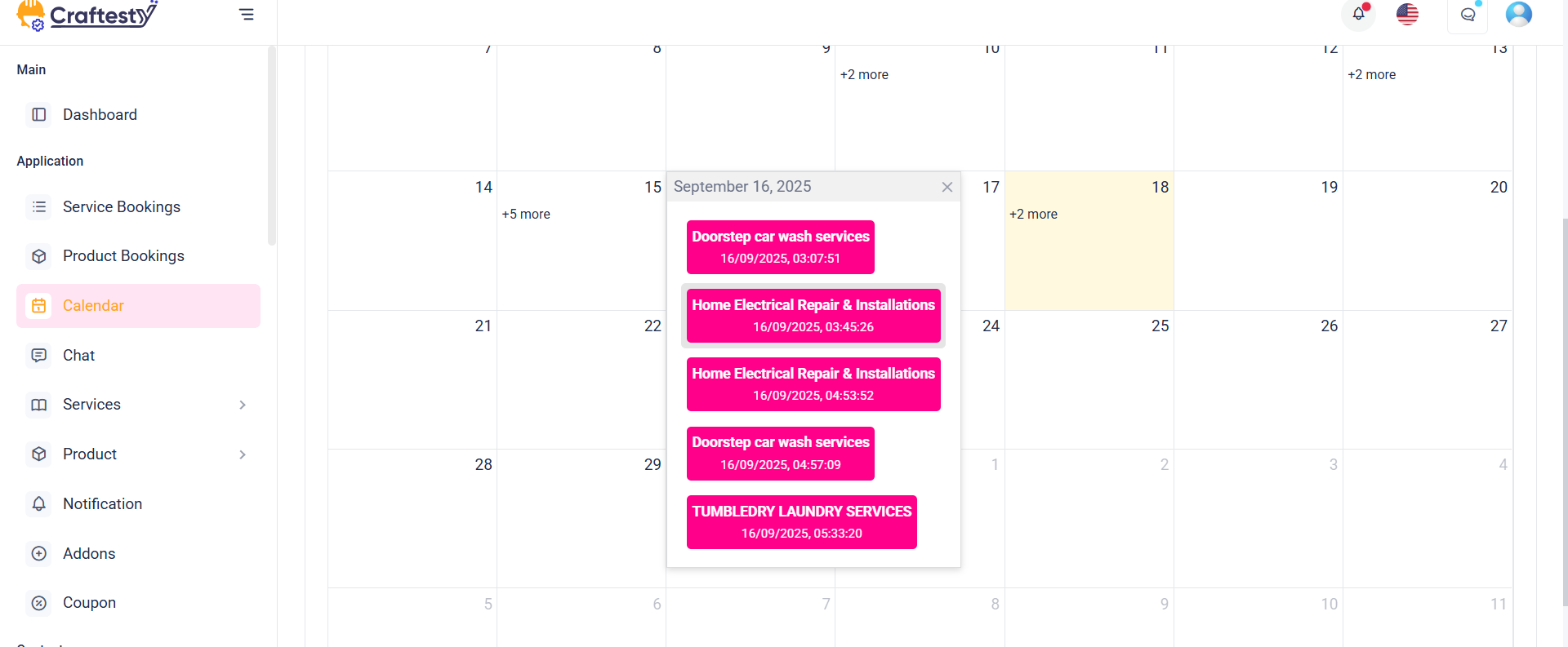
This HTML code represents a Calendar View Management Page for administrators and service providers. It allows users to view, schedule, and manage bookings or events directly through an interactive calendar interface. The calendar view simplifies tracking appointments, multi-day bookings, and availability while providing a clear visual representation of scheduled activities. It ensures efficient time management by integrating booking details with quick access to actions.
Layout:
The page is designed with an interactive calendar layout and modal-driven booking management:
- Calendar Display Section: - Shows all bookings or events in a monthly, weekly, or daily calendar format. - Allows navigation between dates using next/previous controls. - Bookings are color-coded for easy status identification (confirmed, pending, canceled).
- Filter & Search Tools: - Provides options to filter bookings by service, provider, or date range. - Includes keyword search for quick event lookup. - Enhances usability when managing multiple bookings at once.
- Booking Modal: - A popup for adding, editing, or rescheduling a booking. - Fields include Customer Info, Date/Time, Duration, Service Type, and Status. - Supports both hourly and multi-day booking options.
- Delete Confirmation Modal: - Displays a confirmation dialog before deleting a booking. - Prevents accidental removal of important scheduled events. - Includes Cancel and Delete buttons for safe handling.
Responsive Design:
The calendar view is fully responsive using Bootstrap’s grid system: - On desktops, the full interactive calendar is displayed with filters on the top. - On tablets, the calendar adapts to a compact view with collapsible filter options. - On mobile devices, the calendar supports vertical scrolling with day/week switching for better readability. - Modals resize automatically to fit smaller screens, ensuring all booking actions remain accessible.
Purpose:
The purpose of this section is to manage customer records within an admin dashboard. It features a data table listing customer details such as name, email, language, and associated documents or rents. It also includes a modal form to add new customers, capturing essential personal and licensing details, profile image, and documents. This setup facilitates efficient CRUD operations—Create (via the modal), Read (via the table), and implied Update/Delete (to be implemented similarly).
Layout:
The layout consists of a responsive data table wrapped in a .table-responsive container to ensure horizontal scrollability on smaller screens. The "Add Customer" modal is designed using Bootstrap’s modal components and is structured into organized rows and columns for better readability. Each input field includes label, validation message placeholder, and is grouped logically (personal info, contact, license, etc.). File uploads are enhanced with preview and instruction texts.
Responsive Design:
Built with Bootstrap's grid system, the form adapts to various screen sizes using col-md-* classes. Inputs stack vertically on smaller screens, ensuring a mobile-friendly experience. Image and document upload areas maintain usability on touch devices. The table remains scrollable and accessible, while modal dialogs scale appropriately for devices of all sizes.
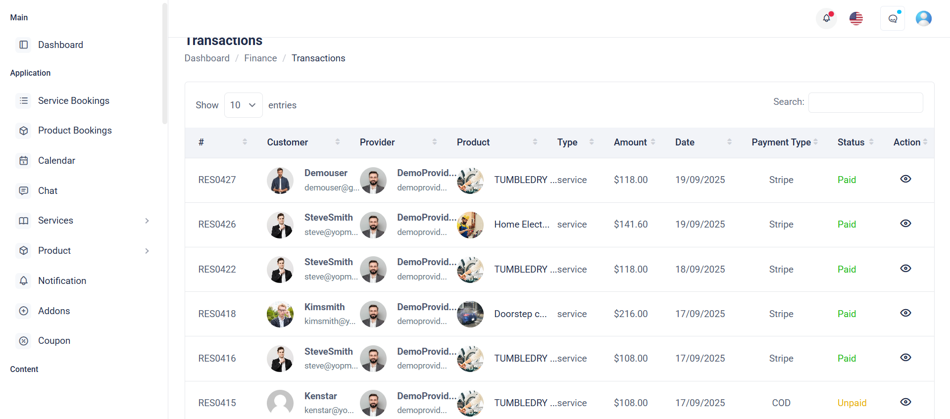
Purpose:
This section displays payment transaction data in a structured and user-friendly format. It uses a skeleton loader table to provide visual feedback while the data is being fetched, enhancing user experience. Once loaded, the real table (#paymentInfoData) shows transaction details such as ID, name, amount, method, date, and status, along with action options.
Layout:
The layout includes two primary parts:
1. A loader table with skeleton elements that simulate table content during data fetch.
2. A real table that remains hidden (d-none) until data is loaded. It uses a table-responsive wrapper for horizontal scrolling and clean display on all devices. The columns are clearly defined for easy readability and action management.
Responsive Design:
Built with Bootstrap classes like table-responsive, this layout adapts gracefully across devices. Skeletons maintain layout consistency while loading, and the real table ensures usability on desktops, tablets, and mobile devices through responsive breakpoints.
Purpose:
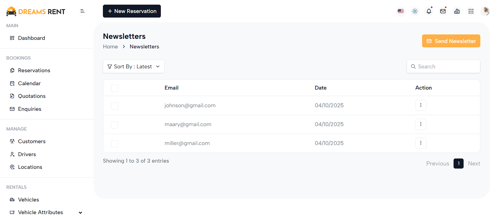
This component provides a dynamic interface for managing newsletter subscriptions. Initially, it displays a skeleton loader table while fetching data via AJAX, enhancing user experience during load times. Once data is available, the actual table replaces the loader, displaying email entries with optional actions like deletion.
Layout:
The layout consists of two divs : one with a visible skeleton table and another hidden real-table that becomes visible when data loads. The skeleton mimics table headers and rows, improving perceived performance. The real table includes columns for checkbox selection, email, subscription date, and action buttons—conditionally rendered based on user permissions.
Responsive Design:
The tables are wrapped in table-responsive containers, ensuring horizontal scroll on smaller devices. Bootstrap classes make the layout flexible, ensuring usability across screen sizes. Checkbox inputs and buttons are touch-friendly, and content adjusts smoothly, offering a clean and mobile-first user interface.
Purpose:
This component renders a dynamic invoice management table with options to view, edit, or delete invoices. It displays key invoice details such as number, client name, email, creation and due dates, total amount, and payment status. It also includes a confirmation modal for safe deletion.
Layout:
Built using Bootstrap, the layout features a bordered table within a table-responsive wrapper, ensuring horizontal scroll on smaller screens. Each row contains user info (with a profile image), invoice metadata, and a dropdown for actions. The modal that pops up for deletion is centered and styled to match the app’s theme.
Responsive Design:
Using Bootstrap classes like d-flex, align-items-center, table-responsive, and avatar-rounded, the table adapts to various screen sizes. Profile images scale well, the dropdown action menu aligns right, and the modal is mobile-friendly thanks to modal-dialog-centered and modal-sm.
Purpose:
This section allows administrators to create and manage custom pages with detailed metadata, SEO settings, and dynamic content sections. It facilitates structured content entry with options for page title, slug, keywords, SEO configurations, and Open Graph (OG) properties. The interface also supports section-based page building via buttons and live section previews.
Layout:
The form is split into two primary columns using Bootstrap’s grid system. The left side (col-md-8) holds the main page creation form inside a card component, which is neatly divided into content and SEO blocks. The right side (col-md-4) displays a section list panel with buttons to toggle between screens and a container for dynamically rendered section cards or loading skeletons for improved UX during data fetch.
Responsive Design:
Leveraging Bootstrap classes like col-md-* and table-responsive, the layout gracefully adapts to different screen sizes. Input fields and buttons stack vertically on smaller screens, ensuring usability on tablets and mobile devices. The interface remains functional and readable across devices.

Purpose:
This interface provides a user-friendly form for administrators to edit existing pages within a content management system. It includes essential page attributes like title, slug, SEO metadata, and Open Graph (OG) tags, along with the ability to manage dynamic content sections using draggable text areas.
Layout:
The page is structured into two primary columns. The left column (8-column grid) houses the editable page form with all necessary fields wrapped inside a Bootstrap card component. It features skeleton loaders for a seamless loading experience and toggles real form elements once data is fetched. The right column (4-column grid) displays available sections or theme-related previews, with options like "Screen One" or "Screen Two" based on the page theme.
Responsive Design:
Built using Bootstrap’s grid system, the layout adapts to various screen sizes. Components like inputs, buttons, and tables stack vertically on smaller screens, ensuring usability across desktop, tablet, and mobile devices.
Purpose:
The form is designed for managing different banner sections in a content management system (CMS). It allows administrators to upload thumbnail images, input titles, descriptions, and assign vehicles for promotional display, providing structured content updates for various sections on a front-facing platform.
Layout:
The form is divided into three collapsible sections (section_id_1, section_id_2, and section_id_3), each tailored to specific banner configurations. Inputs include file uploads, text fields, textareas, and dropdowns, with labels and error feedback for validation. The modal layout encapsulates the form, providing a focused, non-intrusive user experience.
Responsive Design:
Using Bootstrap's grid system (col-md-* classes), the form ensures mobile-first responsiveness. Fields stack vertically on smaller screens and align horizontally on larger displays. Image previews, dynamic error handling, and modal behavior enhance usability across devices, maintaining accessibility and consistency in all viewports.
Purpose:
The given HTML snippet represents an admin interface for managing website navigation menus. Its primary goal is to allow administrators to select, edit, and reorder menu items, either by choosing from existing pages or adding custom links. The interface provides the flexibility to structure menus according to the site's navigation needs, enhancing user experience and content accessibility.
Layout:
The layout is organized into a two-column structure. The left column (8 columns wide) contains the main menu editing area, including a dropdown to select a menu, a sortable list of menu items, and a form to save changes. Skeleton loaders are used for a smooth loading experience, replaced by real form elements once data is ready. The right column (4 columns wide) holds an accordion with sections for adding predefined pages and custom links. Interactive controls like checkboxes and inputs are used for item selection and configuration, with clearly defined action buttons (e.g., "Add to Menu").
Responsive Design:
The layout uses Bootstrap's responsive grid system (col-md-*), ensuring adaptability across screen sizes. Elements stack vertically on smaller screens, maintaining usability on mobile devices. Skeleton loaders enhance perceived performance during loading, providing a modern, user-friendly, and responsive experience.

Purpose:
This HTML snippet defines an admin interface for managing blog posts. It enables administrators to view, filter, sort, search, and manage blogs efficiently. The page includes controls for toggling between list and grid views, adding new blogs, filtering by category, and searching by title. Each blog card offers quick edit and delete actions, along with details like title, author, date, image, and tags.
Layout:
The layout is structured using Bootstrap's grid system. The top section includes breadcrumbs for navigation and action buttons for adding blogs or switching views. Below that, sorting and filtering options are provided via dropdowns and collapsible panels. The main content is a grid of blog cards (blog-item) organized in rows and columns, each displaying a thumbnail, author info, publication date, and title. Each card also has edit and delete controls. A “Load More” button at the bottom allows for dynamic content loading.
Responsive Design:
The layout is fully responsive using Bootstrap classes like col-md-6 and col-lg-4 to adjust the number of columns based on screen size. The design adapts from a multi-column grid on desktops to a single-column stack on smaller screens. Action buttons and dropdowns are flexibly aligned, ensuring a consistent and user-friendly interface across devices.
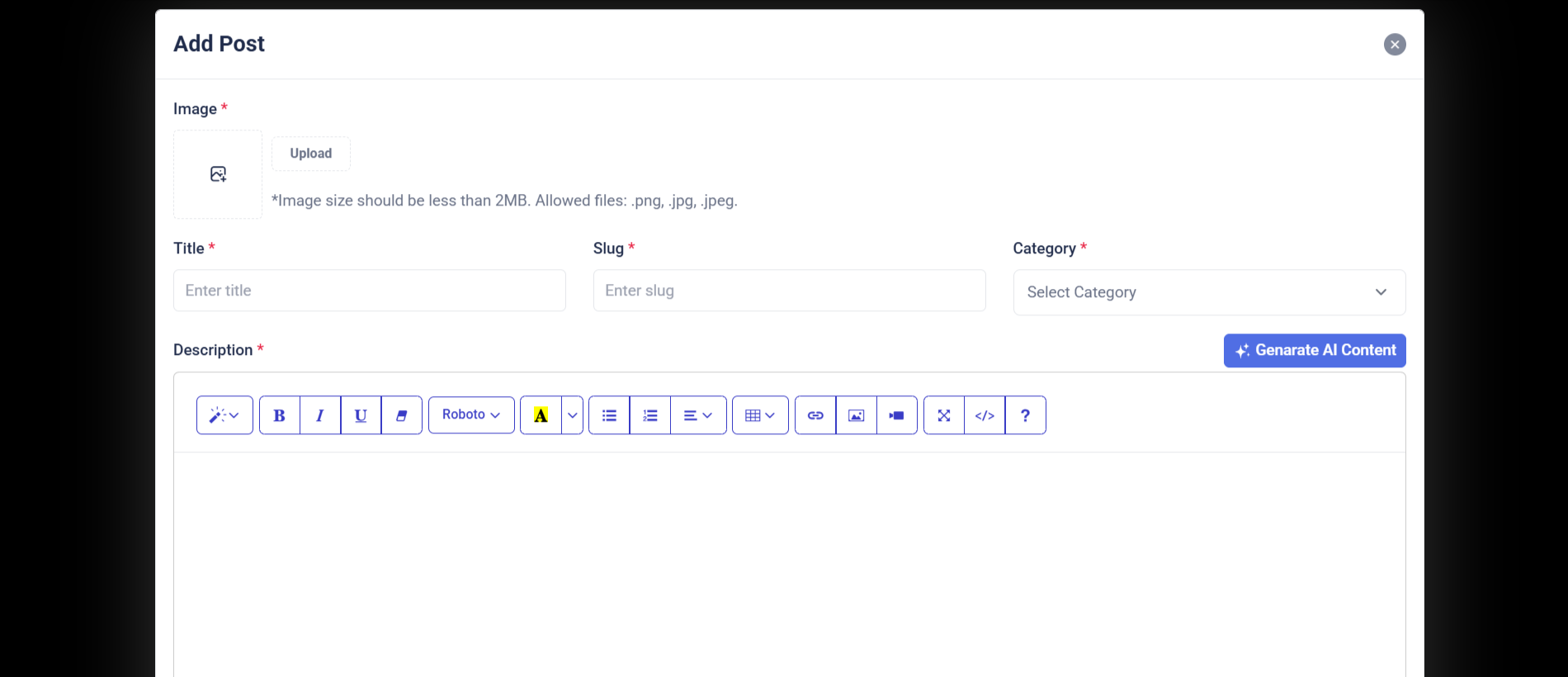
Purpose:
The "Add Blogs" section provides administrators with a structured form interface to create new blog posts within the admin panel. It allows input for essential blog details including the featured image, title, language, category, tags, and description. This form streamlines the blog publishing process, ensuring that all required information is gathered in one place and submitted securely via a POST request to the server.
Layout:
The layout is card-based and cleanly organized using Bootstrap's grid system. It starts with a back-link to the main blog list, followed by a form wrapped inside a card component. The form includes a featured image uploader with preview, and input fields arranged in two-column rows where appropriate. Text inputs and select dropdowns are used for structured data, and a rich text editor (e.g., TinyMCE or CKEditor) is used for the description field. The form ends with action buttons — "Cancel" and "Create New".
Responsive Design:
The design is responsive and mobile-friendly, utilizing col-md-6 and col-md-12 classes to control field width across screen sizes. On smaller devices, columns stack vertically for better readability. Elements like the image preview, upload button, and select dropdowns scale appropriately, ensuring a user-friendly experience across all devices.
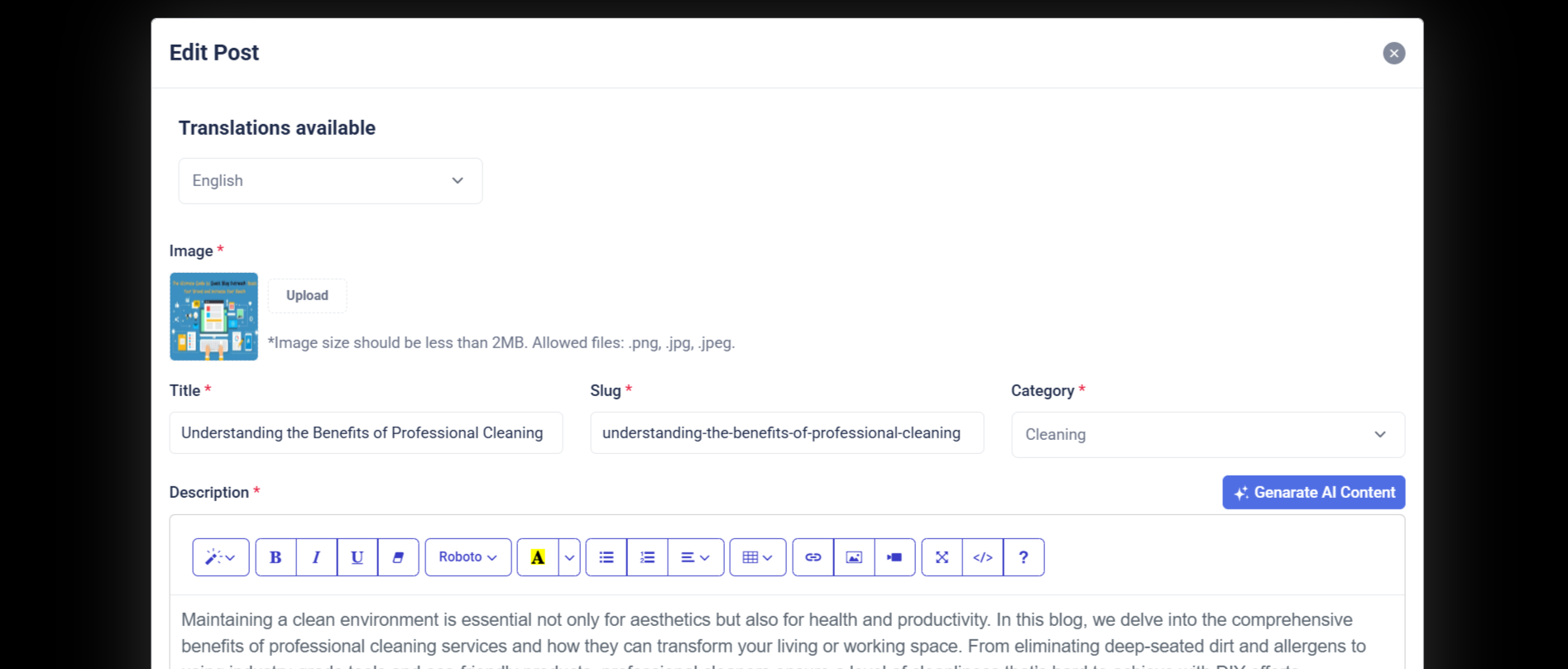
Purpose:
The "Edit Blogs" section enables administrators to update existing blog content efficiently through a pre-filled form. It allows editing of key blog attributes including the featured image, title, category, tags, and description, as well as toggling the blog's publication status. This form is crucial for maintaining up-to-date content and correcting or enhancing blog posts as needed.
Layout:
The layout uses a card-based structure and leverages Bootstrap’s responsive grid system. The form is wrapped within a .card element, split into the card-header, card-body, and card-footer. The featured image is displayed with a preview and upload option. Input fields are clearly grouped: title spans the full width, while category and tags share a row. The description uses a rich text editor for flexibility. A status toggle switch and action buttons (“Cancel” and “Save Changes”) are placed in the footer for convenience and usability.
Responsive Design:
This interface is fully responsive. On medium and larger screens, form fields are arranged side-by-side using col-md-6, while on smaller devices, they stack vertically for easier navigation. The image preview, text inputs, selects, and buttons adjust fluidly across screen sizes, ensuring that content editing is user-friendly whether on desktop, tablet, or mobile devices.
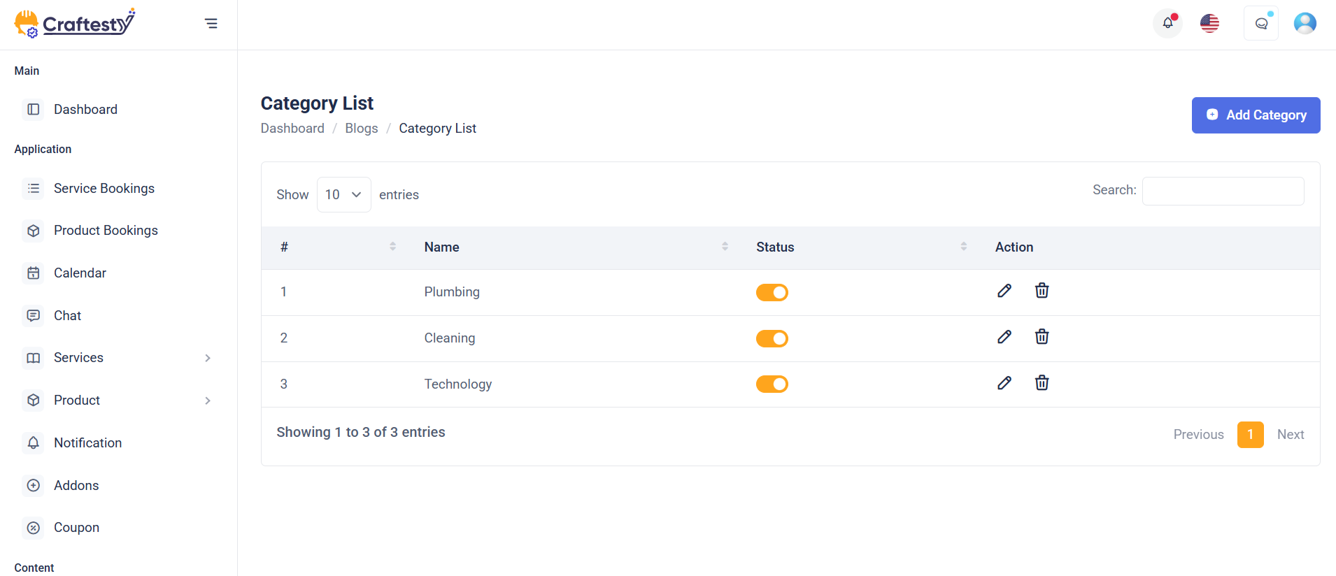
Purpose:
This interface is designed for managing blog categories within an admin dashboard. It allows administrators to view, sort, search, create, edit, and delete blog categories. Each category displays key metadata such as the number of associated blog posts, creation date, and publication status. Through modals, users can add a new category, edit existing ones, or confirm deletions—making the category management process seamless and intuitive.
Layout:
The layout features a breadcrumb navigation at the top, followed by a toolbar with sorting and search options. The main section includes a responsive data table displaying category information. Each row has action options (Edit/Delete) via a dropdown. Modals are provided for category CRUD operations:
“Add Category” includes a language selector and name input.
“Edit Category” pre-fills category info for editing.
“Delete Category” offers a confirmation prompt.
Responsive Design:
Built with Bootstrap, the layout adapts smoothly to all screen sizes. The breadcrumb, buttons, and action dropdowns stack or align based on viewport width. Inputs, filters, and modals adjust gracefully to mobile devices, ensuring an accessible and user-friendly experience on both desktop and mobile platforms.
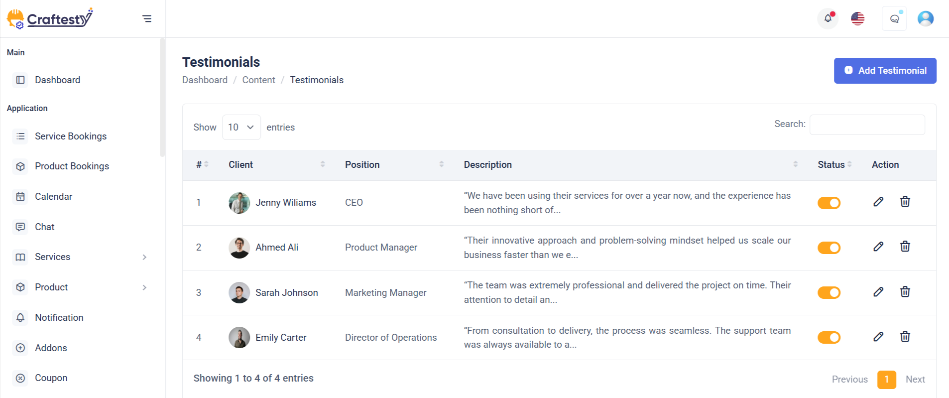
Purpose:
The testimonial management interface is crafted for admin users to efficiently manage customer feedback on a platform. It allows the addition, editing, viewing, and deletion of testimonials—capturing customer names, ratings, reviews, and images. This setup supports maintaining credibility and showcasing social proof on the frontend of the website.
Layout:
The main section features a custom responsive data table ( testimonialsTable) displaying all testimonials with columns for customer name, rating, review, creation date, and optionally, actions (if the user has permission). Three Bootstrap modals are used:
Add Testimonial Modal: Contains form fields for image upload, customer name, rating dropdown, and review textarea.
Edit Testimonial Modal: Pre-populated with selected testimonial data and includes a toggle for status.
Delete Testimonial Modal: Provides a centered confirmation prompt for deletion.
Responsive Design:
Utilizing Bootstrap’s responsive classes like table-responsive, modal-dialog-centered, and d-flex, the layout adapts across all screen sizes. Form controls and upload components stack vertically on smaller devices for better usability. Modals maintain appropriate sizing ( modal-md, modal-sm ) and ensure accessible interaction through consistent spacing, readable text, and mobile-friendly buttons. This design ensures a seamless admin experience on both desktop and mobile devices.
Purpose:
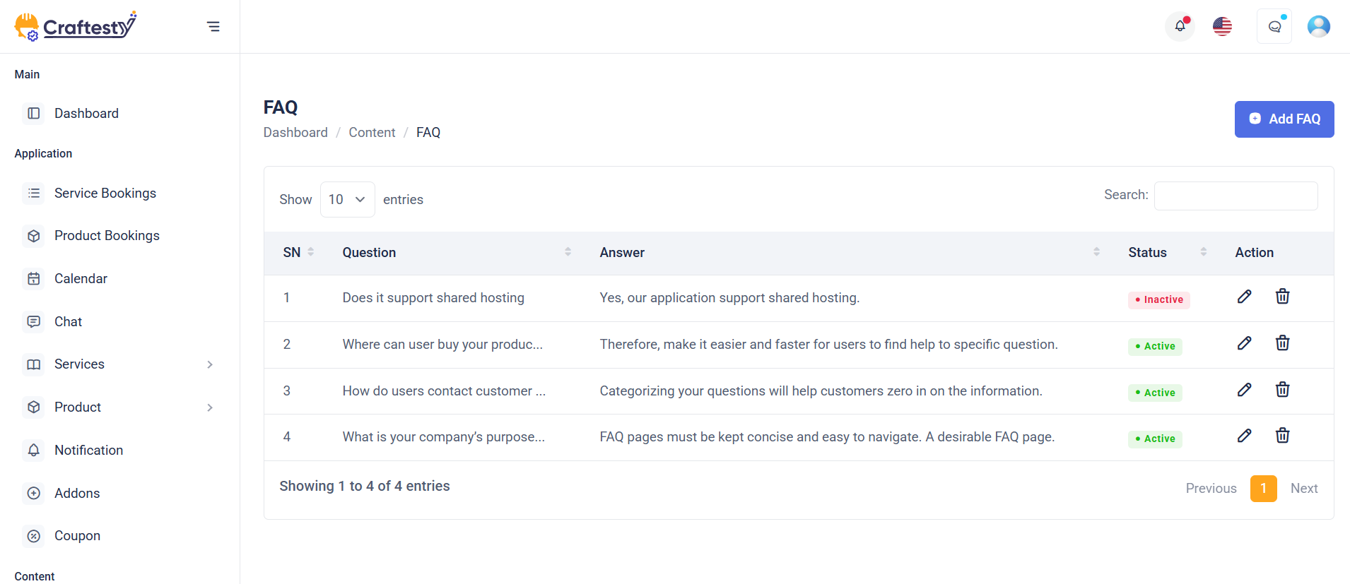
This FAQ management module is designed for administrators to create, update, and manage frequently asked questions across multiple languages. It helps maintain an informative knowledge base for users while supporting multilingual platforms. The interface enables admins to add new FAQs, modify existing ones, toggle status (active/inactive), and delete entries as needed.
Layout:
The main interface consists of a hidden data table (faqTable) that is populated dynamically via AJAX. It displays the question, answer, status, and actions (if permissions allow). Three modals handle FAQ operations:
Add FAQ Modal: Includes a dropdown for language selection, input fields for question and answer, and a submit button.
Edit FAQ Modal: Pre-fills fields with existing data and includes a status toggle switch.
Delete FAQ Modal: Provides a minimal confirmation prompt with clear call-to-action buttons.
Responsive Design:
The structure leverages Bootstrap 5 classes like modal-dialog-centered, form-select, and d-flex to ensure a clean and adaptive layout across devices. Fields are spaced with mb-3, ensuring readability on both desktop and mobile. Dropdowns and textareas adjust fluidly within modal widths (modal-md, modal-sm), while buttons and toggles are touch-friendly for mobile users. The interface is fully responsive, providing a seamless experience on any screen size.
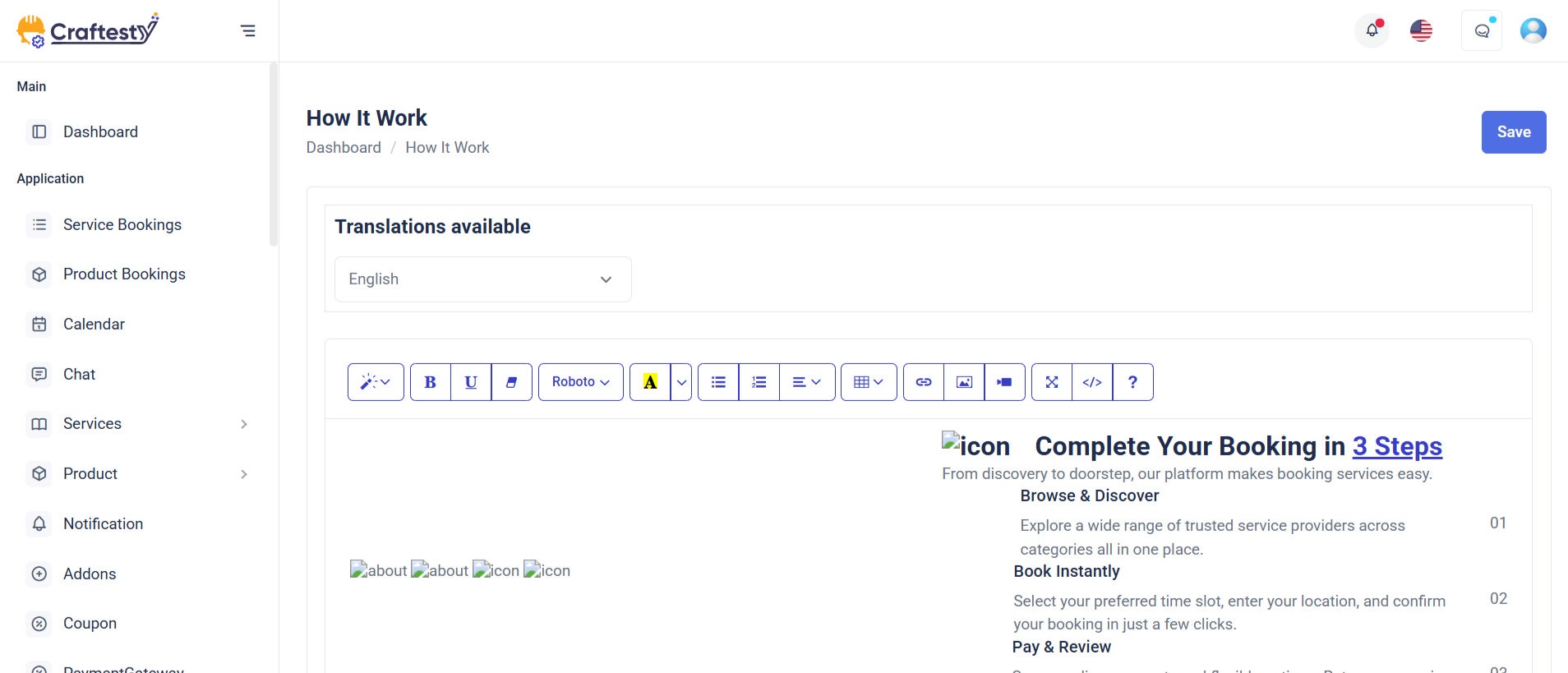
Purpose:
This form is built for administrators to manage the "How It Works" content for a CMS in multiple languages. It allows editing descriptions that guide users on how the platform or service operates, tied to a specific group_id.
Layout:
The form is encapsulated in a Bootstrap card layout with a header, body, and footer. The header includes the main title; the body contains a hidden group_id field, a language dropdown (triggering dynamic content loading), and a description field using a rich text editor ( summernote ). The footer houses action buttons (Cancel/Save) with permission checks for editing.
Responsive Design:
Built using Bootstrap utility classes, the form adapts well across screen sizes. Skeleton loaders offer a visually engaging experience while data loads, and all form controls (selects, textareas, buttons) are styled to be touch-friendly and mobile-responsive. The layout maintains usability and readability from desktop to mobile.
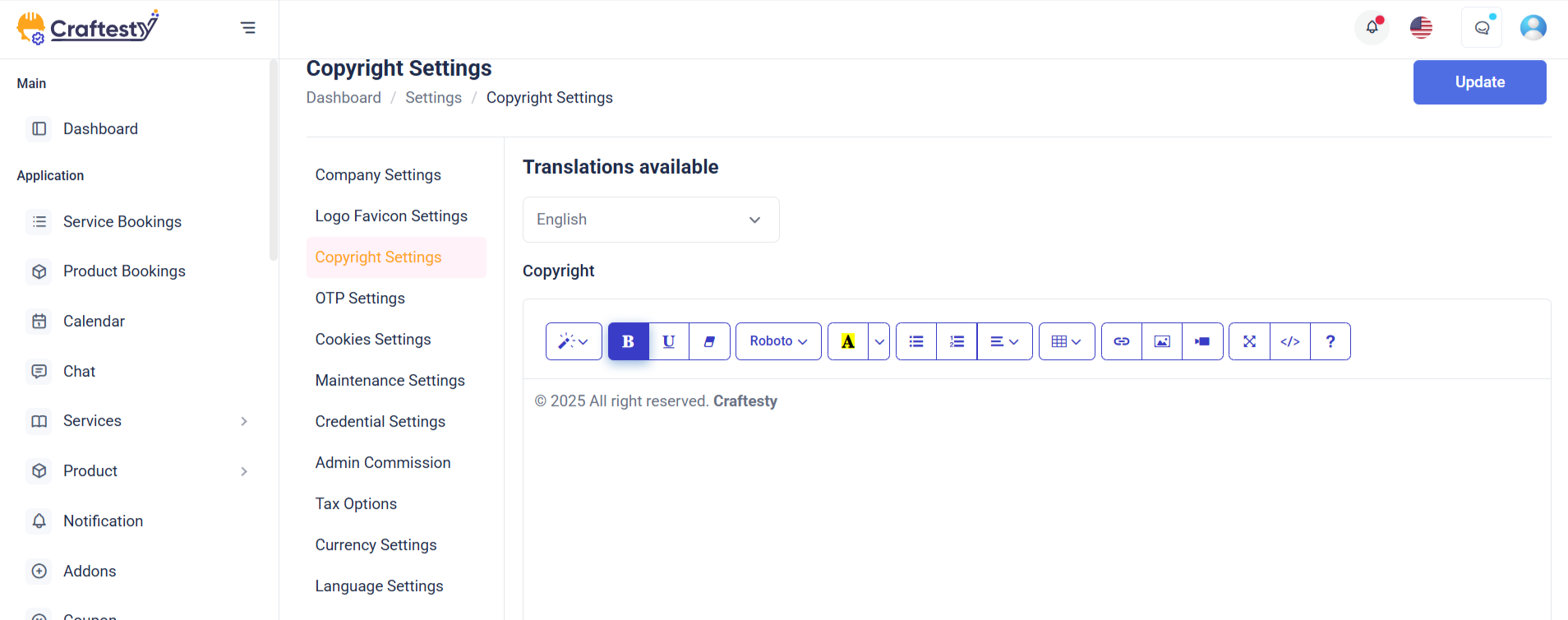
Purpose:
This form is designed for administrators to manage copyright information within the CMS, allowing content customization for different languages. It helps maintain up-to-date legal or informational content typically shown in a website's footer.
Layout:
The form is enclosed in a Bootstrap card with distinct sections: header, body, and footer. The header presents the title; the body contains a group_id (hidden), a language selector that triggers content loading, and a rich-text description field using Summernote. The footer contains action buttons (Cancel and Save) which are conditionally rendered based on user permissions.
Responsive Design:
Built using Bootstrap’s grid system and utility classes, the form ensures seamless usability across all devices. Skeleton loaders improve UX during content loading. Form elements (dropdowns, textareas, and buttons) are styled to be mobile-friendly, with stacked and full-width alignment on smaller screens for better accessibility. The layout ensures a clean and consistent user experience regardless of screen size.
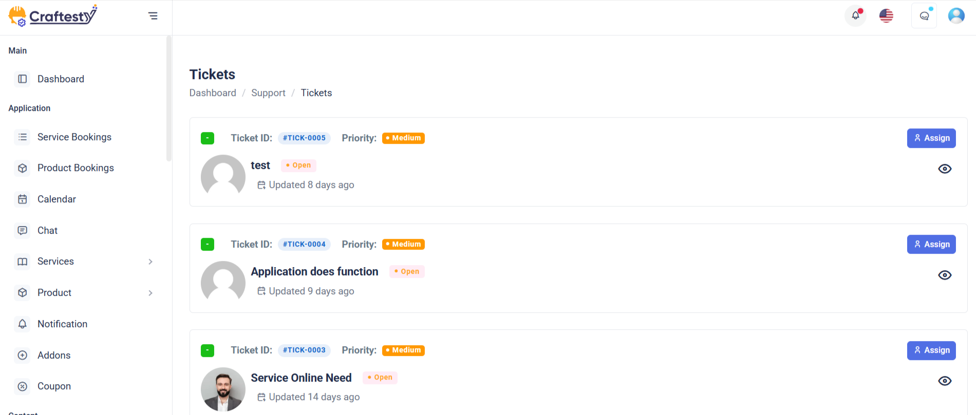
Purpose:
This section is designed for managing support tickets within an admin dashboard. It includes a dynamic data table to list tickets and modals for editing ticket status, viewing ticket history, and confirming deletions. Admins can view, update, or remove tickets efficiently, ensuring smooth support workflow management.
Layout:
The ticket list is rendered in a Bootstrap-powered responsive table with skeleton loaders during data fetch. Each row displays details like ticket code, creator, subject, priority, and status. The Edit Ticket modal includes form fields for updating status and reply. The History Ticket modal displays ticket progress, while the Delete Ticket modal provides a confirmation prompt. All modals follow a consistent design structure with headers, forms, and action buttons.
Responsive Design:
The table is wrapped in table-responsive to ensure horizontal scroll on smaller screens. Modals use Bootstrap’s modal-dialog-centered and size classes (modal-sm, modal-lg) for optimal display on various devices, ensuring accessibility and usability on mobile and desktop.
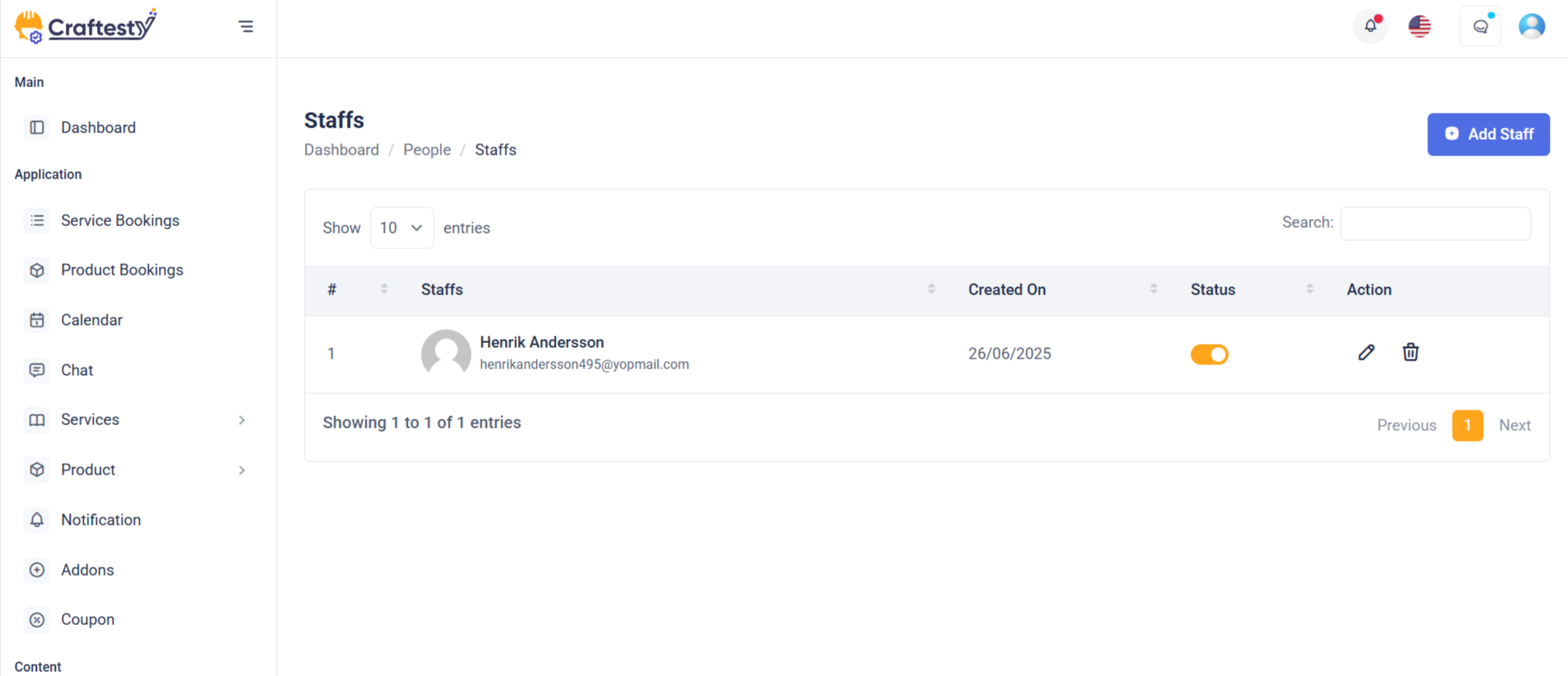
Purpose:
This interface is part of the User Management module in the admin panel. It allows administrators to view, add, edit, and delete users efficiently. The interface supports role assignments, secure user data input, profile image upload, and toggling user status. It provides essential administrative control over platform users.
Layout:
The layout is structured with a responsive data table (#userTable) inside a div that displays user information such as name, phone, email, role, and status. There are three modals:
Add User Modal: A large modal (modal-lg) with a comprehensive form for user creation, including image upload and form validation placeholders.
Edit User Modal: Similar structure to the Add modal but includes an ID hidden input, prefilled values, and a toggle for user status.
Delete Modal: A smaller modal (modal-sm) for confirming user deletion.
Responsive Design:
The design uses Bootstrap’s responsive grid (col-md-6, modal-lg, table-responsive) ensuring adaptability across devices. Form elements and buttons stack properly on small screens, maintaining usability and visual clarity.
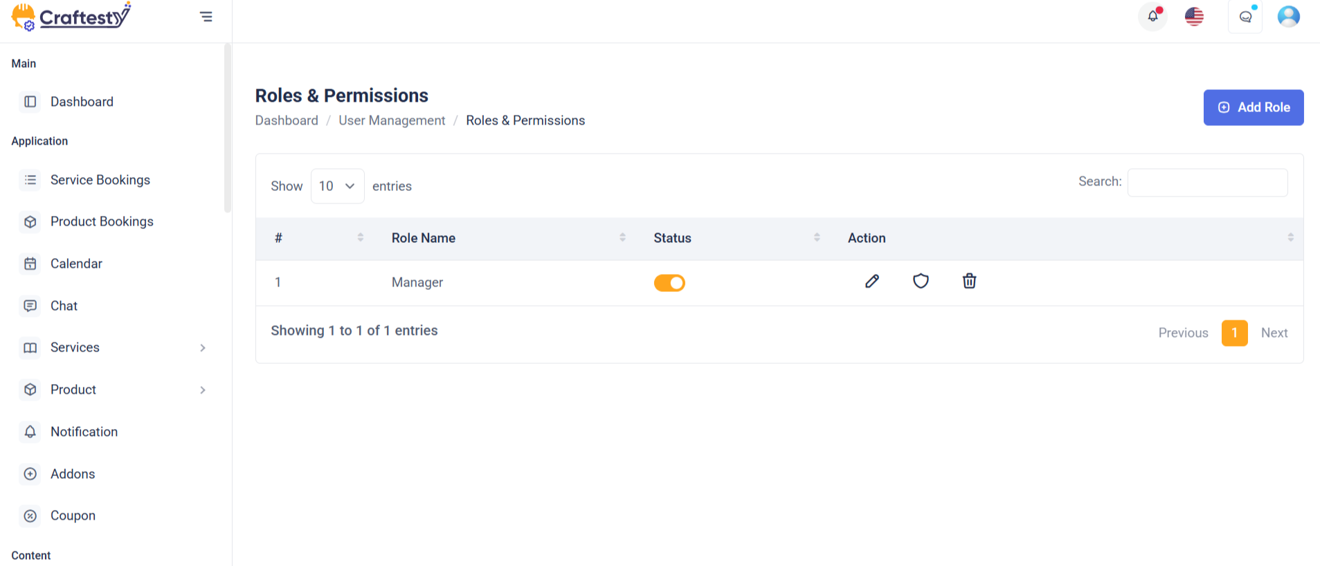
Purpose:
The modals provided are part of a user management interface, specifically for managing user roles. The "Add Role" modal allows administrators to create or update roles, while the "Delete Role" modal confirms role deletion. These modals enhance user experience by enabling inline management actions without page reloads.
Layout:
Each modal is structured using Bootstrap’s modal components. The "Add Role" modal includes a form with a text input for the role name, a hidden status toggle shown conditionally, and submission buttons in the footer. The "Delete Role" modal contains a confirmation message with iconography and two action buttons — cancel or confirm delete.
Responsive Design:
The design uses Bootstrap’s responsive classes (modal-dialog-centered, modal-md, modal-sm, etc.), ensuring proper display across devices. The layout adapts to different screen sizes while maintaining usability and visual clarity on both desktop and mobile views. Elements like buttons and form controls stack and resize as needed.
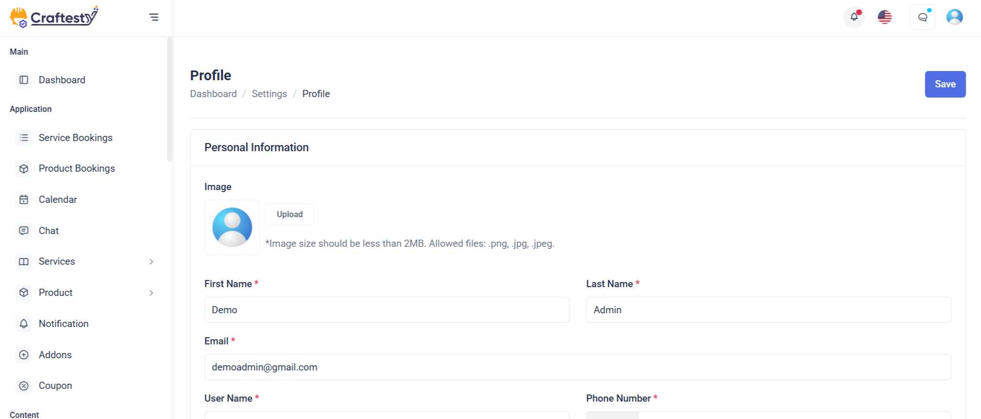
Purpose:
The admin profile form enables administrators to manage their personal and account details, including profile photo, name, contact information, and address. It ensures that the admin can update their profile conveniently within the admin dashboard.
Layout:
The form is structured into two primary sections—Basic Information and Address Information—with clearly labeled fields and grouped layouts for usability. Skeleton loaders enhance the user experience during data fetch, while the form uses Bootstrap classes for consistent styling. The form fields are dynamically revealed after data loading using d-none real-label toggling for a smooth transition from loading state to the actual form.
Responsive Design:
Built with a responsive grid system using row and col-md-* classes, the layout adapts seamlessly across various screen sizes. Profile photo upload and form inputs stack gracefully on smaller devices. The drag-and-drop image uploader and select inputs are optimized for both desktop and mobile interfaces, ensuring accessibility and usability across all devices.
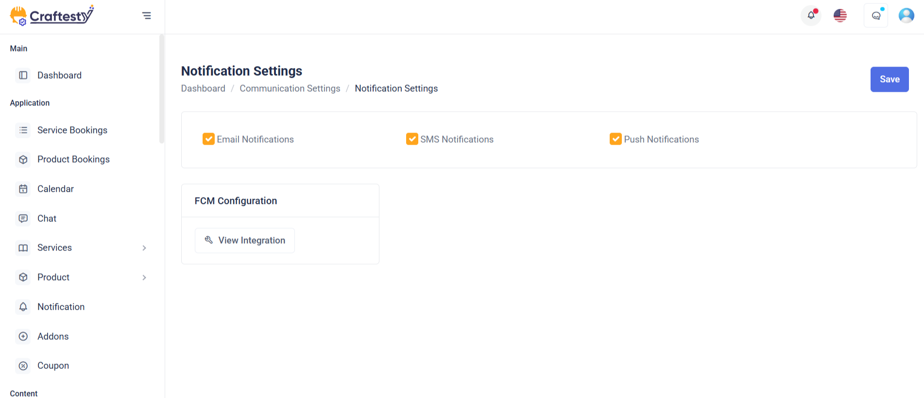
Purpose:
The Notification Settings form allows users to customize how they receive updates from the platform. It provides options for notification preferences, desktop alerts, unread badges, and specific event-based alerts (e.g., booking updates, payment notices, tenant notifications). This enables a personalized and user-controlled notification experience.
Layout:
The layout is structured into a card-based format for clarity and modularity. Each section (general preferences, desktop notifications, and notification types) is encapsulated within individual cards or list items. Radio buttons and switches provide intuitive input elements, while each setting includes concise headings and descriptions to enhance usability.
Responsive Design:
Built with Bootstrap classes like d-flex, col-*, and form-check, the form adapts smoothly across devices. On smaller screens, layout elements stack vertically, ensuring form readability and interactivity. The use of spacing utilities like gap-2, mb-3, and me-2 ensures consistent padding and margins for a polished experience on both mobile and desktop.
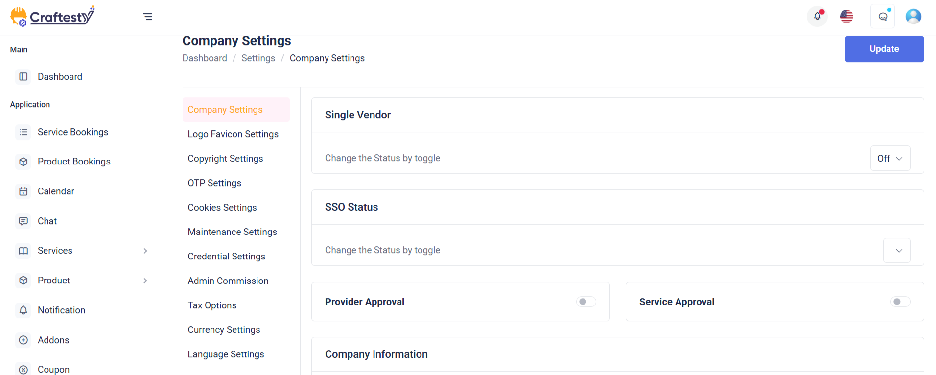
Purpose:
The form facilitates company settings configuration in an admin panel. It allows administrators to input and update key business details such as profile photo, organization name, contact info, industry, team size, and address. It's part of a broader system for managing general settings.
Layout:
Structured using Bootstrap, the form is divided into clear sections—Company Settings, Basic Information, and Address Information. Each section includes headers, skeleton loaders for pre-loading effects, and form fields with labels, validation errors, and Laravel localization support. Visual elements like image upload previews and select dropdowns enhance usability.
Responsive Design:
The layout is fully responsive, using Bootstrap grid classes (col-md-6, col-md-12) to ensure elements align neatly across devices. Skeleton loaders adapt for mobile or desktop views, and fields are spaced using margin and padding utilities to maintain readability. Select2 and file inputs are optimized for both touch and desktop interaction.
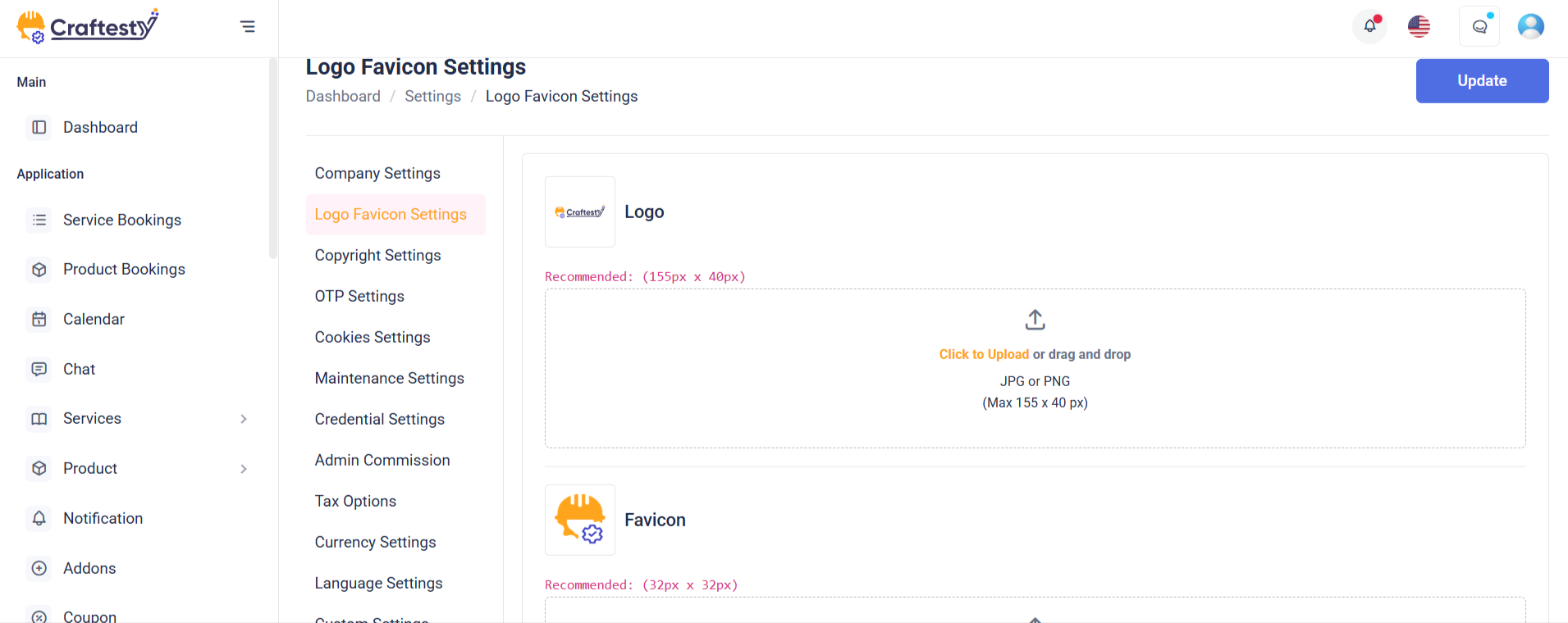
Purpose:
The form is designed for updating logo and favicon settings within a website's admin panel. It allows users to upload and preview various branding images, such as the main logo, favicon, small icon, and dark theme logo. These images personalize the website’s appearance and ensure consistent branding across different views and devices.
Layout:
The form is structured inside a Bootstrap card with clear divisions: header, body, and footer. Each image upload section includes a label, preview container, file input, and instructional text. Skeleton loaders provide visual placeholders during data loading. Image previews come with a delete button, allowing users to remove uploaded images.
Responsive Design:
The layout uses Bootstrap's grid and flexbox utilities to ensure responsiveness. Elements are aligned with d-flex, flex-wrap, and spacing classes, adapting smoothly to various screen sizes. The form maintains usability on both desktop and mobile devices by stacking content vertically on smaller screens.
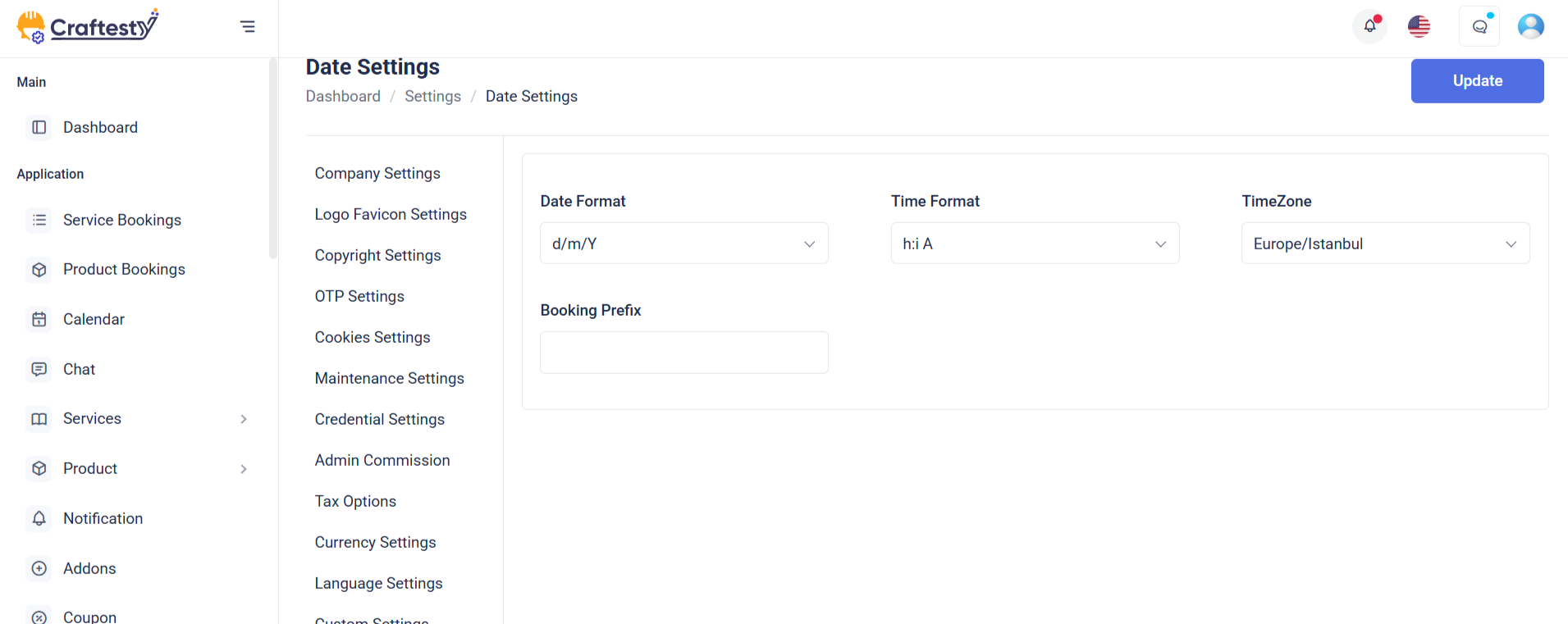
Purpose:
This form is part of a website settings panel used to configure localization and currency preferences for a web application. It allows admins to define time zone, date/time formats, default language, currency type, separators, and switcher toggles to tailor the application for global or regional use.
Layout:
The form is organized using Bootstrap’s grid system. It includes grouped sections: “Localization” and “Currency Information,” each with labeled rows and columns. Skeleton loaders provide a smooth user experience while data is being fetched. Fields are revealed dynamically via `real-input` and `real-label` classes.
Responsive Design:
Designed with responsiveness in mind, the form uses `col-md-8` and `col-md-4` to split labels and inputs effectively on medium to large screens. It ensures a clean single-column stack on smaller devices, keeping the interface accessible and mobile-friendly. The switcher controls and buttons also adjust fluidly for different screen sizes.
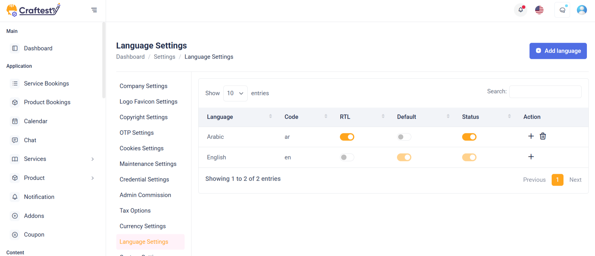
Purpose:
This section manages multilingual support for a website, allowing administrators to select, add, and manage different languages. It includes language switching, real-time search, and a dynamic table to display translation progress and statuses for each language.
Layout:
The layout is divided into three main parts:
1. A header with a language dropdown and an "Add New Language" button.
2. A search bar for filtering language entries.
3. A table section with skeleton loaders for initial loading, which switches to a fully functional data table (real-table) after content is loaded. The table includes columns for language name, code, RTL status, default flag, translation count, progress, and action buttons.
Responsive Design:
Built using Bootstrap’s utility classes, the layout adjusts fluidly for various screen sizes. Flex utilities ensure dropdowns, buttons, and the search bar align well on both large and small devices, while the tables are wrapped in .table-responsive to enable horizontal scrolling on mobile.
Purpose:
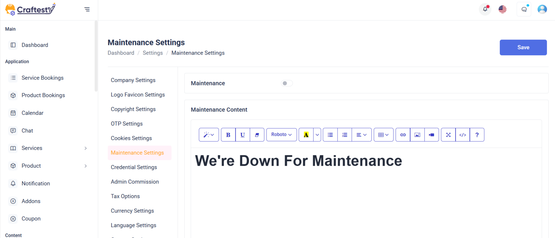
The Maintenance Settings form allows administrators to configure the website’s maintenance mode. This includes uploading a maintenance image, adding a custom description message, and toggling the maintenance mode status (enabled/disabled). It provides a centralized interface to notify users when the site is temporarily unavailable.
Layout:
The form is structured within a card component, divided into a header, body, and footer:
Header contains the section title
Body includes an image upload field (with preview and delete option), a rich-text description field (powered by Summernote), and a toggle switch to activate maintenance mode.
Footer provides action buttons (Cancel and Save Changes). Skeleton loaders ensure placeholders are shown during content loading, replaced by real elements once loaded.
Responsive Design:
Built using Bootstrap’s utility classes, the layout adjusts fluidly for various screen sizes. Flex utilities ensure dropdowns, buttons, and the search bar align well on both large and small devices, while the tables are wrapped in .table-responsive to enable horizontal scrolling on mobile.
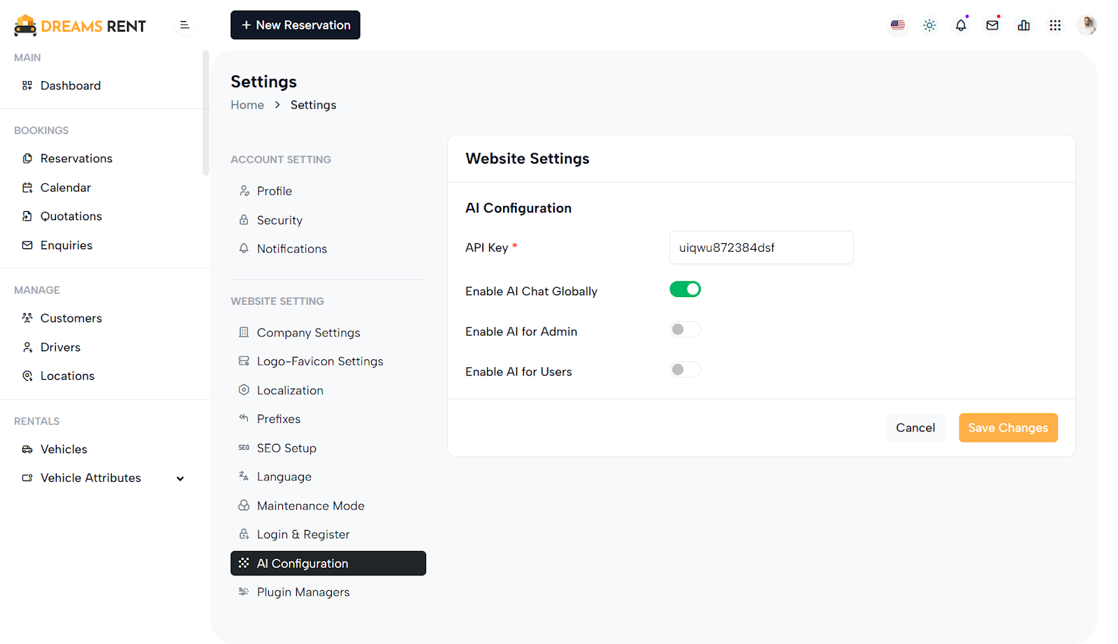
Purpose:
The AI Configuration form allows administrators to manage and customize AI feature settings within the system. It enables input of an API key for integration, and toggles to control where AI functionalities are enabled — globally, for admin users, or end users.
Layout:
The form is cleanly structured within a card layout, with the body containing labeled input rows and the footer providing action buttons. Each setting (API key, global enable, admin enable, user enable) is organized in rows with two main columns: the first for the label and the second for the input or toggle switch. Skeleton loaders act as placeholders until actual content is loaded dynamically.
Responsive Design:
The layout uses Bootstrap's grid system (row, col-md-4) for responsiveness. Labels and fields align horizontally on larger screens and stack vertically on smaller screens, ensuring usability across all devices. The form remains intuitive and accessible, with adequate spacing and alignment for a smooth user experience.
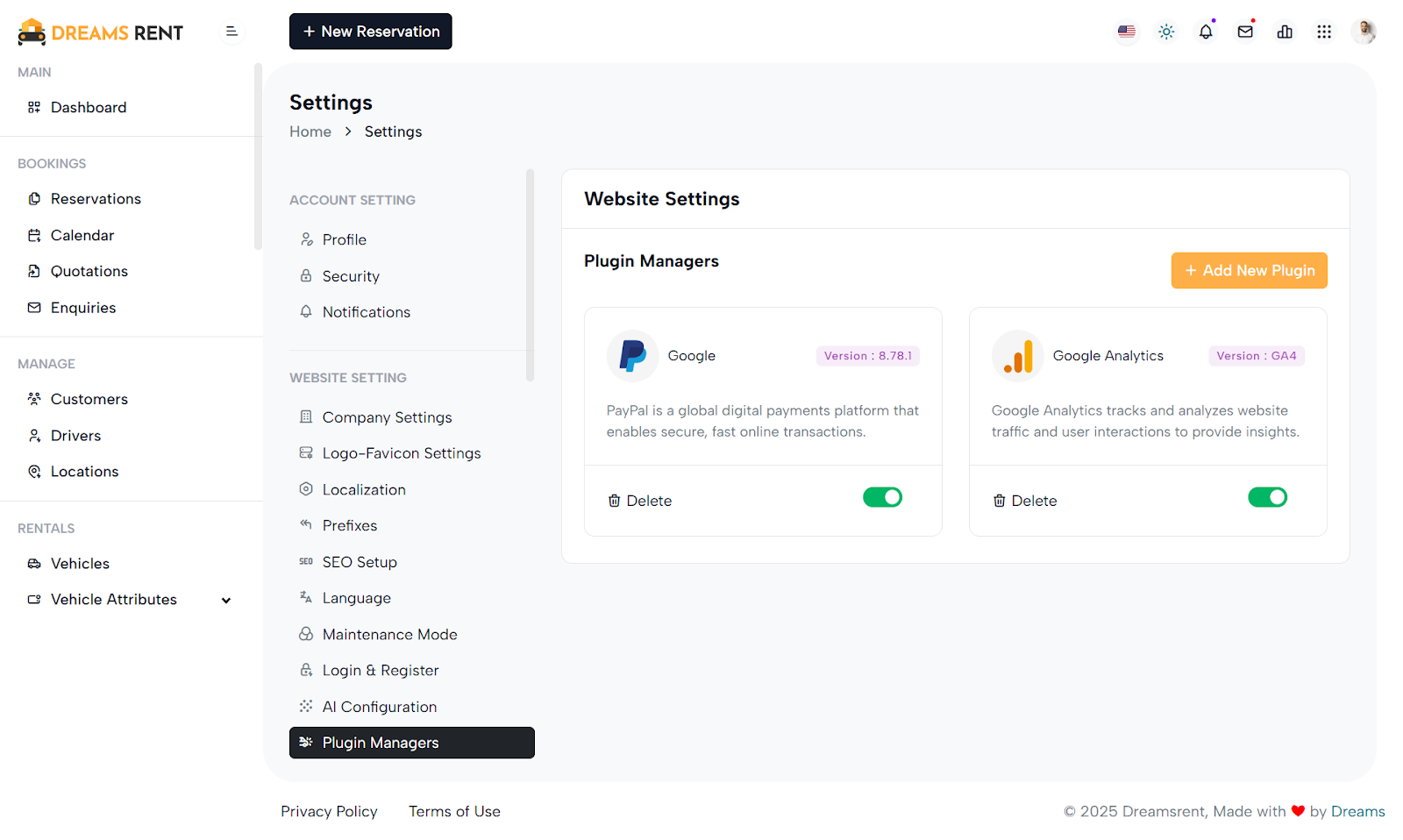
Purpose:
The Plugin Manager interface allows administrators to view, manage, and install third-party plugins that extend website functionality. It provides a dashboard for enabling/disabling plugins, viewing their versions, and adding new ones from a curated list with purchase and install options.
Layout:
The interface is split into two main sections: a sidebar menu (general_settings_side_menu) and a main content area. Each plugin is displayed in a card layout with its name, version, icon, description, toggle switch, and delete option. An "Add New Plugin" button opens a modal with a plugin table listing name, image, version, price, and purchase link. A second modal captures the purchase key for final installation.
Responsive Design:
The design leverages Bootstrap's grid (col-xl-6, col-xl-9) and responsive utilities. On smaller devices, the plugin cards stack vertically. Modal dialogs are centered and scrollable for better mobile usability. All elements remain accessible and visually consistent across screen sizes, ensuring a smooth user experience.
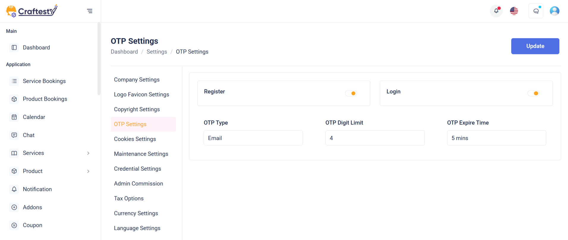
Purpose:
The OTP Settings form enables administrators to configure OTP (One-Time Password) preferences for secure user authentication. It provides options to select the OTP type (SMS or Email), digit length, expiration time, and toggle OTP enforcement for login and registration processes.
Layout:
The form is structured within a Bootstrap card component, offering clear visual separation of content. It begins with headers followed by grouped input fields distributed across a responsive grid using col-md-4 classes. Each input (select or toggle switch) is wrapped with loaders (skeleton) for a better user experience during data fetching, and hidden real inputs are revealed post-load using .real-label and .real-input classes. Error handling spans and labels are placed for validation feedback.
Responsive Design:
The layout is fully responsive using Bootstrap’s grid system. On larger screens, inputs align side by side, while on smaller devices they stack vertically, ensuring usability on all screen sizes. Switches and buttons remain accessible and aligned for optimal interaction across devices.
Purpose:
This form allows administrators to configure invoice settings for their business. It includes inputs for uploading an invoice logo, defining invoice prefixes, setting payment due days, round-off values, company details visibility, and custom invoice terms—ensuring professional and consistent invoicing.
Layout:
The form is sectioned using Bootstrap cards with structured rows and columns. The invoice logo has a preview image area, skeleton loaders, and file upload controls. Inputs like invoice_prefix, invoice_due, and invoice_round_off are grouped with labels and validation messages. Toggles (switches) are used for enabling round-off and showing company details. The invoice_terms is a textarea input with word guidance, emphasizing clarity in invoice communication.
Responsive Design:
Bootstrap’s grid system ensures that each row adapts gracefully to different screen sizes. Columns stack on smaller devices (col-sm-12) while maintaining side-by-side layout on larger screens (col-md-4, col-md-6). Elements adjust their alignment and spacing using flexbox for seamless mobile usability.
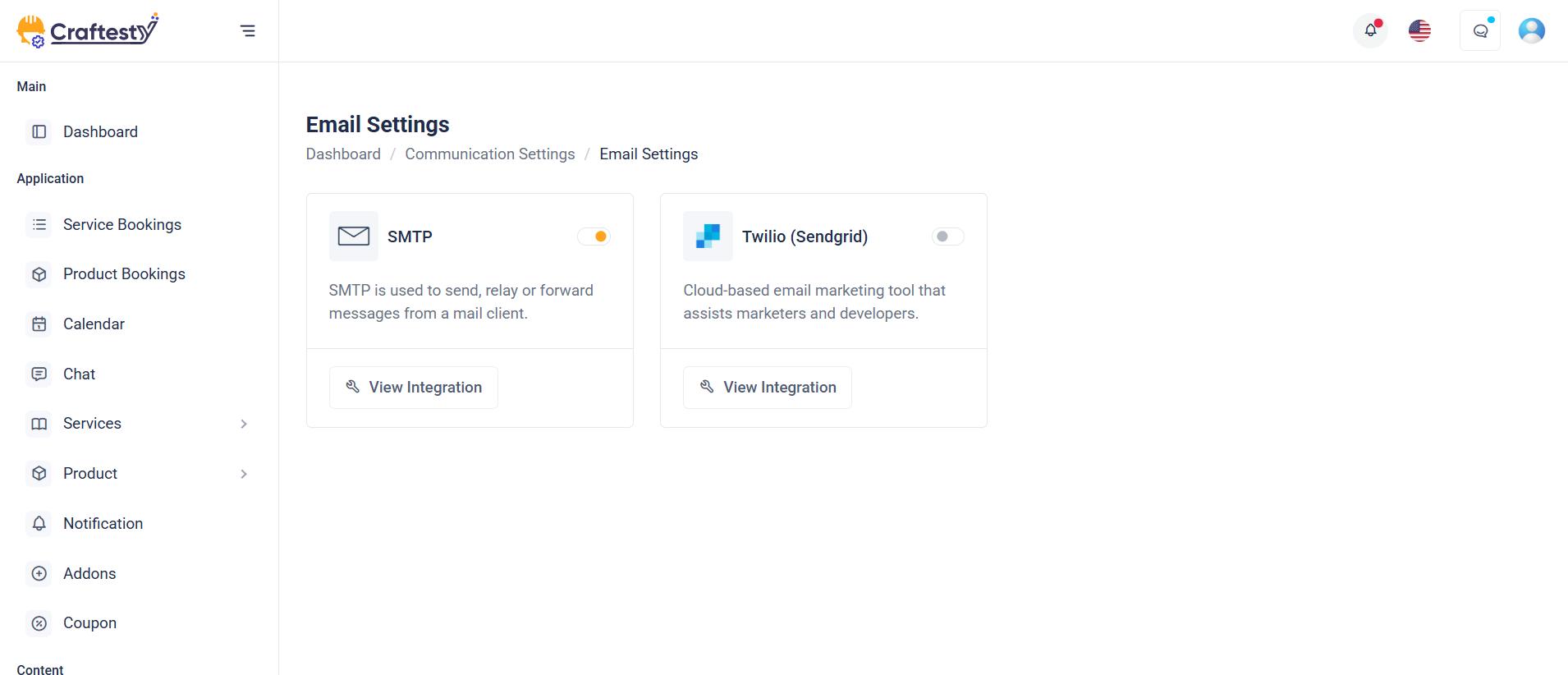
Purpose:
This section provides a mail configuration dashboard allowing users to manage and toggle between different email delivery methods: PHP Mail, SMTP, and SendGrid. It ensures that the platform can send system notifications or transactional emails reliably based on the selected mailer service.
Layout:
Each mailer method is displayed within a Bootstrap card containing an icon, name, connection status badge, info text, a “Configure” button, and a toggle switch to enable/disable the method. Initially, skeleton loaders appear during data fetch, and then the actual cards (real-card) are shown. Each card uses data-bs-target modals for configuration.
Responsive Design:
Designed with Bootstrap’s grid system (col-md-6) and d-flex utilities, the layout is responsive. On larger screens, two cards appear side-by-side, while on smaller screens, they stack vertically. Flexbox ensures content inside cards adjusts gracefully. The use of img-fluid, flex-fill, and avatar classes ensures visuals and spacing remain intact across all device sizes.
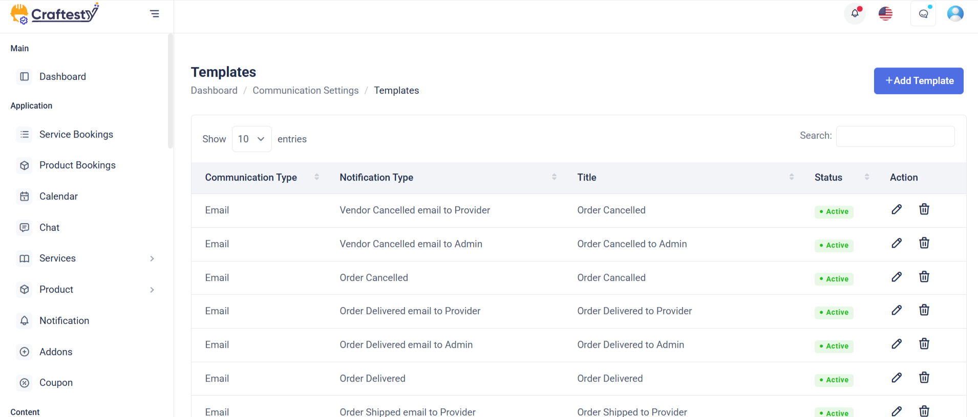
Purpose:
This section manages email templates within the application. It provides a dynamic table to view templates, a form modal for creating or editing them, a preview modal to view template content, and a delete confirmation modal. It enhances communication workflows by allowing admins to customize email and SMS messages for various notification types.
Layout:
The main layout includes a Bootstrap table with skeleton loaders initially shown while data loads, then replaced with actual template rows. The Create Template modal contains input fields for title, notification type, subject, tags, description, and SMS content, including dynamic placeholders. Two additional modals handle template preview and deletion confirmation. Form elements include validation error containers and toggle switches for status control.
Responsive Design:
Built using Bootstrap's grid system and modal dialogs, the layout adapts to all screen sizes. Elements like col-lg-12, modal-lg, and form-control ensure fields and content adjust properly, maintaining accessibility and usability on both desktop and mobile devices.
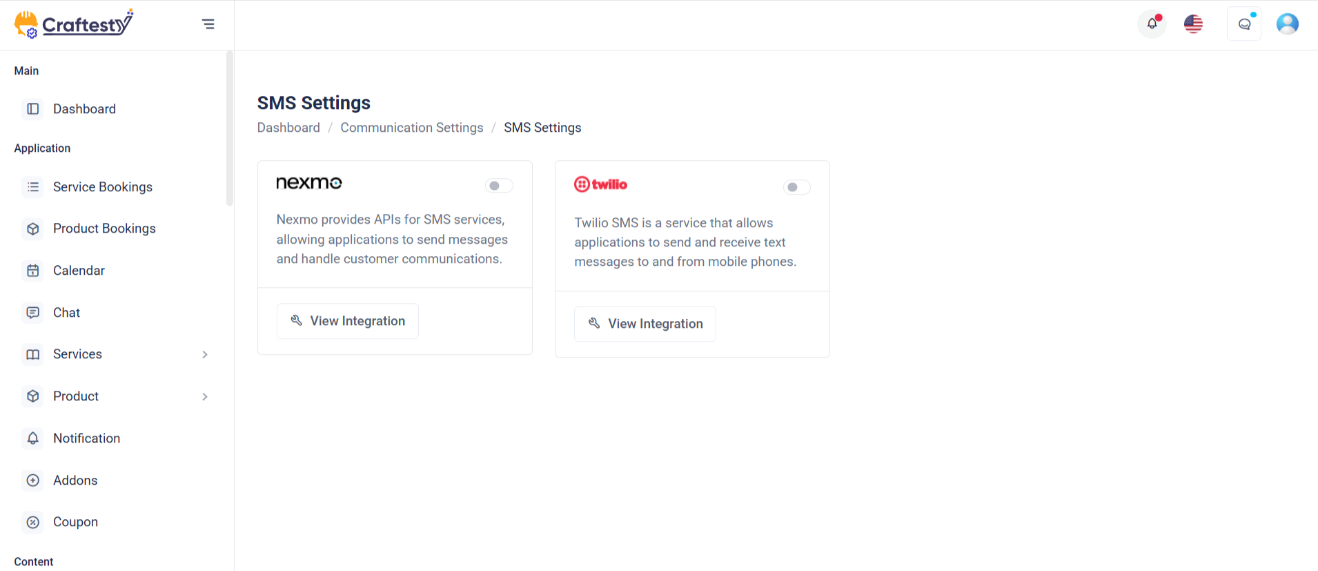
Purpose:
This section manages SMS gateway integrations under the broader "System Settings" area. It allows administrators to view, configure, and toggle the status of available SMS services like Nexmo, 2Factor, and Twilio. These gateways enable the system to send SMS notifications, such as OTPs or alerts.
Layout:
The content is structured within a card component. Each SMS gateway is displayed in its own card inside a responsive row. Each card includes the provider logo, connection status badge, a brief description, a Configure link that triggers a modal for settings, and a toggle switch to enable or disable the gateway. The layout is visually clean and uses spacing, icons, and color badges to improve readability and interaction.
Responsive Design:
The layout uses Bootstrap’s responsive grid (col-xxl-4 col-md-6) and d-flex utilities, ensuring the cards stack nicely on smaller screens while displaying in rows on larger ones. All controls and text scale appropriately across device sizes.
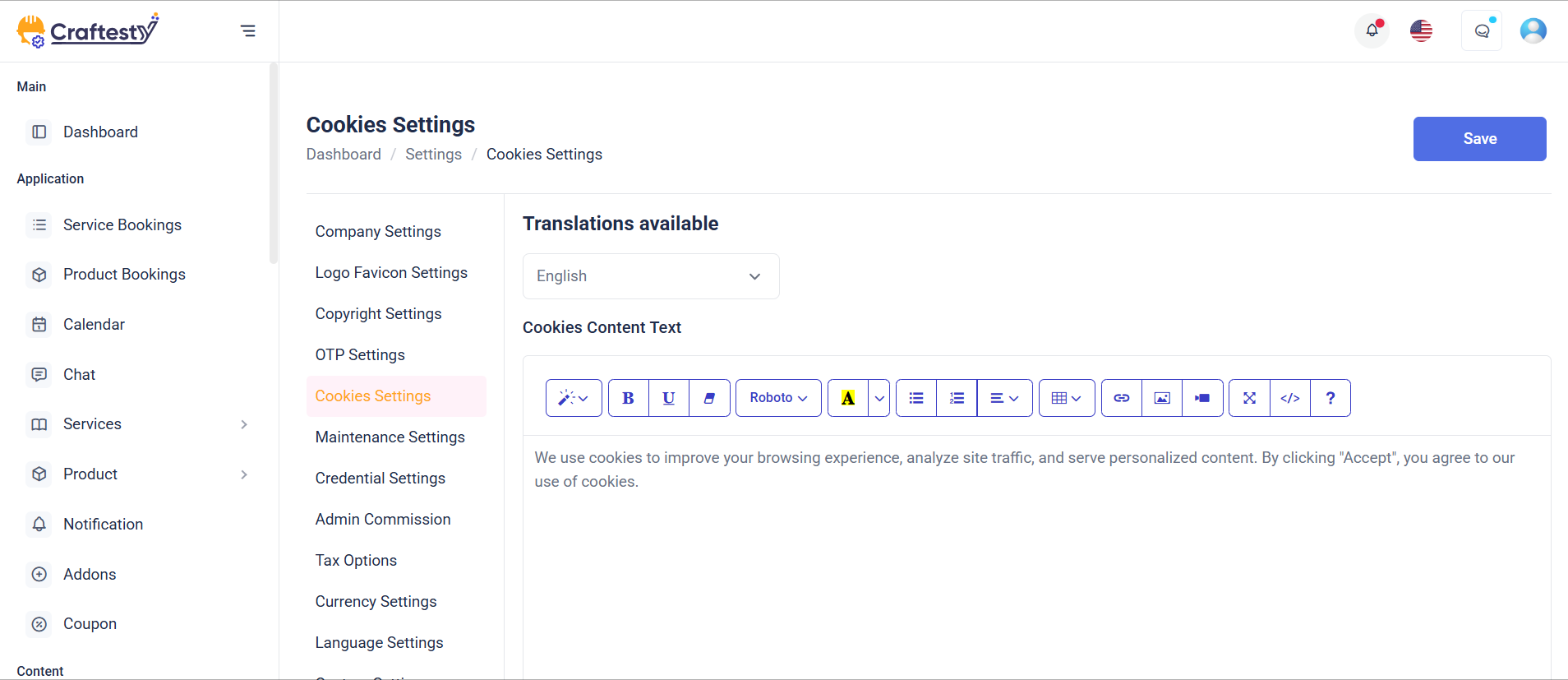
Purpose:
This form handles GDPR Cookies Settings in the System Settings panel, allowing admins to configure cookie consent content, button texts, position, visibility of decline options, and related links—ensuring compliance with data privacy laws.
Layout:
The form is structured inside a card with a header, body, and footer. Each setting (e.g., content text, position, button labels) is presented in row components with labels on the left and inputs on the right. Placeholder skeletons are used for loading states and are replaced with actual labels/inputs once data loads. Error messages are shown below fields for validation feedback.
Responsive Design:
Using Bootstrap’s grid (col-xl-4, col-xl-6, etc.) and utility classes, the layout adapts across screen sizes. On smaller screens, rows stack vertically for better usability. Skeleton loaders and hidden classes (d-none real-label) enhance UX by supporting smooth loading transitions and maintaining layout consistency.
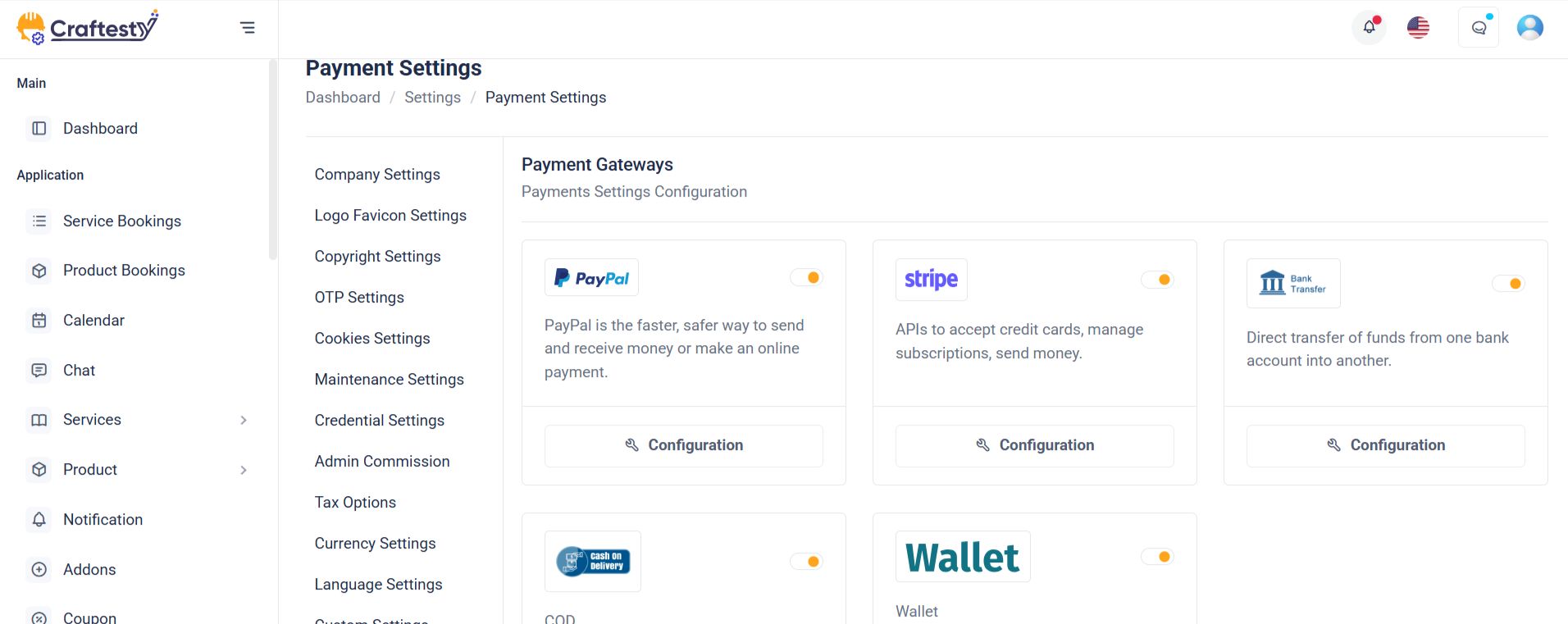
Purpose:
This section manages Payment Gateway Settings, allowing administrators to view, configure, and enable/disable services like PayPal and Stripe. It visually displays connection status, provides quick access to configuration modals, and enables toggling of gateway activation.
Layout:
Each gateway is wrapped inside a card using a column (col-xl-4) for grid placement. Inside the card, the body displays branding (logo), description, and a configuration icon. The footer contains the connection badge and a toggle switch. Skeleton loaders (label-skeleton) show during data loading, and actual content is revealed with d-none real-label toggled after loading.
Responsive Design:
Built with Bootstrap grid (col-xl-4 d-flex), the layout adapts gracefully across screen sizes. On larger screens, gateways display in a row. On smaller devices, cards stack vertically. Flex utilities (d-flex, justify-content-between) ensure proper spacing and alignment, while hidden labels maintain a clean experience during loading and content reveal.
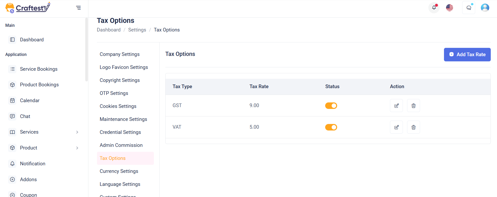
Purpose:
This interface allows admins to create, manage, and delete tax rates and tax groups used for billing, invoicing, or financial configurations. Tax groups can include multiple tax rates, providing flexibility in defining complex tax structures.
Layout:
Structured using Bootstrap modals, the layout includes three forms: Add/Edit Tax Rate, Add/Edit Tax Group, and their respective delete confirmation modals. Each form includes labeled input fields, status toggles, and validation error messages. Select inputs (like sub_tax) use Select2 for enhanced user experience. Footer actions include Cancel and Submit buttons, designed for clarity and user guidance.
Responsive Design:
Designed with Bootstrap 5 utilities, the modals are centered (modal-dialog-centered) and responsive (modal-md, modal-sm). Form controls stack vertically on smaller screens. The use of d-flex, justify-content-between, and w-100 ensures that elements like status toggles and submit buttons adjust gracefully on all devices, ensuring accessibility and usability on mobile, tablet, and desktop.
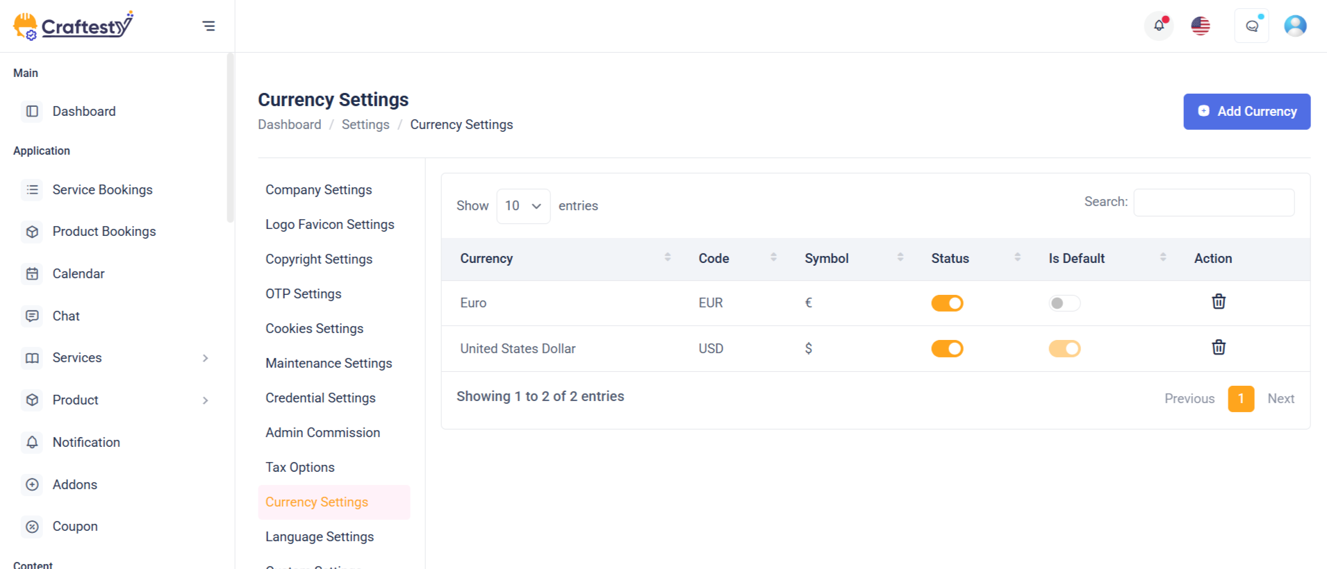
Purpose:
This modal interface is designed to add and delete currencies in an admin panel. It allows admins to define new currencies with their names, codes, symbols, exchange rates, and statuses, which are crucial for financial operations, multi-currency support, and accurate pricing conversions.
Layout:
Built with Bootstrap modals, the layout includes two primary sections: an Add/Edit Currency form and a Delete confirmation dialog. The currency form contains input fields for name, rate, code, and symbol, organized in a clean, user-friendly format using grid-based layout (row, col-md-6). A hidden toggle for currency status appears conditionally, enhancing flexibility for editing existing entries. The delete modal provides a centered confirmation message with visual emphasis using an icon.
Responsive Design:
Utilizing Bootstrap 5 classes like modal-dialog-centered, modal-md, and modal-sm, the design adapts smoothly across devices. Inputs stack vertically on smaller screens, and the grid layout ensures even distribution on larger viewports, maintaining usability across all screen sizes.
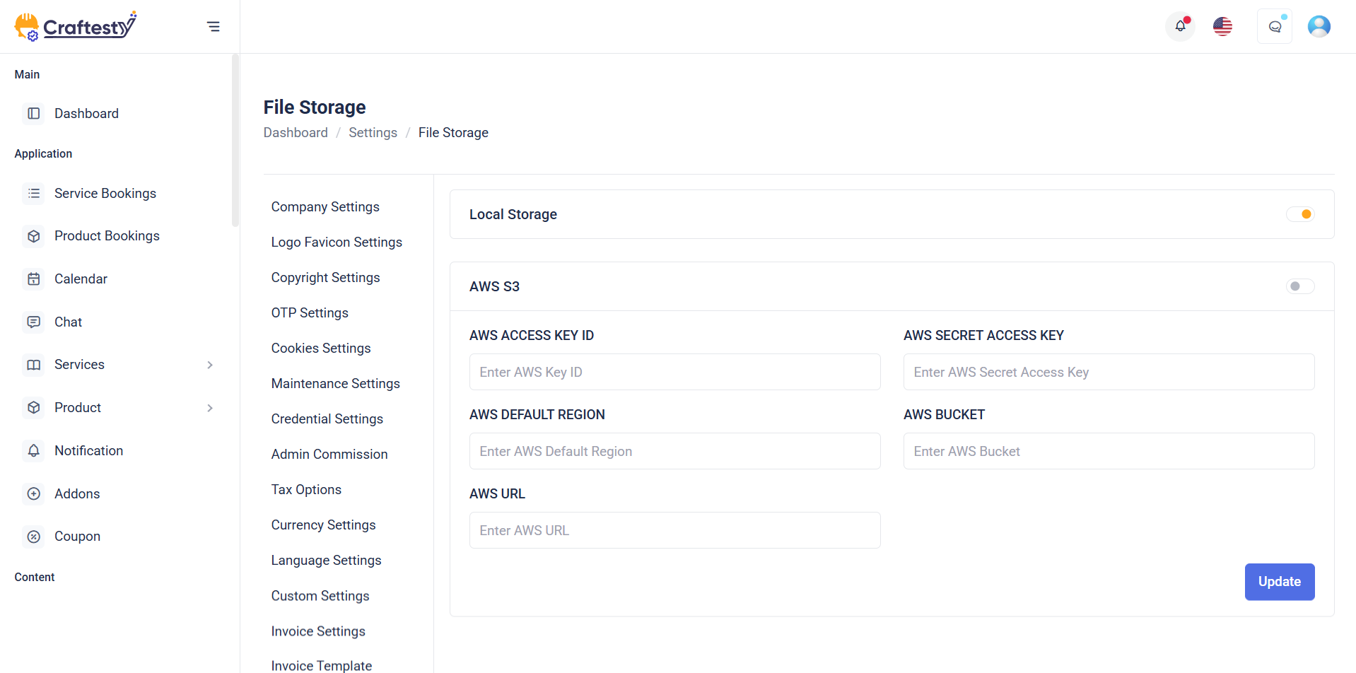
Purpose:
The "Storage" section allows users to manage and toggle between different file storage options, such as Local Storage and AWS. It helps administrators choose where application files like media, backups, and uploads should be stored, supporting both local and cloud environments for flexibility and scalability.
Layout:
This section uses a two-column card layout. Each storage option is presented within a card that includes an icon, label (with a loading skeleton effect), and a toggle switch to enable or disable the storage type. For AWS, an additional settings button opens a modal for configuration. Skeleton loaders are used for a smooth data-loading experience, which later gets replaced with actual labels and controls.
Responsive Design:
Utilizing Bootstrap’s grid system (col-md-6), the layout adapts seamlessly from desktop to smaller screens, stacking cards vertically on mobile devices. Flexbox classes (d-flex, align-items-center, justify-content-between) ensure proper spacing, alignment, and accessibility across all screen sizes.
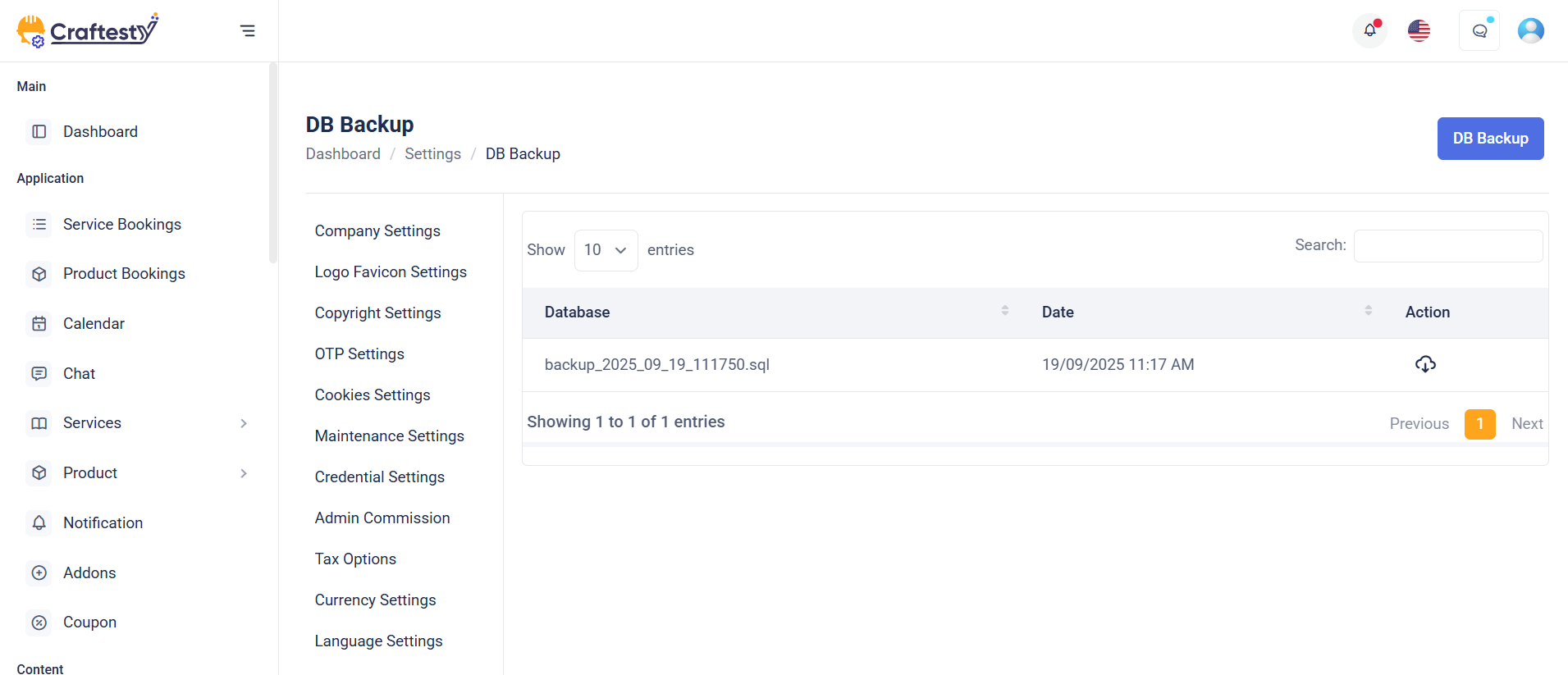
Purpose:
The Database Backup section provides administrators with tools to generate and manage database backups. It ensures data security by enabling backup creation and offering options to delete old backups when no longer needed. This helps maintain data integrity and prepare for disaster recovery scenarios.
Layout:
The layout follows a two-column structure. On the left is a sidebar (general_settings_side_menu), and on the right is the main content area (col-xl-9) with a card component. The card includes a header titled "Other Settings" and a body that displays the "Database Backup" section. It features a button to open the Generate Backup modal and a table (#backup-list) to list backup files. Additionally, two modals handle generating and deleting backups, each with confirmation prompts and action buttons.
Responsive Design:
The interface leverages Bootstrap’s responsive grid and utility classes (row, col-xl-9, table-responsive) to ensure optimal display on all screen sizes. Elements stack neatly on smaller devices while maintaining usability and readability.
Purpose:
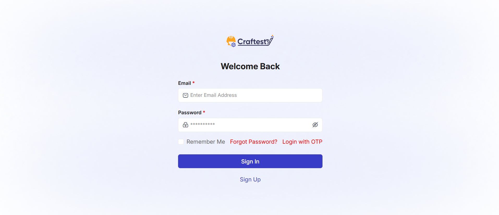
The purpose of this form is to provide a secure and simple login interface for users to access their accounts. It offers essential login fields such as email and password, ensuring user authentication. The form also includes options for users to reset their passwords or sign in via OTP, giving them flexibility based on their preferences. Additionally, it provides a "Remember me" checkbox for convenience in saving login credentials. The login process is designed to be user-friendly, with clear error messaging to guide users through the authentication process.
Layout:
The layout of the form is clean and structured, with each input field clearly labeled for user clarity. The email and password fields are placed one after the other, and the password field is grouped with an eye icon for toggling visibility. There is a separate section for links like "Forgot Password?" and "Sign in with OTP," offering alternative ways to log in. Below the form fields, the "Remember me" checkbox allows users to save their credentials.
Responsive Design:
The form is designed to be fully responsive. On smaller screens, the form maintains a user-friendly layout with appropriate spacing and easy-to-tap buttons. The use of a toggle for password visibility and social login buttons ensures a seamless experience across devices. Elements like the "Remember me" checkbox and login options adjust to maintain clarity and usability, even on mobile views.
User Product list
Purpose:
The combined layout serves two critical purposes in a Product platform:
Layout:
The sidebar is built using a collapsible, accordion-based layout with a focus on usability and space optimization. It includes components such as a keyword search, toggle switch for availability, checkboxes and radio buttons for filter options, a price range slider, and clear action buttons like "Filter Results" and "Reset Filter." The accordion structure helps reduce clutter, especially on mobile.
Responsive Design:
Sidebar: On desktop (col-xl-3, col-lg-4), it stays fixed for easy access; on tablets and mobile (col-sm-12, col-12), it expands to full width and uses collapsible accordions for simplified navigation.
Product detail
Purpose:
This HTML code represents a User Product Details Page. It allows users to view detailed information about a specific product, select options, adjust quantity, and make purchases. Users can also read and write reviews, check stock availability, view shipping details, and explore related products.
Layout:
The page is divided into a product display area, tabs for details, and related products:
- Product Media & Images:
- Main product image gallery in
large-imgwith a thumbnail slidersmall-img. - Supports multiple images and mobile-friendly sliders. - Product Information: - Displays product name, category, price, discount, and stock status. - Shows reviews count and average ratings. - Options like colors, add-on services, and quantity selectors are available. - Action buttons for Add to Cart, Buy Now, and My Product for providers. - Wishlist and social sharing buttons included.
- Tabs Section:
-
Overview: Shows detailed product description. -Specification: Table listing product specifications. -Reviews: Displays customer reviews, ratings breakdown, and allows authenticated users to submit reviews. -Shipping & Delivery: Shows international and domestic shipping information. - Related Products:
- Displays a slider of related products (
related_products_container) to encourage further exploration.
Flow & Interaction:
- Users can browse product images and select variations like color or additional services.
- Quantity selection is available with plus/minus controls for adding multiple units to the cart.
- Clicking Add to Cart or Buy Now triggers appropriate actions based on authentication status.
- Tabs dynamically load product overview, specifications, reviews, and shipping details.
- Users can write reviews if authenticated, and load more reviews dynamically with AJAX.
- Related products section dynamically populates based on product context.
- Responsive layout ensures proper display on mobile, tablet, and desktop devices.
Components:
- Product image sliders:
large-imgandsmall-imgfor interactive galleries. - Product info section: Name, price, stock, color options, add-on services, and action buttons.
- Tabs: Overview, Specification, Reviews, and Shipping & Delivery for organized information.
- Review system: Ratings, customer reviews, progress bars, and review submission form.
- Related products slider: Encourages additional purchases and engagement.
- Responsive Bootstrap cards, rows, and buttons for clean layout and interaction.
- Hidden inputs and data attributes for currency, product ID, and authentication to support dynamic actions via JavaScript/AJAX.
User Services list
Purpose:
The combined layout serves two critical purposes in a Service list platform:
Layout:
The sidebar is built using a collapsible, accordion-based layout with a focus on usability and space optimization. It includes components such as a keyword search, toggle switch for availability, checkboxes and radio buttons for filter options, a price range slider, and clear action buttons like "Filter Results" and "Reset Filter." The accordion structure helps reduce clutter, especially on mobile.
Responsive Design:
Sidebar: On desktop (col-xl-3, col-lg-4), it stays fixed for easy access; on tablets and mobile (col-sm-12, col-12), it expands to full width and uses collapsible accordions for simplified navigation.
Service detail
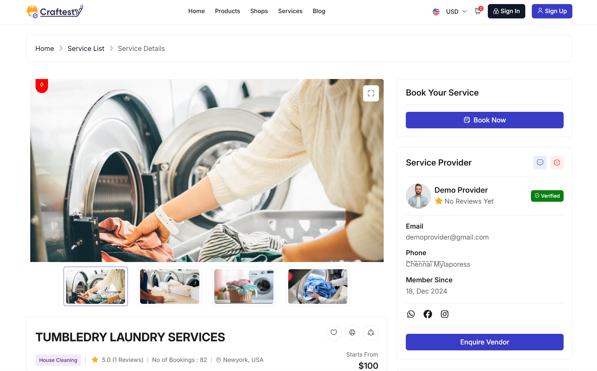
Purpose:
This HTML code represents a Service Details and Calendar Booking Page for users and service providers. It allows users to view detailed information about a service, explore media, read reviews, and book appointments directly from the page. For service providers, it ensures that all key service data, bookings, and user interactions are easily accessible. The page integrates calendar-based booking, multimedia gallery, and user review management for a comprehensive service experience.
Layout:
The page is designed with a two-column layout with tabbed content and interactive modals:
- Service Media Section: - Includes a large image slider for showcasing the service. - Thumbnails and mobile sliders allow quick navigation between images. - Supports video embedding for enhanced visual presentation.
- Service Details Section: - Displays service title, provider information, ratings, booking count, location, and starting price. - Favorite and share icons allow user interaction. - Tabs organize content into Overview, Services, Gallery, and Reviews for structured access.
- Overview Tab: - Contains detailed description, key highlights, and “what’s included” section. - Dynamically populated content ensures up-to-date service information.
- Services Tab: - Lists additional services or add-ons available for booking. - Supports dynamic loading of service options.
- Gallery Tab: - Displays images and videos related to the service in an organized layout. - Multimedia content is responsive and scrollable.
- Reviews Tab: - Shows aggregated ratings, star-based progress bars, and user-submitted reviews. - Authenticated users can submit their own ratings and reviews. - “Load more” functionality allows progressive review display.
- Booking Section: - Provides a calendar-based booking button or link. - Supports user-specific actions (e.g., direct booking for customers, service management for providers). - Integrates with modals for enquiry or booking submission.
- Service Provider Card: - Displays provider information, contact details, social links, and verification status. - Includes enquiry button to contact the provider directly.
- Location Section: - Embeds a responsive map with service location. - “View Location” button for expanded map view.
- Related Services Slider: - Horizontal carousel of related services with navigation buttons. - Allows cross-selling and easy discovery of similar offerings.
Responsive Design:
The page is fully responsive using Bootstrap’s grid system: - On desktops, the main content and sidebar are displayed side by side. - On tablets and mobile devices, columns stack vertically for easy scrolling. - Sliders and carousels are touch-friendly and swipe-enabled. - Modals and interactive elements resize automatically to fit smaller screens while maintaining functionality.
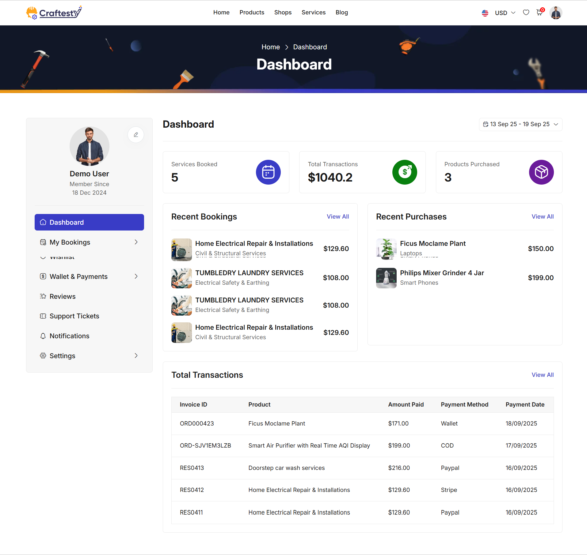
Purpose:
This HTML code represents a User Dashboard Page for customers. It allows users to view their booking history, track upcoming appointments, and analyze booking trends in a single interface. The page integrates a calendar-based date range filter, dynamic booking list, and dashboard statistics for comprehensive account management.
Layout:
The page is designed with a two-column layout with interactive filters and dynamic content sections:
- Breadcrumb & Banner Section: - Includes a top banner or breadcrumb for navigation context. - Provides quick reference to the current page or section.
- Sidebar Menu: - Contains customer-specific navigation options such as profile, bookings, and settings. - Allows users to quickly access different sections of their dashboard.
- Main Dashboard Header: - Displays page title and a date range picker for filtering bookings. - Date picker supports dynamic selection of custom date ranges for reports.
- Booking List Section: - Dynamic container to display user bookings. - Loader animation indicates data fetching. - Supports pagination and filtering based on the selected date range.
- Dashboard Statistics Section: - Displays key metrics and summaries (e.g., total bookings, completed services, upcoming appointments). - Helps users quickly understand their activity and trends.
Responsive Design:
The page is fully responsive using Bootstrap’s grid system: - On desktops, sidebar and main content appear side by side for efficient navigation. - On tablets and mobile devices, columns stack vertically for easier scrolling and interaction. - Dynamic containers and loaders adjust to screen size, ensuring a smooth user experience across all devices. - Interactive elements like the date picker remain accessible and usable on touch devices.
User Booking Product 1

Purpose:
This HTML code represents a User Product Booking Page, encompassing both the Cart Summary and Checkout Process. It allows users to review selected products, adjust quantities, apply coupons, choose payment methods, and confirm orders. The page ensures a seamless e-commerce experience, combining product management, billing details, and payment options in a single interface.
Layout:
The page is designed with a two-column layout for cart and checkout functionality:
- Cart Summary Section (Left Column): - Displays products added to the cart with columns: Product, Price, Quantity, Subtotal, and Actions. - Supports quantity updates, item removal, and emptying the cart. - Dynamically calculates subtotal and total amounts. - Provides buttons to update the cart or proceed to checkout.
- Cart Totals Section (Right Column): - Summarizes the order totals including subtotal, discounts, and final total. - Includes coupon code input and application/removal actions. - Shows available payment methods based on user and system settings. - Provides a "Proceed to Checkout" or "Pay Now" button depending on login status and checkout stage.
- Checkout Section (Optional / Conditional Display): - Displays billing address selection or addition of new addresses. - Shows detailed order summary, payment options, and coupon discounts. - Confirms the total payable amount and provides a final "Pay Now" action. - Handles both authenticated and guest users with appropriate modals or restrictions.
Responsive Design:
The page is fully responsive using Bootstrap’s grid system: - On desktops, cart summary and totals appear side by side for easy management. - On tablets and mobile devices, columns stack vertically for easier scrolling and interaction. - Tables are horizontally scrollable on smaller screens to maintain readability. - Buttons, input fields, and interactive elements adjust automatically to different viewport sizes for optimal usability. - Modals, forms, and dropdowns scale appropriately to ensure a smooth checkout experience on all devices.
User Booking Product 2

User Booking Product 3
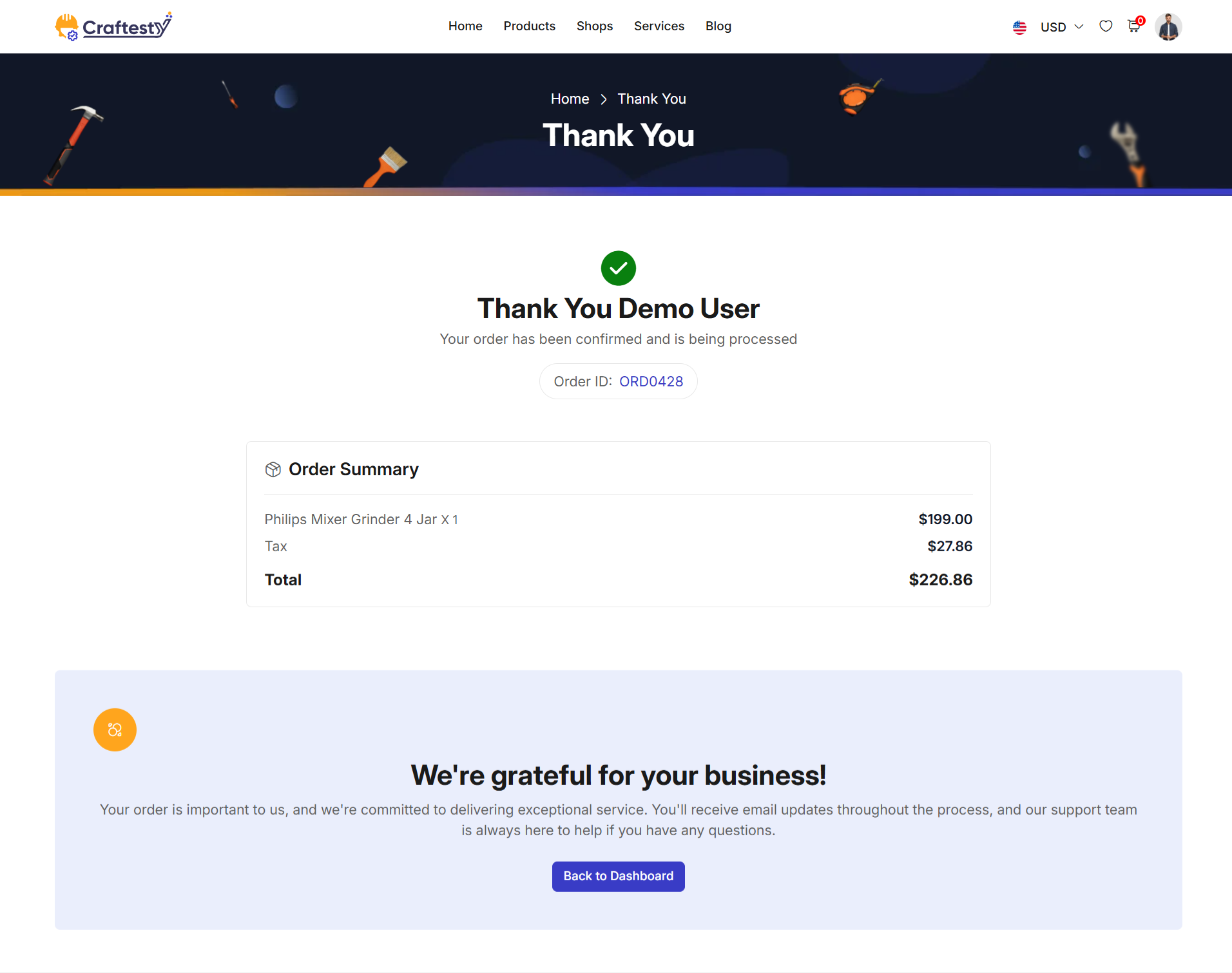
User Booking 1
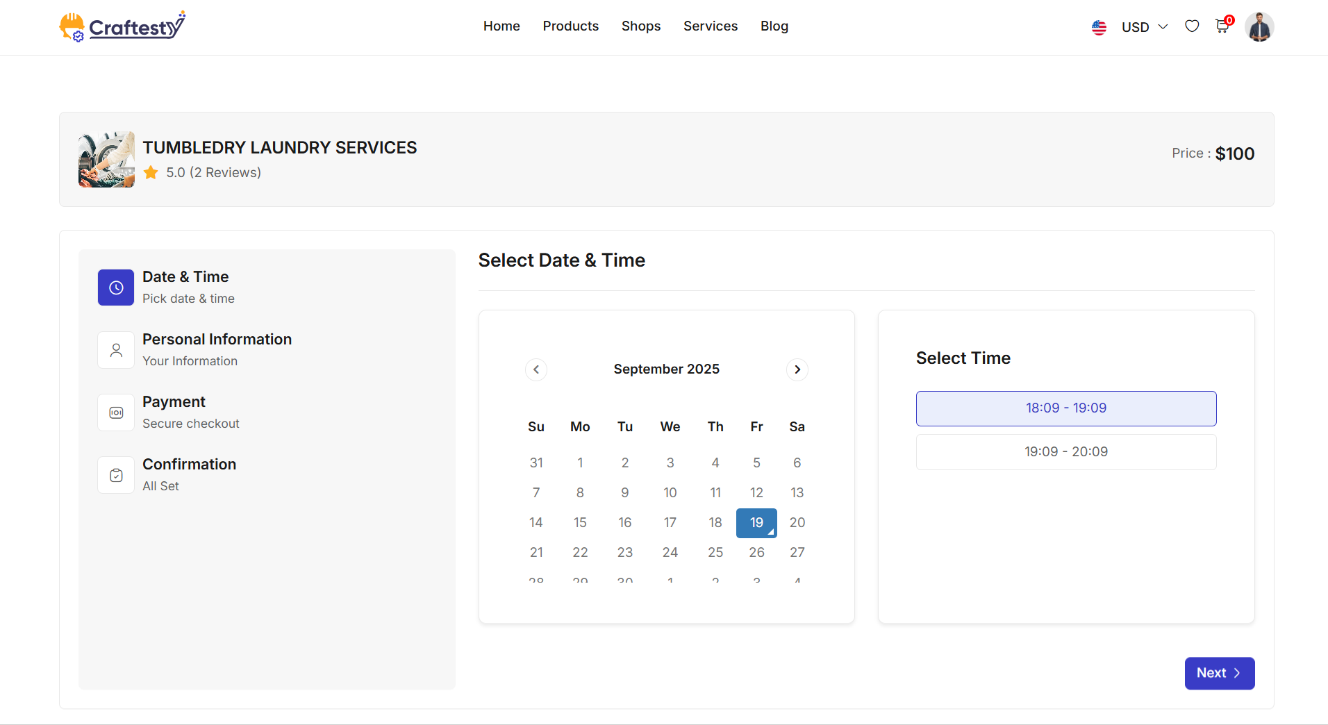
Purpose:
This HTML code represents a User Service Booking Page. It allows users to select a branch, choose staff, add additional services, pick a date and time, and provide personal information for booking a service. The page provides a step-by-step multi-field booking workflow for a smooth and guided user experience.
Layout:
The page is divided into multiple fieldset sections that guide the user through the booking process:
- Location Selection: - Users select a branch from available locations. - Displays branch details including name, address, staff count, and average rating. - Navigation: "Next" button to proceed.
- Staff Selection: - Displays available staff for the selected branch. - Users can select preferred staff. - Navigation: "Prev" and "Next" buttons for step control.
- Additional Services: - Allows selection of optional add-on services. - Shows service name, price, duration, and ratings. - Users can add or skip additional services. - Navigation: "Prev" and "Next" buttons.
- Date & Time Selection: - Users select a booking date and choose an available time slot. - Dynamically updates available slots based on previous selections. - Navigation: "Prev" and "Next" buttons.
- Personal Information: - Collects user's first name, last name, email, phone, address, city, state, postal code, and optional booking notes. - Displays summary of selected service, staff, additional services, and location. - Shows cancellation policy. - Navigation: "Prev" and "Next" buttons.
Flow & Responsiveness:
The page uses a multi-step booking flow with fieldsets to separate each stage:
- Each step is displayed one at a time, improving clarity and reducing user confusion.
- Users can navigate back and forth between steps using "Prev" and "Next" buttons.
- Skeleton loaders are used for smooth loading experience while fetching dynamic data (branches, staff, slots, services).
- Responsive design using Bootstrap ensures proper layout on desktop, tablet, and mobile screens. - Multiple columns collapse to a single column on smaller screens. - Cards, tables, avatars, and forms scale to maintain readability and usability.
- Interactive elements include radio buttons for selections, checkboxes for optional services, and date/time pickers.
User Booking 2
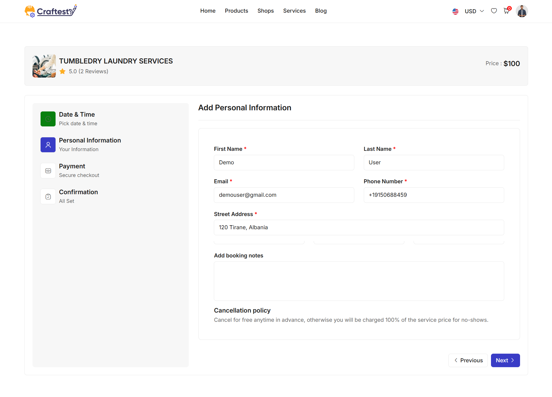
User Booking 3
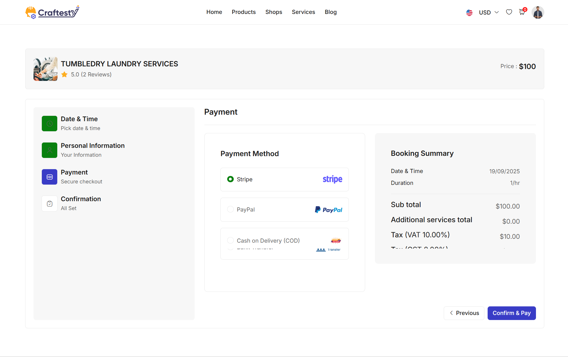
User Booking 4
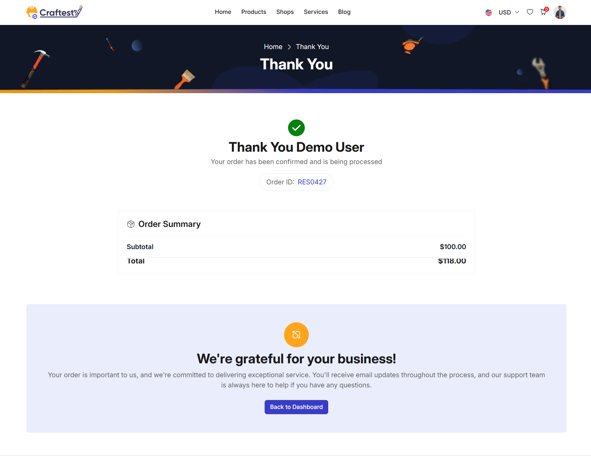
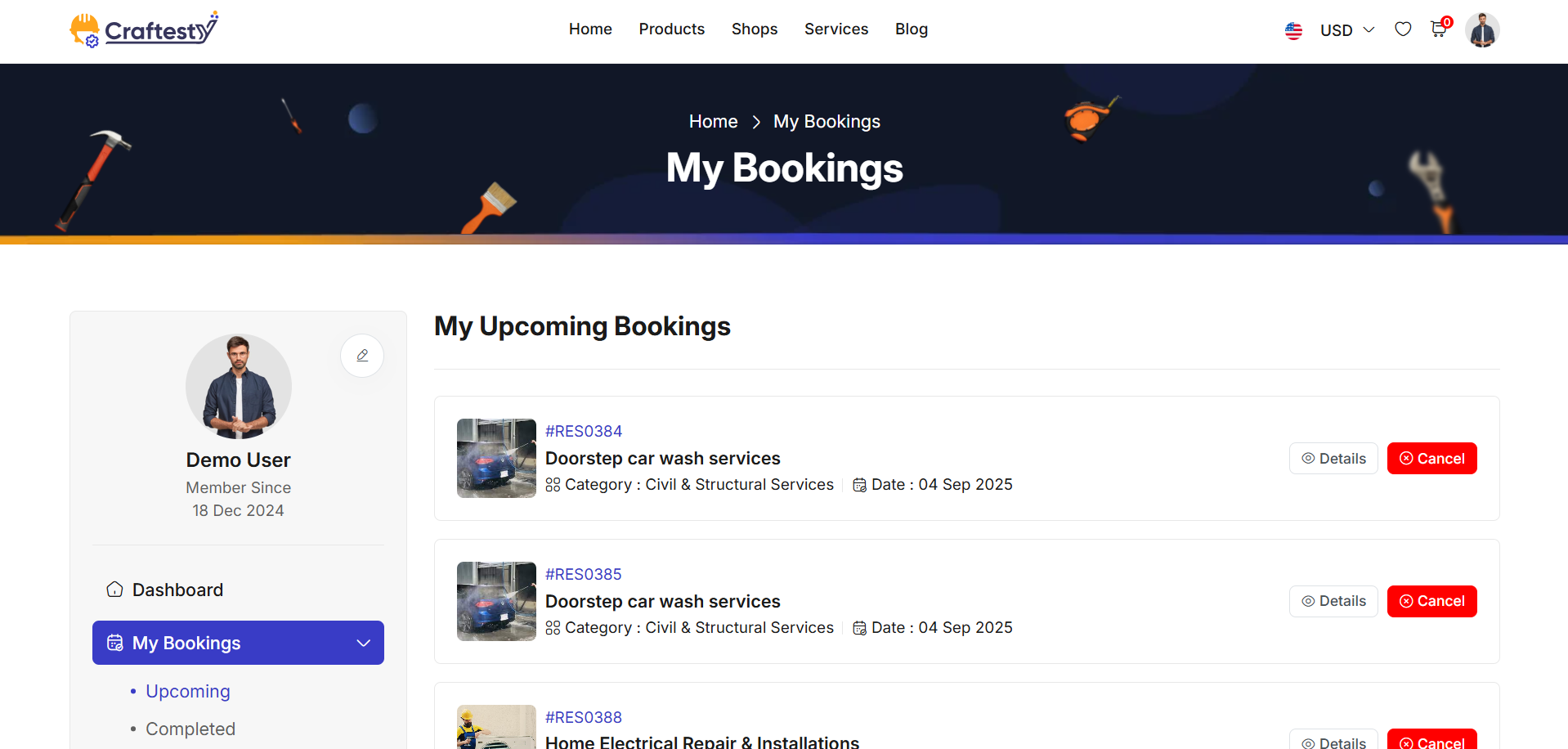
Purpose:
This HTML code represents a User Service Booking List Page. It allows users to view, manage, and cancel their upcoming service bookings. Users can also see detailed information about each booking via a modal popup.
Layout:
The page is divided into the main content area and modals for user actions:
- Main Booking List:
- Uses a
containerwith a sidebar for navigation. - Displays a heading My Upcoming Bookings. - Dynamic booking list is loaded inbooking-list-containerwith a spinner loader while data is being fetched. - Cancel Booking Modal:
- Modal popup
cancel_bookingallows users to cancel a booking. - Includes a textarea for entering the reason for cancellation. - Action buttons: "Cancel" to close modal and "Yes, Cancel" to confirm cancellation. - View Booking Details Modal:
- Modal popup
view_detailsshows detailed information of a selected booking. - Large modal with a header containing the booking summary and badge for order ID. - Body dynamically filled with booking details. - Close button with icon for user convenience.
Flow & Interaction:
- User navigates the list of upcoming bookings dynamically fetched from the backend.
- Clicking "Cancel" triggers the
cancel_bookingmodal where the user can submit a reason. - Clicking "View Details" opens the
view_detailsmodal showing a summary of the booking. - Spinner loader improves the perceived performance while booking data is loading.
- Responsive layout ensures proper display on mobile, tablet, and desktop devices.
Product List
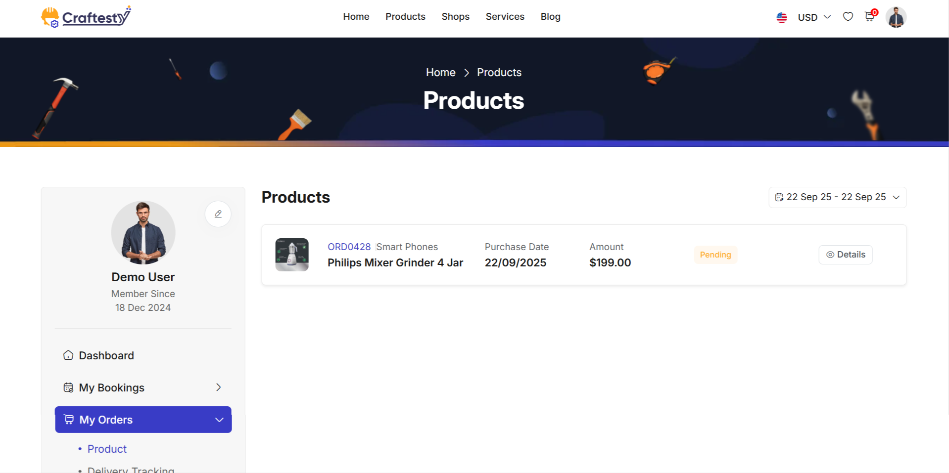
Purpose:
This HTML code represents a User Product Booking Page. It allows users to view, manage, and checkout their selected products in a shopping cart format. Users can also apply coupons, select payment methods, and provide billing information before confirming the order.
Layout:
The page is divided into the main content area and checkout section:
- Cart Section:
- Uses a
containerwith a sidebar for navigation. - Displays Cart Summary with all selected products in a table format. - Users can adjust quantities, remove items, empty the cart, or update it. - Displays cart totals dynamically with subtotal and total amounts. - "Proceed to Checkout" button allows moving to the checkout step; requires login if the user is a guest. - Checkout Section: - Hidden by default, displayed when the user proceeds to checkout. - Collects Billing Details, including first/last name, email, phone, and address. - Shows Order Summary with dynamic totals, discounts, and applied coupons. - Displays Payment Methods dynamically based on available options: Stripe, PayPal, COD, Wallet, Bank Transfer. - Users can apply or remove coupon codes to adjust the total amount. - "Pay Now" button finalizes the order.
Flow & Interaction:
- User views the cart and can update product quantities or remove items.
- Clicking "Proceed to Checkout" shows the checkout form for billing and payment.
- Users can select payment method and apply coupons for discounts.
- Dynamic elements, like totals and order summary, are updated in real-time with JavaScript/AJAX.
- Responsive layout ensures proper display on mobile, tablet, and desktop devices.
Components:
- Sidebar navigation:
customer.sidemenufor consistent UX. - Cart table: Lists products with quantity controls, subtotal, and delete options.
- Checkout form: Collects billing details and displays order summary.
- Coupon application: Input and buttons to apply or remove coupon codes dynamically.
- Payment section: Multiple payment method options with dynamic visibility based on configuration.
- Responsive Bootstrap cards, tables, and buttons for clean layout.
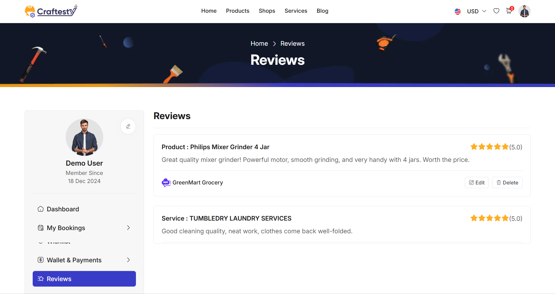
Purpose:
This HTML code represents a User Product Reviews & Ratings Page. It allows users to view and manage product reviews and ratings for products they have purchased or interacted with. Users can see a list of reviews, loading indicators for asynchronous data fetch, and a message when no reviews exist.
Layout:
The page is divided into a sidebar navigation and the main content area for reviews:
- Sidebar Navigation:
- Uses
provider.partials.sidebarfor consistent user navigation. - Allows quick access to other provider-related sections. - Reviews Section:
- Displays a heading Product Reviews & Ratings.
-
ratings-containeris the placeholder for dynamically loaded reviews. -loadershows a spinner while reviews are being fetched asynchronously. -no-ratings-messagedisplays when no reviews are available.
Flow & Interaction:
- User navigates to the reviews page to view ratings and comments for products.
- Reviews are fetched asynchronously from the backend and populated in
ratings-container. - Spinner loader improves perceived performance during data fetch.
- If there are no reviews, a user-friendly message is displayed in
no-ratings-message. - The page layout is responsive and works well on mobile, tablet, and desktop devices.
Components:
- Sidebar navigation:
provider.partials.sidebarincluded for consistent UX. - Dynamic review list:
ratings-containerpopulated via AJAX or frontend rendering. - Loader:
spinner-bordershows while reviews are loading. - No reviews message:
no-ratings-messagecard displayed when there are no reviews. - Bootstrap cards and layout classes for a clean and responsive interface.
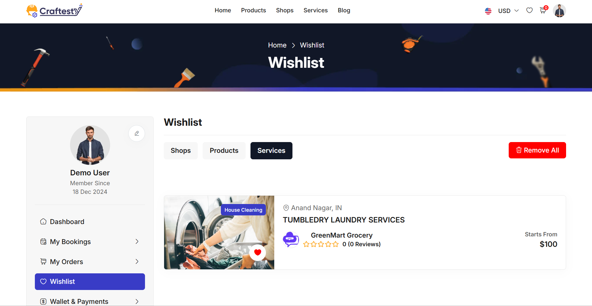
Purpose:
This section is designed to display the user’s wishlist items in a visually structured and user-friendly format. It primarily serves the purpose of:
- Providing a placeholder skeleton layout during data loading to maintain a smooth and engaging user experience.
- Dynamically rendering a list of wishlisted vehicles or services once the real data is available.
- Offering essential information at a glance, including vehicle ratings, details, location, and author.
Layout:
The layout is composed of two primary states:
- Includes multiple .list_view-container blocks simulating the final content structure.
- Contains placeholders for images, titles, ratings, vehicle details, and user info.
Responsive Design:
- Grid System: Utilizes Bootstrap’s grid classes (e.g., col-md-12) to ensure the layout adapts across screen sizes.
- Flex Containers: Implements d-flex, justify-content-between, and align-items-center for clean alignment on both desktop and mobile views.
- Skeleton and Content: Both placeholder and real data views are fully responsive, stacking neatly on smaller screens and displaying in row format on larger ones. This responsive design ensures usability across devices while keeping the user engaged with minimal visual disruption during content loading.
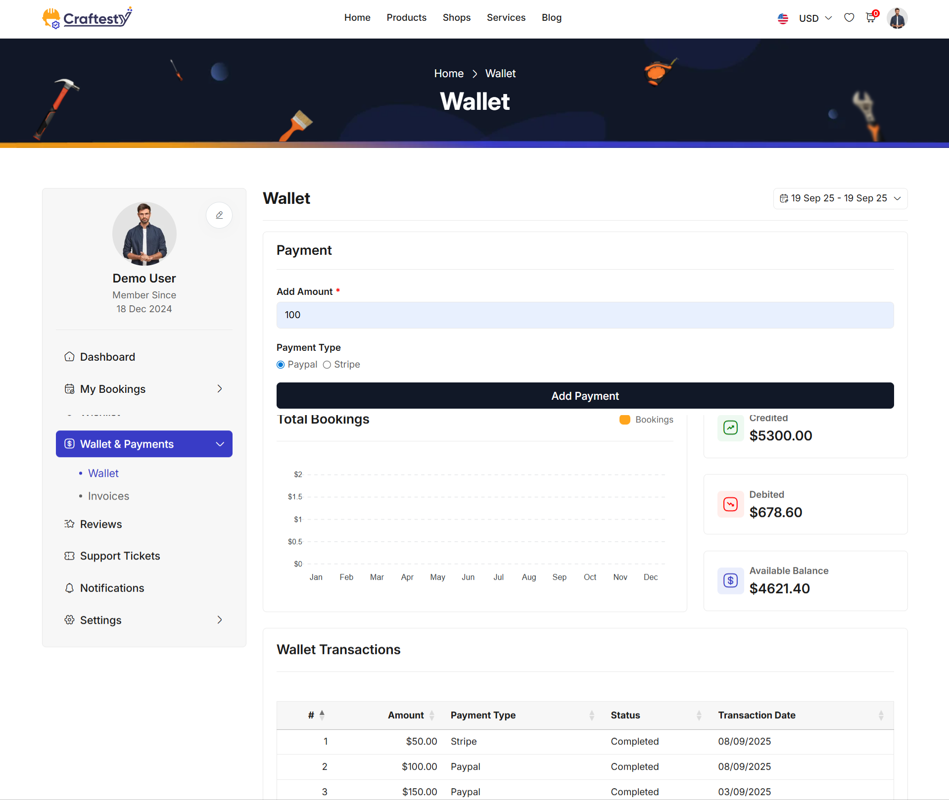
Purpose:
The layout is designed with a focus on responsive design to ensure that the interface is adaptable and functional across different screen sizes, from mobile devices to larger desktop screens.
- The wallet-info section presents crucial information like the available balance, total credits, debits, and transaction history. The responsive grid system ensures that each card within the wallet-card is displayed effectively on any screen size. For instance, the use of col-lg-12 and col-md-12 ensures that on larger screens, the balance information is properly distributed, while on smaller screens, the layout adjusts to maintain readability.
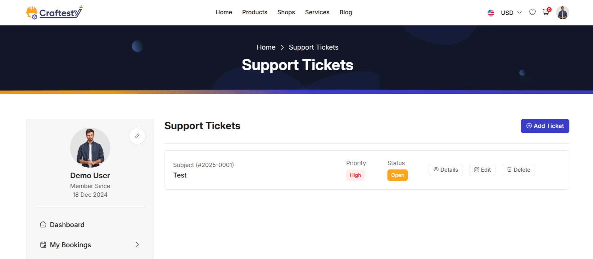
Purpose:
The purpose of the ticket management interface is to provide users with a streamlined platform to handle and track customer service requests efficiently. The system allows users to create, update, and delete tickets while keeping a log of the interactions, making it easier to assign tasks, monitor progress, and manage priority levels. It includes features such as categorizing tickets, adding detailed descriptions, and uploading relevant documents. This interface aims to enhance customer support operations by offering an organized and user-friendly tool for managing tickets from creation to resolution.
Layout:
The layout of this ticket management interface is designed to offer a clean, organized, and user-friendly experience. The table structure includes columns for Ticket Code, Subject, Created Date, Priority, Assignee, and Status, providing a comprehensive view of each ticket's details at a glance.
Responsive Design:
The design is fully responsive, ensuring that it adapts to various screen sizes, including desktops, tablets, and mobile devices. The ticket management table and modal forms adjust their layout dynamically to fit the available screen space. On smaller screens, the table becomes scrollable, while the form fields and buttons resize to maintain readability and usability. The modal dialogs are optimized for mobile use, ensuring that users can create, update, and delete tickets easily, regardless of the device they are using. This responsive approach enhances the accessibility and usability of the system across multiple platforms.
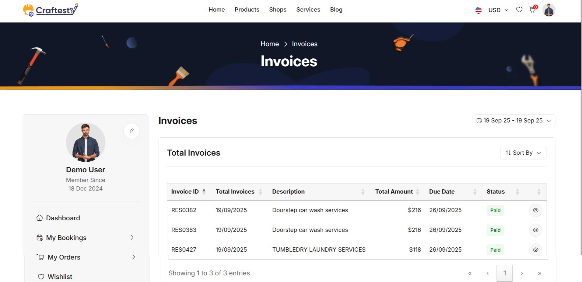
Purpose:
The purpose of this interface is to provide users with a functional and interactive way to filter and sort booking data effectively. It allows users to filter bookings by different time periods (e.g., this week, this month, or custom date range) and sort them in ascending or descending order, or alphabetically.
Layout:
The layout consists of two main sections: a filtering sidebar and a responsive data table. The filtering sidebar on the left allows users to refine the data based on different time filters (e.g., this week, this month, custom range) and sort the data by ascending, descending, or alphabetical order. Each filter and sort option is housed within a dropdown menu for a compact and organized look.
Responsive Design:
The design is fully responsive, adjusting seamlessly across various screen sizes, from desktops to mobile devices. On smaller screens, the filter section becomes hidden or collapses to maximize space, ensuring that users can still view and interact with the table without clutter. The table itself is wrapped in a table-responsive class,
Profile
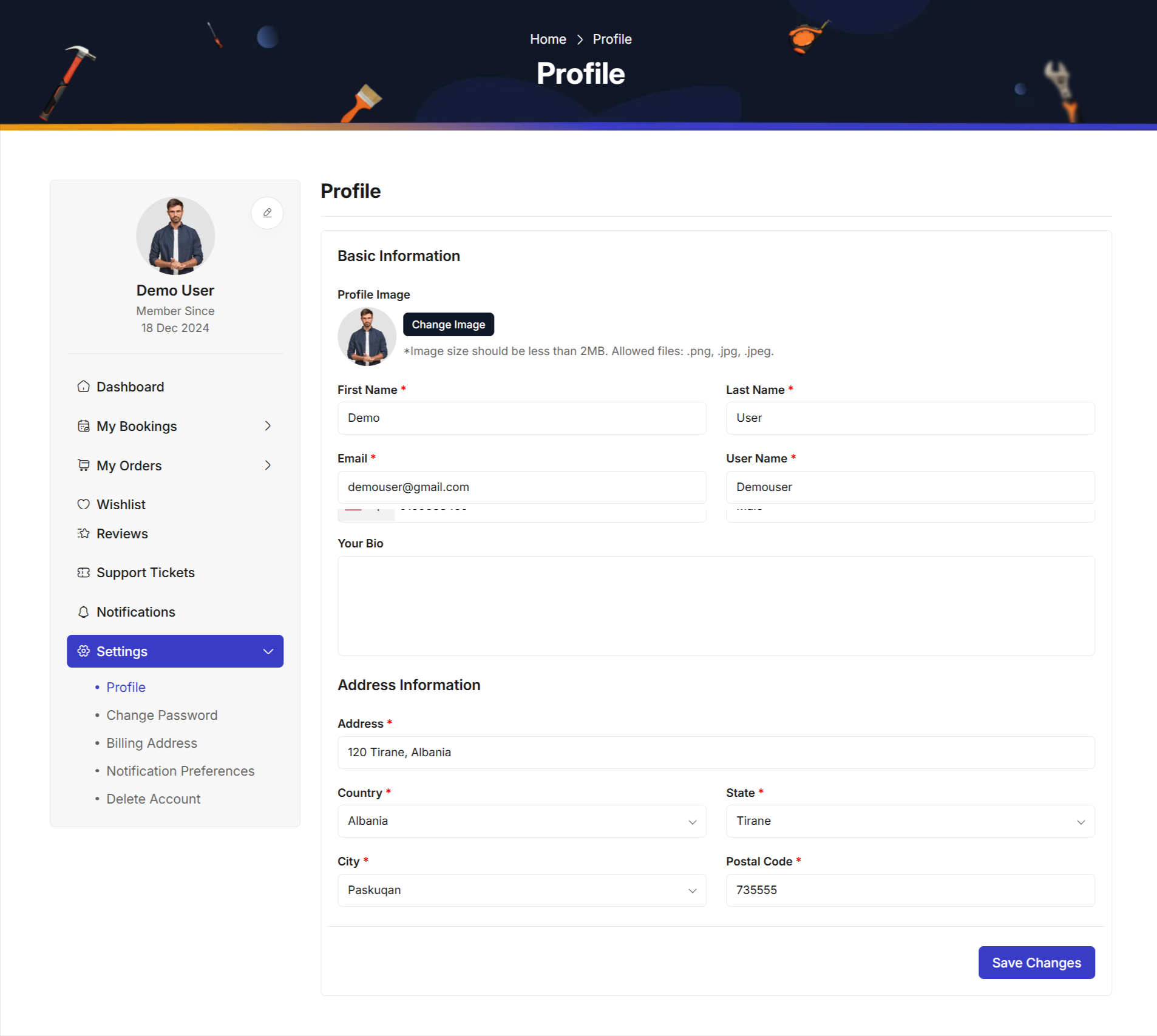
Purpose:
The purpose of this form is to allow users to update and manage their personal profile information, including basic details such as first name, last name, username, phone number, email, and address. It also includes a section for updating the user's profile picture.
Layout:
The layout is divided into three main sections: Basic Information, Address Information, and Profile Submission. Each section is clearly defined with headings and descriptions, making the form easy to navigate.
Responsive Design:
The form is designed with responsiveness in mind, using a flexible grid layout that adapts to different screen sizes. On larger screens, the form maintains its multi-column structure, while on smaller devices (like tablets or mobile phones), the form rearranges itself into a single-column format to ensure that all input fields are easily accessible.
Security
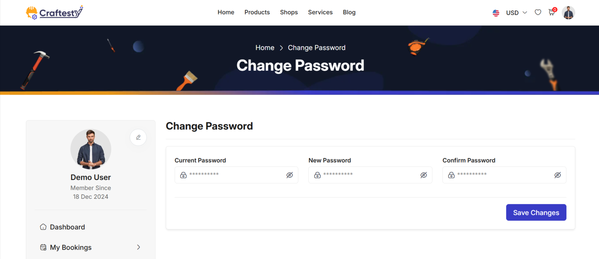
Preference
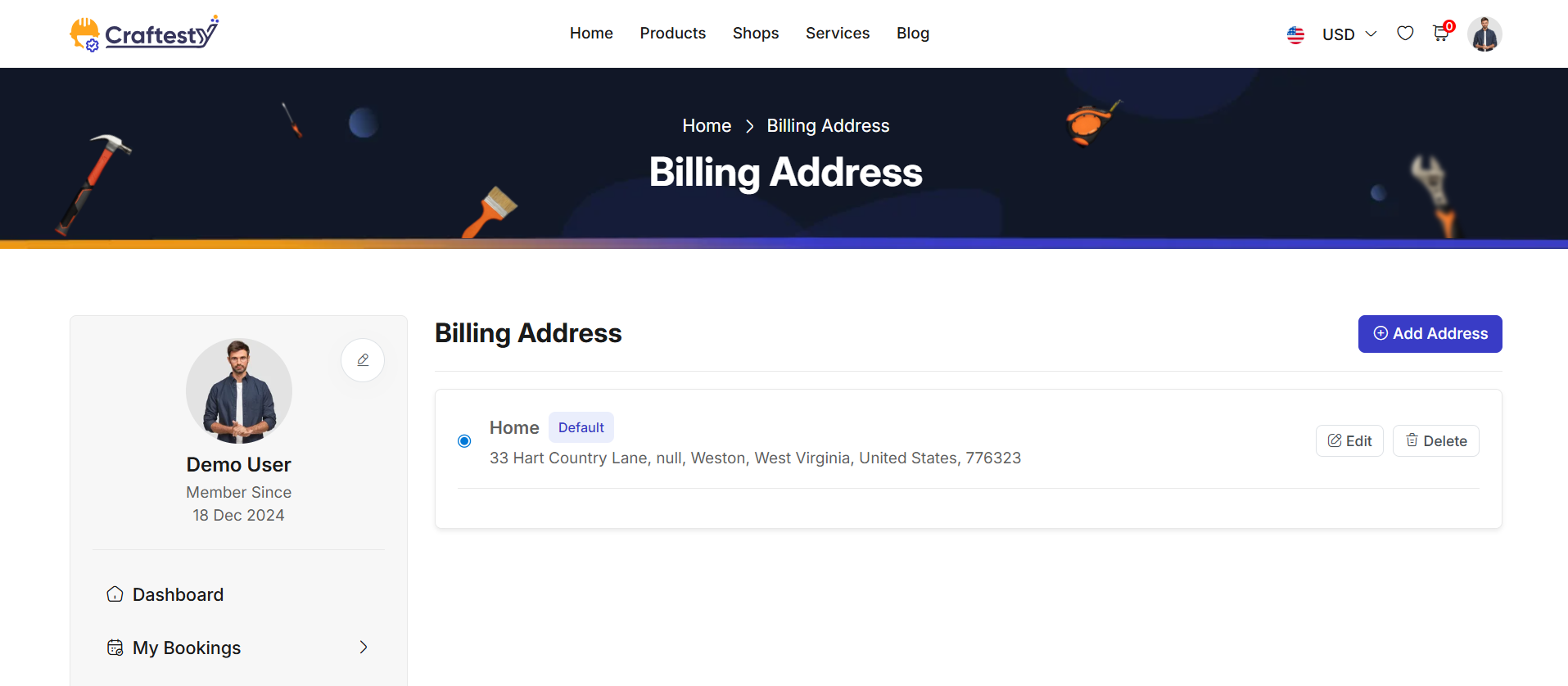
Notifications
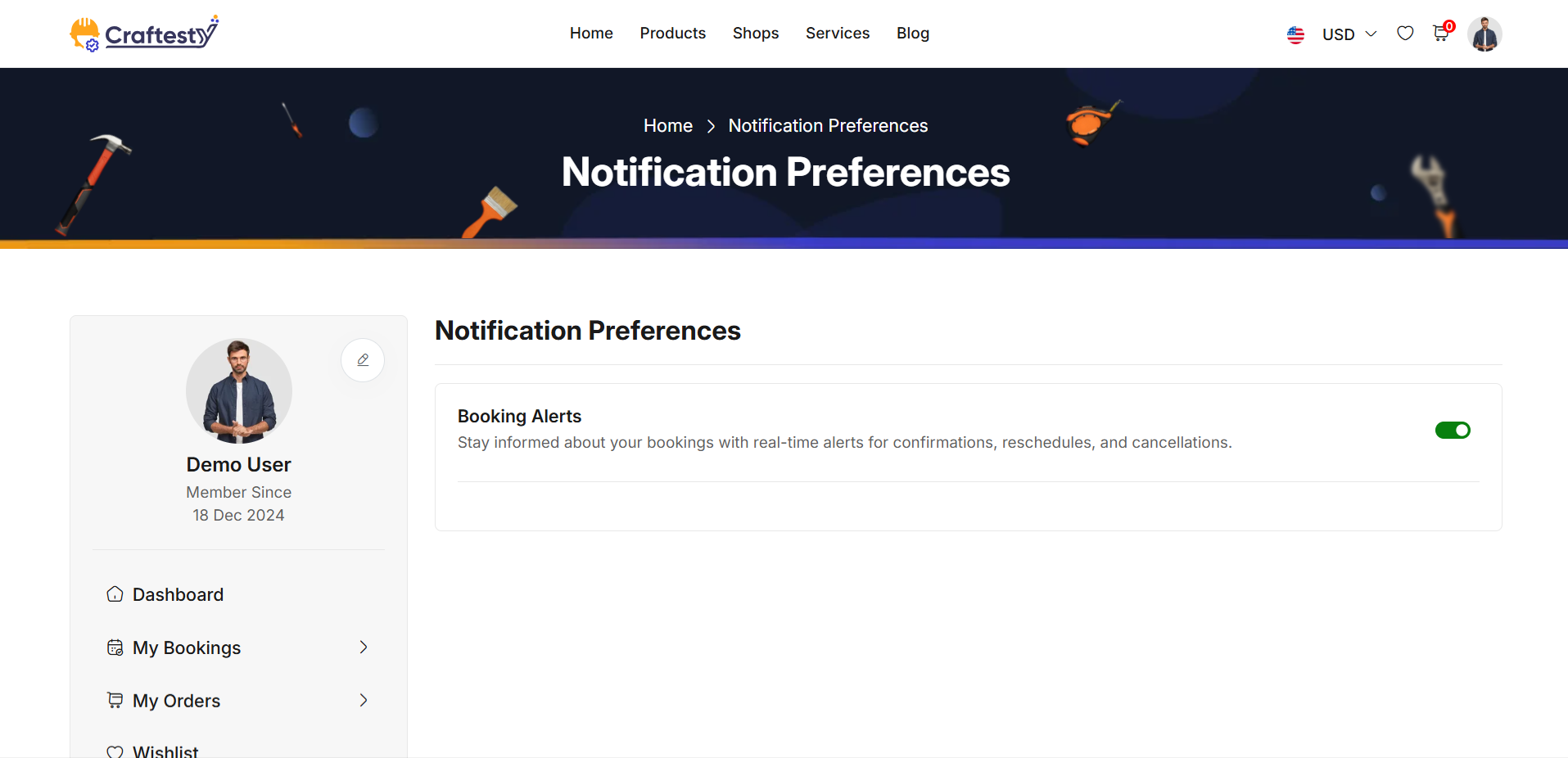
Purpose:
The purpose of this layout is to provide users with the ability to manage and customize their notification preferences. It offers checkboxes for specific types of notifications (e.g., special offers, booking confirmations, new car additions) and toggle switches for enabling/disabling mobile, desktop, and email notifications. This functionality ensures users can receive notifications based on their preferences, enhancing their experience by providing timely updates.
Layout:
The layout is structured in two main sections. The first section includes a list of notification types with checkboxes for enabling or disabling each. The second section consists of toggle switches for enabling/disabling mobile, desktop, and email notifications. Each notification type and toggle is clearly labeled for easy understanding.
Responsive Design:
The design is responsive, adapting to different screen sizes. On larger screens, the content is displayed in a grid format. On smaller screens, elements such as checkboxes and toggle switches are stacked vertically for better readability and accessibility. This ensures an optimal user experience across all device sizes.
Purpose:
The purpose of this form is to provide a secure and simple login interface for users to access their accounts. It offers essential login fields such as email and password, ensuring user authentication. The form also includes options for users to reset their passwords or sign in via OTP, giving them flexibility based on their preferences. Additionally, it provides a "Remember me" checkbox for convenience in saving login credentials. The login process is designed to be user-friendly, with clear error messaging to guide users through the authentication process.
Layout:
The layout of the form is clean and structured, with each input field clearly labeled for user clarity. The email and password fields are placed one after the other, and the password field is grouped with an eye icon for toggling visibility. There is a separate section for links like "Forgot Password?" and "Sign in with OTP," offering alternative ways to log in. Below the form fields, the "Remember me" checkbox allows users to save their credentials.
Responsive Design:
The form is designed to be fully responsive. On smaller screens, the form maintains a user-friendly layout with appropriate spacing and easy-to-tap buttons. The use of a toggle for password visibility and social login buttons ensures a seamless experience across devices. Elements like the "Remember me" checkbox and login options adjust to maintain clarity and usability, even on mobile views.
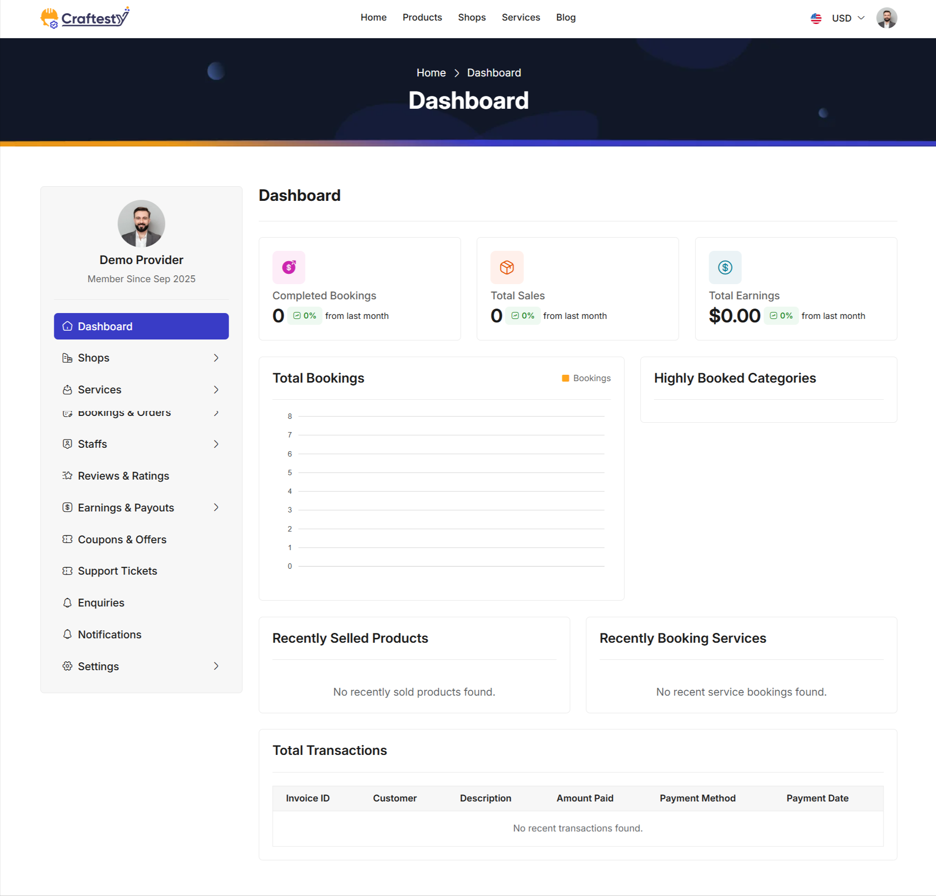
Purpose:
This HTML code represents a Provider Dashboard Page. It allows service and product providers to monitor their business performance, track sales, bookings, and transactions in a single interface. Users can see summaries, charts, recently sold products/services, and detailed transaction history.
Layout:
The page is divided into a sidebar and main dashboard content:
- Sidebar Navigation:
- Uses
provider.partials.sidebarfor consistent provider navigation. - Allows quick access to other dashboard sections. - Summary Cards: - Displays key metrics like Completed Bookings, Total Sales, and Total Earnings. - Each card includes a count, percentage change, and an icon. - Loader placeholders are shown while data is being fetched.
- Booking Chart & Highly Booked Categories:
- Shows total bookings in a chart format (
booking-chart). - Highlights the most booked categories (highly-booked-categories) with skeleton loaders until data is loaded. - Recently Sold Products & Services: - Displays the most recent products sold and services booked. - Uses skeleton loaders for better UX during asynchronous data fetch.
- Total Transactions Table: - Shows a detailed list of all transactions including invoice ID, customer, description, amount paid, payment method, and payment date. - Skeleton loader rows appear while fetching transaction data.
Flow & Interaction:
- Provider logs in to view their dashboard.
- Summary cards load asynchronously with key performance metrics.
- Booking charts and highly booked categories are dynamically populated.
- Recently sold products and services are updated in real-time.
- Transactions table fetches and displays all financial details, with placeholders during loading.
- Responsive layout ensures proper display on mobile, tablet, and desktop devices.
Components:
- Sidebar navigation:
provider.partials.sidebarfor consistent UX. - Dashboard summary cards: Metrics for bookings, sales, and earnings.
- Charts:
booking-chartfor bookings trends;highly-booked-categoriesfor popular services. - Recently sold products/services: Cards with skeleton loaders for dynamic content.
- Transactions table: Detailed view of all payments with skeleton loading for improved UX.
- Bootstrap cards, tables, and flex utilities for a clean, responsive, and visually consistent layout.
Shop List
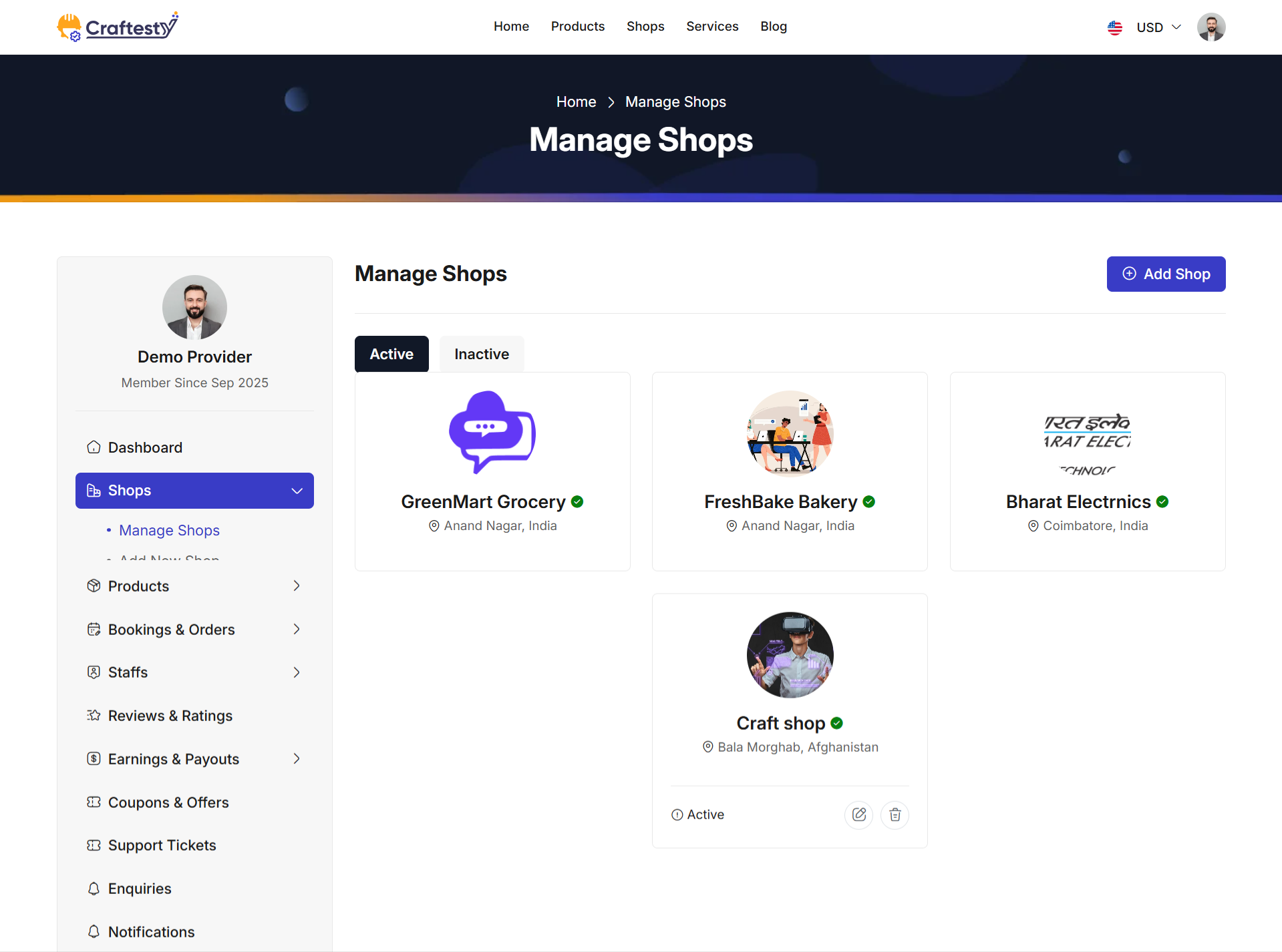
Purpose:
The Shop List (Manage Shops) interface allows providers to view, manage, and organize their shops in one place. It separates active and inactive shops into distinct tabs for easy navigation. Providers can quickly create a new shop, update existing ones, toggle shop status (active/inactive), or delete shops. This ensures that shop management remains streamlined and accessible.
Layout:
The layout uses a tabbed interface with card-based shop previews for clarity:
- Breadcrumb & Header: Displays navigation hierarchy and page title "Manage Shops".
- Action Button: A prominent "Add Shop" button allows providers to create new shops.
- Tabs: Two primary tabs categorize shops: Active and Inactive.
- Shop Cards: Each shop is represented by a card containing essential details and quick actions.
These cards are included via reusable Blade partials (
shop-card.blade.php). - Status & Delete Modals: Each shop has modals (status toggle and delete) included through Blade partials, ensuring consistent and reusable UI patterns.
- Pagination: Shops are paginated with Bootstrap-5 pagination links for smooth navigation.
If no shops exist under a tab, a fallback message ("You have no active/inactive shops") is shown.
Responsive Design:
The design leverages the Bootstrap grid system (col-xl-9, col-lg-8, row-gap-4)
to adapt seamlessly across devices. On larger screens, shop cards align side by side in a grid, while on mobile devices,
they stack vertically for better readability. Navigation tabs, modals, and buttons remain fully functional across all screen sizes.
Shop Create 1
Shop Create 2
Purpose:
The purpose of this interface is to allow providers to create and manage their shops by submitting all essential details in a structured format. The form collects important information such as shop title, owner details, contact information, tax details, address, media uploads (logo & gallery), and working day availability. This ensures that each shop entry is complete, accurate, and ready to be displayed to customers.
Layout:
The layout follows a clean card-based design, with each section grouped for clarity:
- Basic Information: Includes shop title, owner name, phone, email, description, and tax system status.
- Address Information: Collects address line, country, state, city, and postal code using searchable dropdowns.
- Gallery: Upload area for shop logo (with preview) and multiple shop images with remove options.
- Availability: Accordion-based weekly schedule where each day can be enabled/disabled with start & end time inputs. An "All Days" toggle provides quick setup for full-week availability.
Required fields are clearly marked with an asterisk, and validation feedback is displayed inline beneath inputs.
Responsive Design:
The design leverages Bootstrap grid classes (col-lg-6, col-12, etc.) ensuring a flexible,
mobile-friendly layout. On larger screens, inputs are placed side by side, while on smaller devices, they stack vertically.
File upload components, searchable dropdowns, and accordion elements remain fully functional across all screen sizes.
Product List
Purpose:
The purpose of this interface is to allow providers to view, manage, and organize their listed products. Each product card displays essential details such as product image, title, category, price, stock quantity, and current status. Action buttons enable quick editing, deletion, and status toggling, providing an efficient way to maintain a product catalog.
Layout:
The layout follows a responsive card grid format with each product represented as a card:
- Product Image: Large preview area with fixed height and
object-fit: coverfor consistent display. Hover actions (edit & delete) appear overlayed. - Badges: Category and stock quantity displayed as small badges for quick recognition.
- Product Title: Displayed below with text truncation for long names and tooltip on hover.
- Pricing & Status: Shows product price and current status (e.g., Active/Inactive) with a toggle option.
- Action Buttons:
- Edit button () redirects to product edit form.
- Delete button () opens a confirmation modal before removal.
- Status toggle updates product availability dynamically without full page reload.
Products are displayed in a responsive grid (col-xl-4 col-md-6 col-sm-12), ensuring three cards per row on large screens, two on medium, and single-column stacking on small devices.
Responsive Design:
The product cards are fully responsive, using Bootstrap’s grid system to adapt across screen sizes. Hover overlays, badges, and truncated titles maintain clarity on both desktop and mobile. The design ensures that action buttons remain easily accessible without cluttering the interface.
Product Create
Purpose:
The purpose of this interface is to allow providers to add new products to their shops in a structured and detailed manner. The form collects essential product information such as title, code, category, shop association, descriptions, images, pricing, stock details, shipping policies, specifications, SEO data, and status settings. This ensures that each product entry is complete, accurate, and optimized for customer visibility.
Layout:
The layout is organized into card-based sections for better readability and logical grouping:
- Product Information: Includes product name, code, category, sub-category, shop, short and full description fields with inline validation.
- Product Gallery: File upload for multiple product images with preview thumbnails and remove options.
- Pricing, Stock & Variations:
- Single Product – Base price and stock quantity fields.
- Variable Product – Dynamic variations section with add/remove variation options.
- Shipping: Separate fields for international and domestic shipping information.
- Specifications: Add multiple technical/product details dynamically.
- SEO Settings: Meta title and meta description fields to improve search engine visibility.
- Status & Features: Dropdowns to set product status (Active/Draft) and mark product as featured or not.
Required fields are clearly marked with an asterisk, and error messages are displayed inline below inputs when validation fails.
Responsive Design:
The form uses Bootstrap grid system (col-md-6, col-12, etc.) to ensure a
responsive, mobile-friendly design. On larger screens, inputs are displayed side by side, while
on smaller screens they stack vertically. File upload previews, variation containers, and
specification sections adapt seamlessly across devices.
Actions:
At the bottom, the form provides two action buttons:
- Cancel: Redirects back to the product list without saving changes.
- Save Product: Submits the form to create a new product entry with all provided details.
Services list
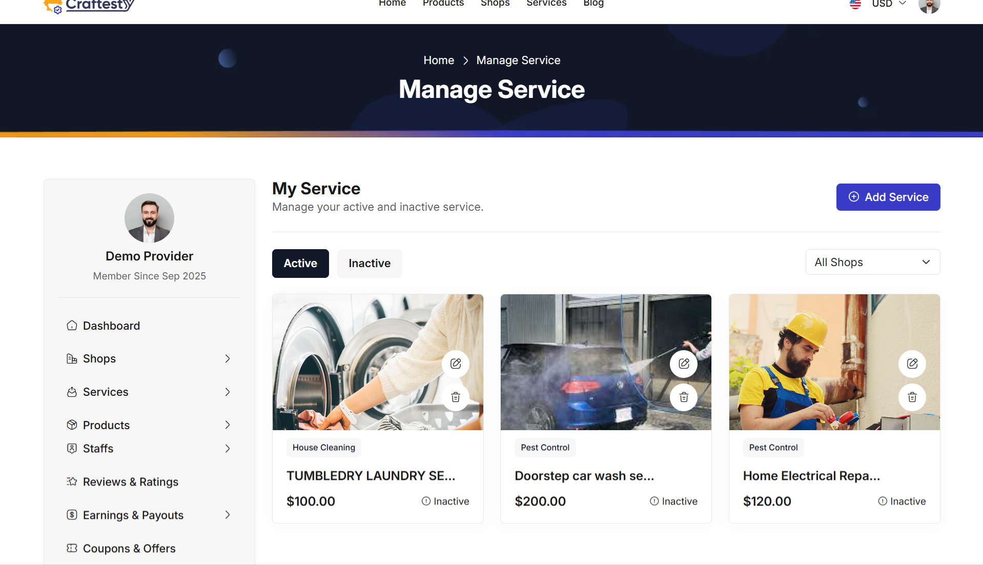
Purpose:
The purpose of this interface is to allow providers to view, manage, and organize all their services efficiently. Each service is displayed as a card with relevant information such as service name, category, price, availability, and current status. Action buttons allow quick editing, deletion, or status updates without navigating away from the page.
Layout:
The layout uses a responsive card grid format where each service is represented by a card:
- Service Image: Displays the main image of the service with fixed height and
object-fit: coverto maintain consistent visual alignment. - Badges: Shows the service category as a badge for easy identification.
- Service Name: Truncated with tooltip support for long names to maintain layout integrity.
- Pricing & Status: Shows service price and current status (Active/Inactive) with a clickable toggle.
- Action Buttons:
- Edit: Opens the service edit form.
- Delete: Opens a confirmation modal before removing the service.
- Status Toggle: Updates the service availability dynamically on the list.
Responsive Design:
The service cards are fully responsive using Bootstrap grid classes (col-xl-4, col-md-6, col-sm-12).
Cards adapt seamlessly across different screen sizes: three per row on large screens, two per row on medium,
and a single-column layout on small screens. Hover actions, badges, and truncated titles maintain clarity and usability.
Actions:
Users can quickly perform actions on each service card:
- Edit Service: Click the edit button to modify service details.
- Delete Service: Click the delete button to open a confirmation modal before removal.
- Toggle Status: Activate or deactivate the service directly from the list without page reload.
Services
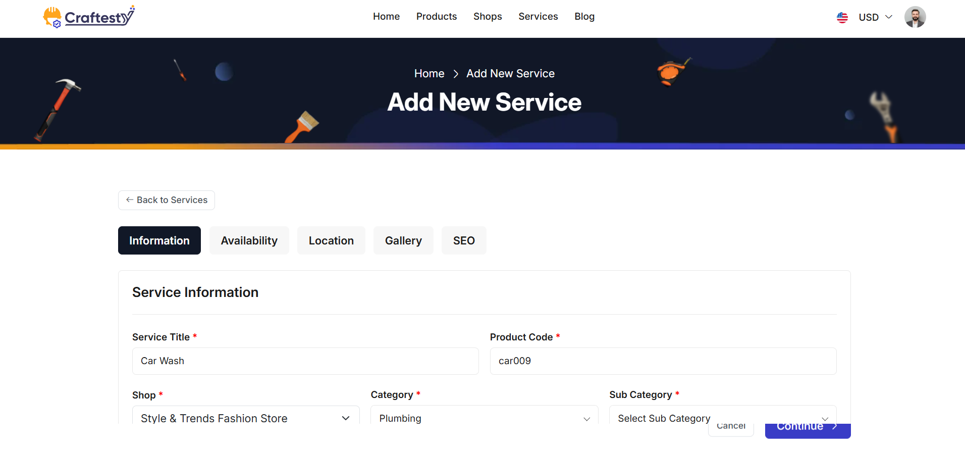
Purpose:
Services 2
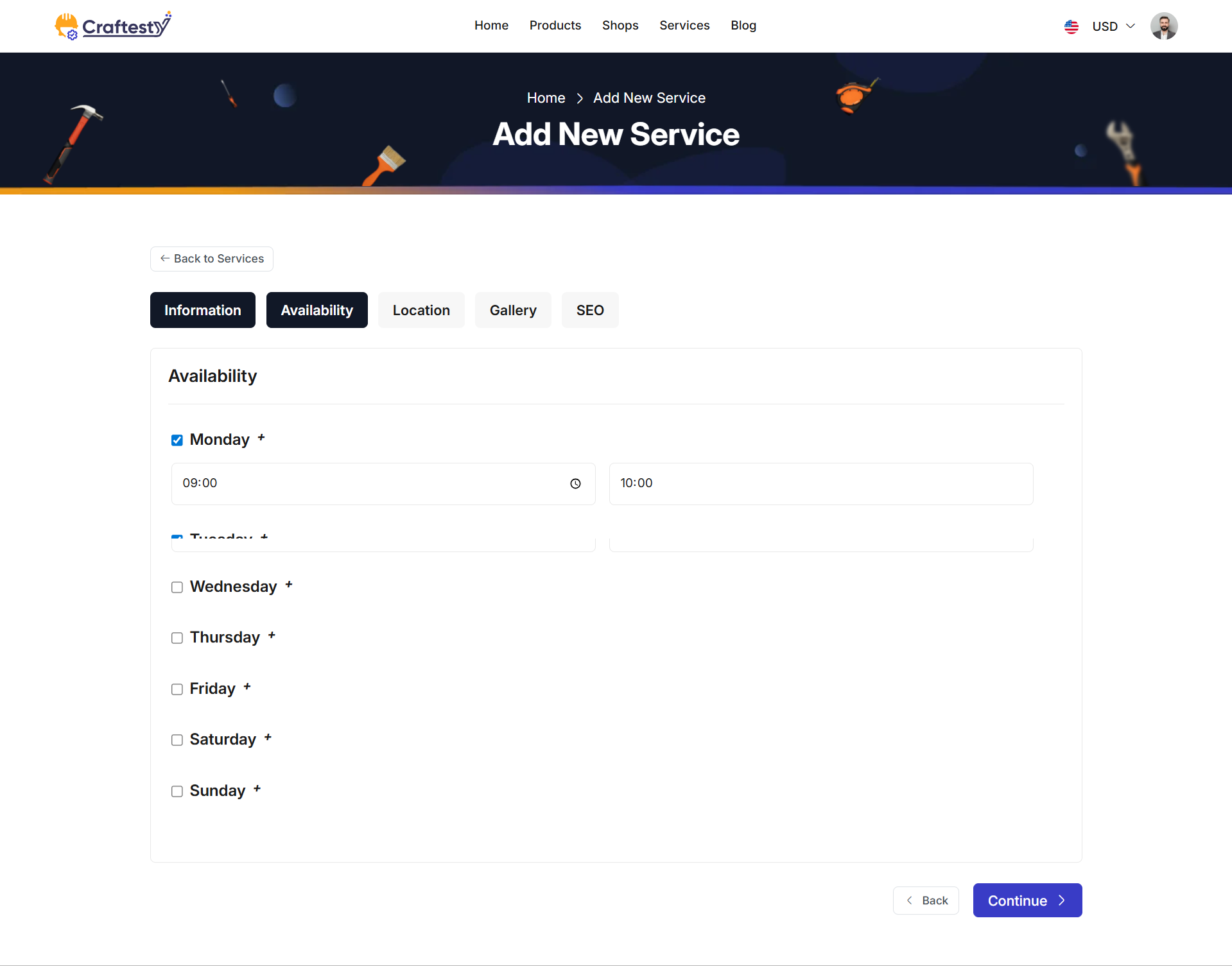
Services 3
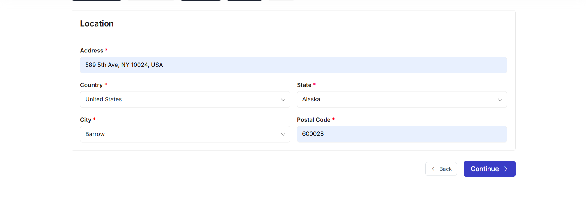
Services 4
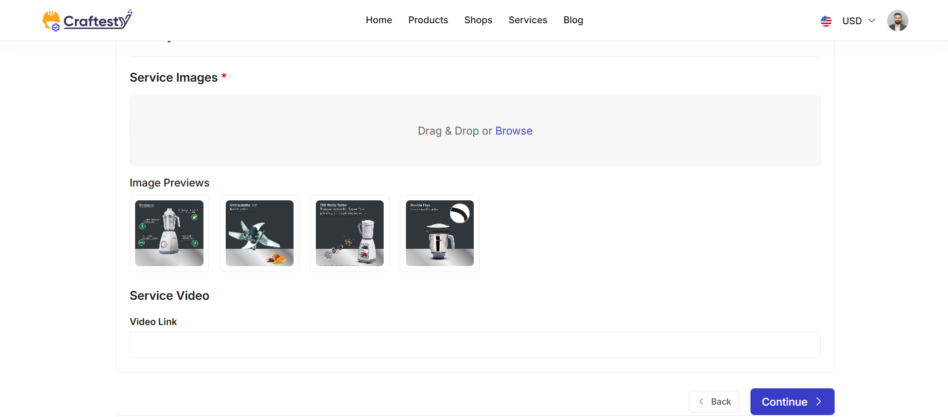
Services 5
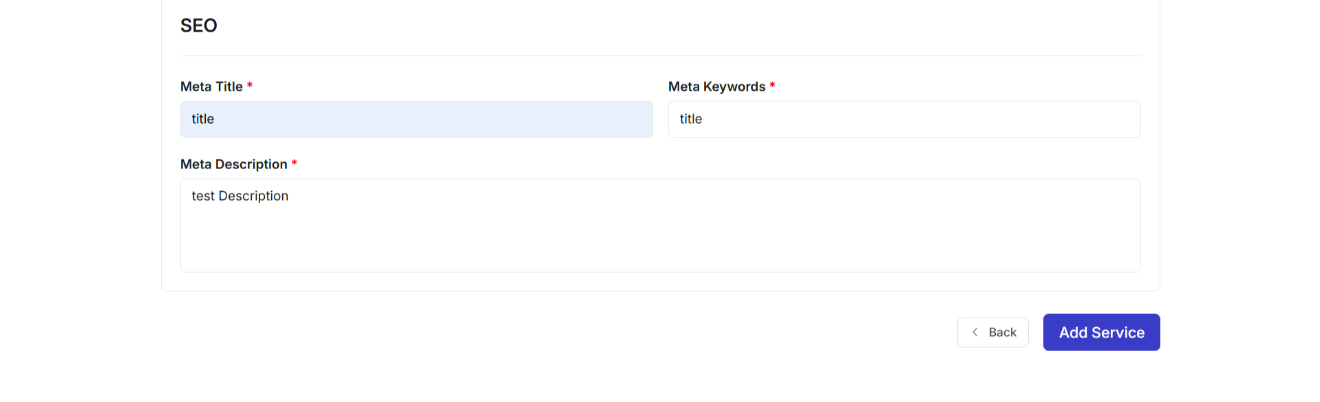
Purpose:
The purpose of this interface is to allow providers to add new services to their shops in a detailed and structured way. The multi-step form collects essential information including service details, pricing, availability, location, gallery, SEO data, and additional service options. This ensures that each service entry is complete, accurate, and ready to be offered to customers.
Layout:
The layout is organized into multi-step card-based sections for better readability and logical grouping:
- Service Information: Includes service title, product code, shop selection, category/sub-category, price, price type, duration (hours/minutes), and detailed description fields with validation.
- Additional Service: Allows adding multiple related services dynamically using an "Add Service" button.
- Availability: Accordion-style weekly schedule where each day can be enabled/disabled with time slots. Users can add multiple time slots for a single day.
- Location: Address input along with searchable country, state, city dropdowns, and postal code field.
- Gallery: File uploads for multiple service images with previews, plus an optional video link field.
- SEO Settings: Fields for meta title, meta keywords (tags input), and meta description to optimize search engine visibility.
Required fields are marked with an asterisk. Inline validation messages are displayed under inputs for easy correction.
Responsive Design:
The form leverages Bootstrap grid classes (col-lg-6, col-md-6, col-12, etc.) to ensure a responsive, mobile-friendly layout.
Multi-step wizard sections stack vertically on smaller devices, and file upload previews, duration selectors, and time slot accordions remain fully functional on all screen sizes.
Actions:
Navigation and submission options are provided at each step of the multi-step form:
- Cancel: Returns the user to the previous page without saving changes.
- Back/Continue: Moves between the steps of the multi-step wizard.
- Add Service: Submits the form to create a new service entry with all the provided details.
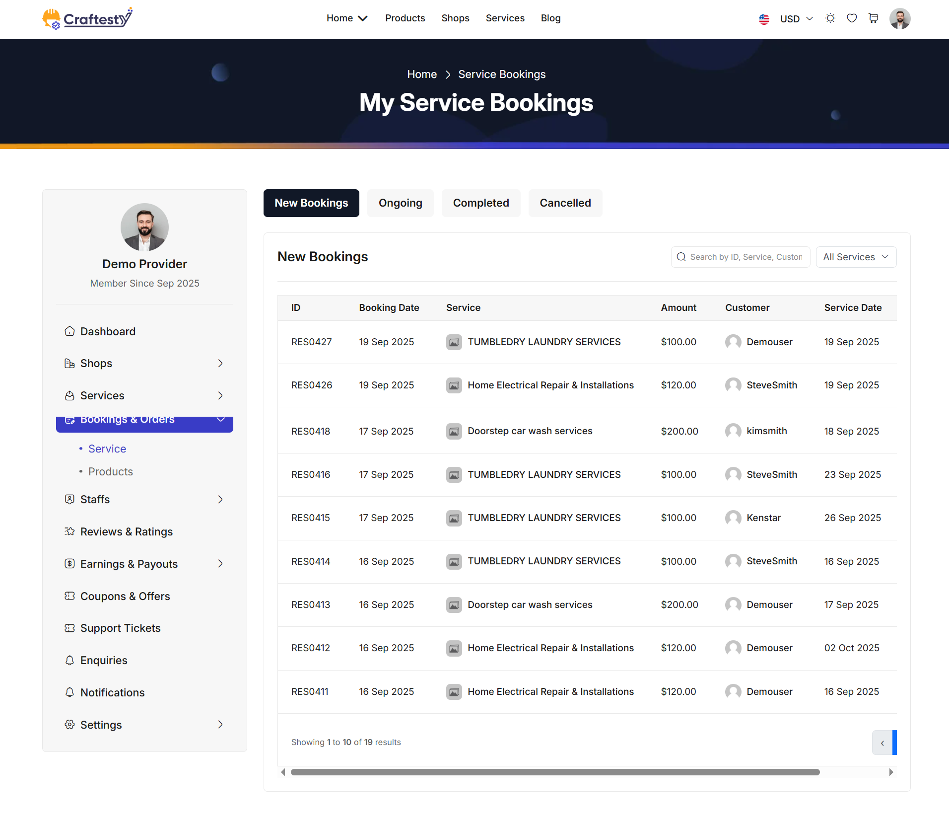
Purpose:
The purpose of this interface is to allow providers to view, search, filter, and manage all bookings related to their services. Providers can quickly access booking details, track statuses, and filter bookings by service type or customer to streamline operations.
Layout:
The layout uses a card-based design with tab navigation and a responsive table for booking records. Four tabs separate bookings by status: New Bookings, Ongoing, Completed, and Cancelled. Clicking a tab dynamically updates the booking list table.
A search box allows providers to query bookings by ID, service name, or customer name. A dropdown filter lets them select a specific service or view all services. The booking table displays information in a responsive layout with columns for ID, Booking Date, Service Name, Amount, Customer Name, Service Date, and action buttons if applicable. Initially, a "Loading initial bookings..." message is displayed while data is fetched asynchronously.
Responsive Design:
The design uses Bootstrap grid classes such as col-xl-9 and col-lg-8 along with responsive table wrappers to ensure proper display across all devices.
On smaller screens, the table can scroll horizontally, and search/filter dropdowns remain fully functional.
Actions & Interactivity:
Clicking on a status tab reloads the table with bookings of that status dynamically. Typing in the search box filters bookings in real-time by ID, service, or customer. Selecting a service from the dropdown updates the table to show only related bookings. Depending on the implementation, action buttons such as view, edit, or cancel may be available for each booking row.
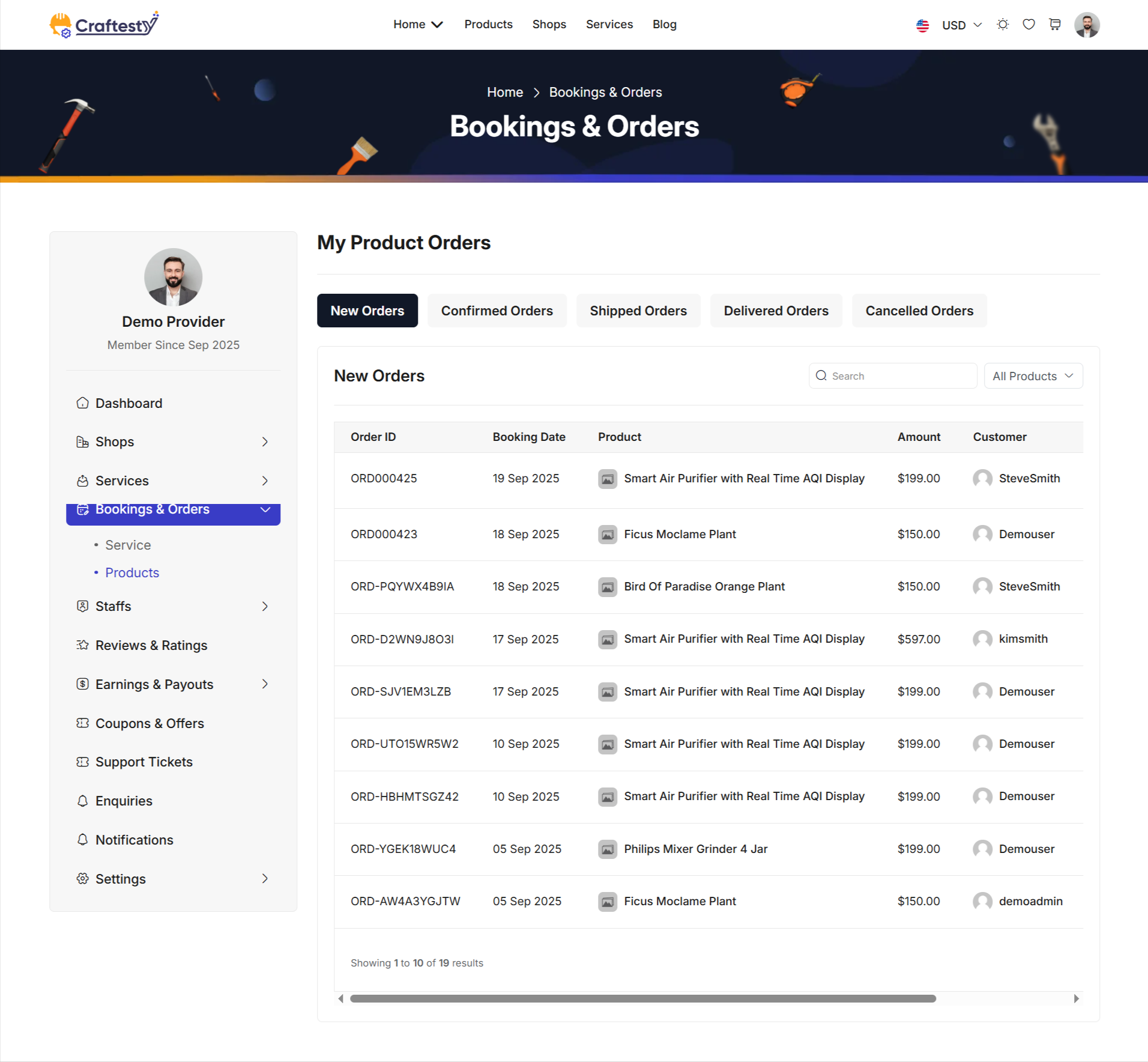
Purpose:
The purpose of this interface is to allow providers to view, search, filter, and manage all bookings related to their products. Providers can quickly access order details, track statuses, and filter bookings by product type or customer to streamline operations.
Layout:
The layout uses a card-based design with tab navigation and a responsive table for booking records. Five tabs separate bookings by status: New Orders, Confirmed Orders, Shipped Orders, Delivered Orders, and Cancelled Orders. Clicking a tab dynamically updates the booking list table.
A search box allows providers to query bookings by Order ID, product name, or customer name. A dropdown filter lets them select a specific product or view all products. The booking table displays information in a responsive layout with columns for Order ID, Booking Date, Product Name, Amount, Customer Name, Quantity, Cancelled By (if applicable), and action buttons. Initially, a "Loading initial orders..." message is displayed while data is fetched asynchronously.
Responsive Design:
The design uses Bootstrap grid classes such as col-xl-9 and col-lg-8 along with responsive table wrappers to ensure proper display across all devices.
On smaller screens, the table can scroll horizontally, and search/filter dropdowns remain fully functional.
Actions & Interactivity:
Clicking on a status tab reloads the table with bookings of that status dynamically. Typing in the search box filters bookings in real-time by Order ID, product, or customer. Selecting a product from the dropdown updates the table to show only related bookings. Depending on the implementation, action buttons such as view, edit, or cancel may be available for each booking row.
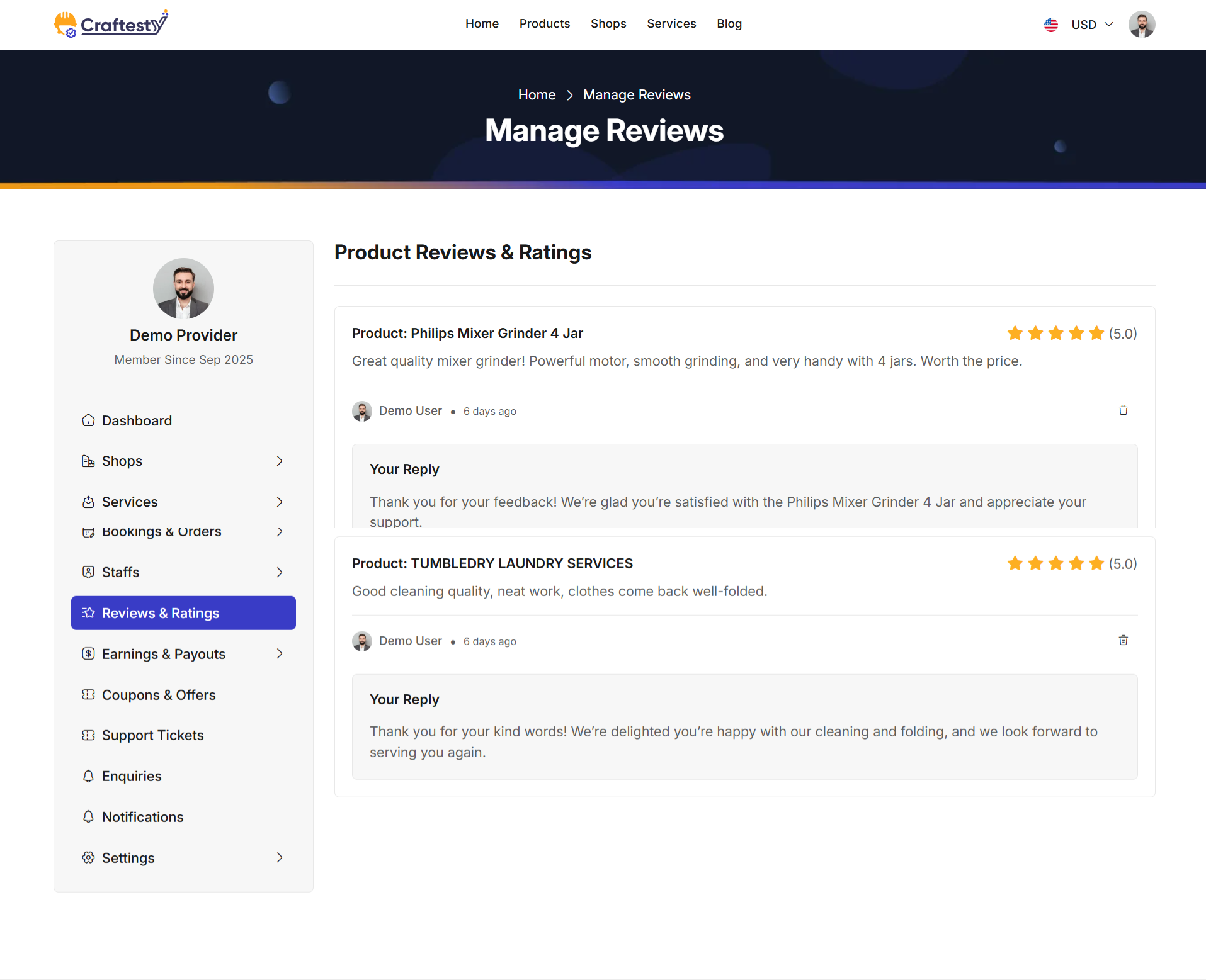
Purpose:
This interface allows providers to view, manage, and respond to customer reviews and ratings for their products. Providers can assess customer feedback, reply to reviews, and moderate content to maintain high-quality service standards.
Layout:
The layout displays individual reviews in card-based sections for clarity. Each card contains the product name, star rating, review content, and customer information including profile image and review date. If the customer has not uploaded a profile image, a default placeholder image is used. Providers can also see if a reply has already been made and respond directly from the interface.
Action buttons are provided for each review. If a reply does not exist, a "Reply" button is shown. All reviews include a "Delete" button to remove inappropriate or unwanted feedback. Replies, when present, are displayed in a separate card below the review, with distinct styling for clarity.
Responsive Design:
Cards are responsive and adapt across all devices using Bootstrap grid classes and flex utilities. On smaller screens, content wraps gracefully and all action buttons remain accessible. Customer profile images automatically fallback to a default placeholder if the original image fails to load.
Actions & Interactivity:
Providers can click the "Reply" button to respond directly to customer reviews. The "Delete" button allows removal of inappropriate reviews. Star ratings are displayed visually, alongside the numerical rating, to give an at-a-glance overview of feedback. Replies, when added, are shown immediately below the original review in a dedicated card.
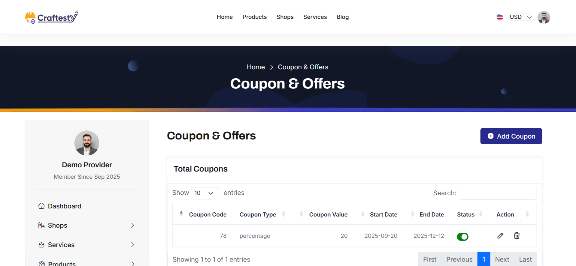
Purpose:
This interface allows providers to manage all their coupons and promotional offers efficiently. Providers can view existing coupons, check their status, and take actions such as editing, activating/deactivating, or deleting offers. The system ensures providers have complete visibility over ongoing promotions and their validity periods.
Layout:
The layout uses a card-based design with a header section for page title and add coupon button. Permissions are checked to show or hide buttons and actions depending on the provider’s access level. The coupon table displays key details including coupon code, type, value, start date, end date, and status if applicable. Action buttons are conditionally rendered based on permissions to edit or delete coupons.
A loader table with skeletons is displayed initially while the real coupon data is fetched asynchronously. The table automatically replaces the skeleton loader with live data once available.
Responsive Design:
The interface uses Bootstrap grid classes and responsive table wrappers to ensure proper display on all devices. The table scrolls horizontally on smaller screens, and buttons remain accessible and functional across all viewports.
Actions & Interactivity:
Providers can click the "Add Coupon" button to create new offers, depending on their permissions. The table displays existing coupons with options to edit, activate/deactivate, or delete based on access rights. Skeleton loaders provide immediate visual feedback while the coupon data is being retrieved. Status changes and actions on coupons update dynamically without requiring a page reload.
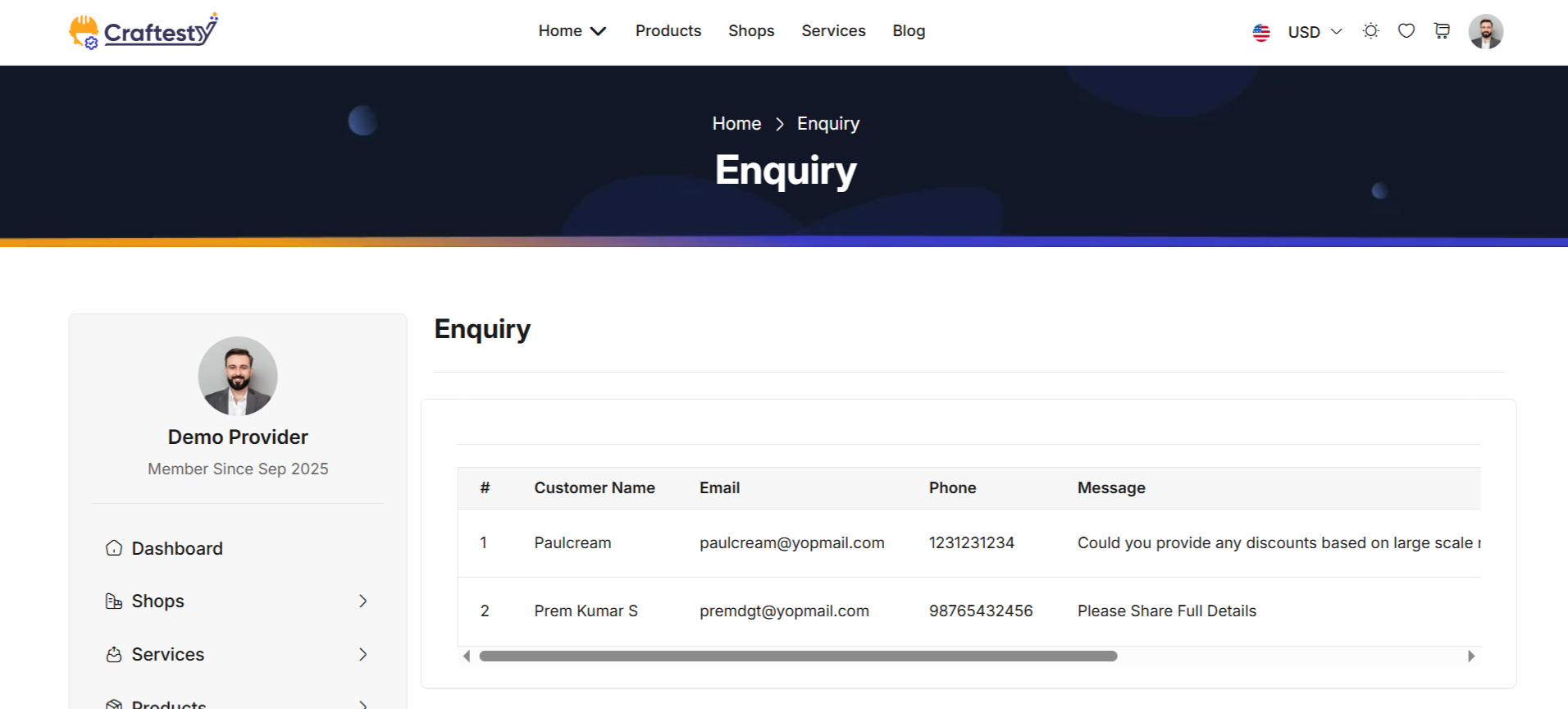
Purpose:
The Enquiry List interface allows providers to manage customer enquiries efficiently. Providers can view all enquiries submitted through the system, track their status, and take necessary actions such as responding, marking as read, or resolving the enquiry.
Layout:
The interface uses a card-based design with a responsive table to display all enquiry records. The table includes columns for serial number, customer name, email, phone, message content, enquiry date, status, and action buttons. The table is initially empty and will be dynamically populated with enquiries fetched asynchronously from the server.
If no enquiries are found, a placeholder message "No enquiries found" is displayed. Action buttons per row allow providers to interact with each enquiry based on permissions and status.
Responsive Design:
The table uses Bootstrap classes and table wrappers to ensure proper display across all devices. On smaller screens, horizontal scrolling is enabled, ensuring all columns remain accessible without breaking the layout.
Actions & Interactivity:
Providers can click action buttons in each row to reply, mark as resolved, or delete the enquiry depending on permissions. The table updates dynamically without requiring a full page reload. Filters, sorting, or pagination can be implemented if required for better management of large enquiry volumes.
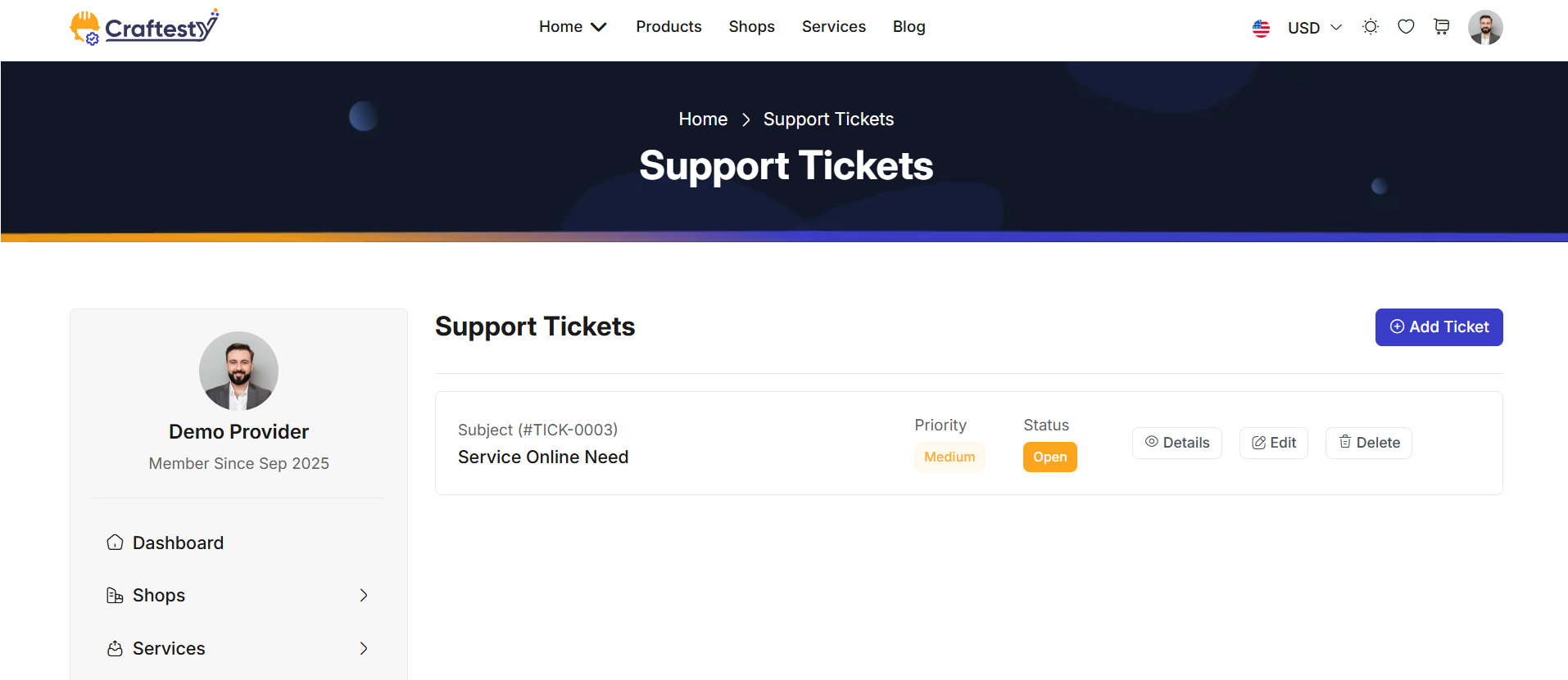
Purpose:
The purpose of the ticket management interface is to provide users with a streamlined platform to handle and track customer service requests efficiently. The system allows users to create, update, and delete tickets while keeping a log of the interactions, making it easier to assign tasks, monitor progress, and manage priority levels. It includes features such as categorizing tickets, adding detailed descriptions, and uploading relevant documents. This interface aims to enhance customer support operations by offering an organized and user-friendly tool for managing tickets from creation to resolution.
Layout:
The layout of this ticket management interface is designed to offer a clean, organized, and user-friendly experience. The table structure includes columns for Ticket Code, Subject, Created Date, Priority, Assignee, and Status, providing a comprehensive view of each ticket's details at a glance.
Responsive Design:
The design is fully responsive, ensuring that it adapts to various screen sizes, including desktops, tablets, and mobile devices. The ticket management table and modal forms adjust their layout dynamically to fit the available screen space. On smaller screens, the table becomes scrollable, while the form fields and buttons resize to maintain readability and usability. The modal dialogs are optimized for mobile use, ensuring that users can create, update, and delete tickets easily, regardless of the device they are using. This responsive approach enhances the accessibility and usability of the system across multiple platforms.
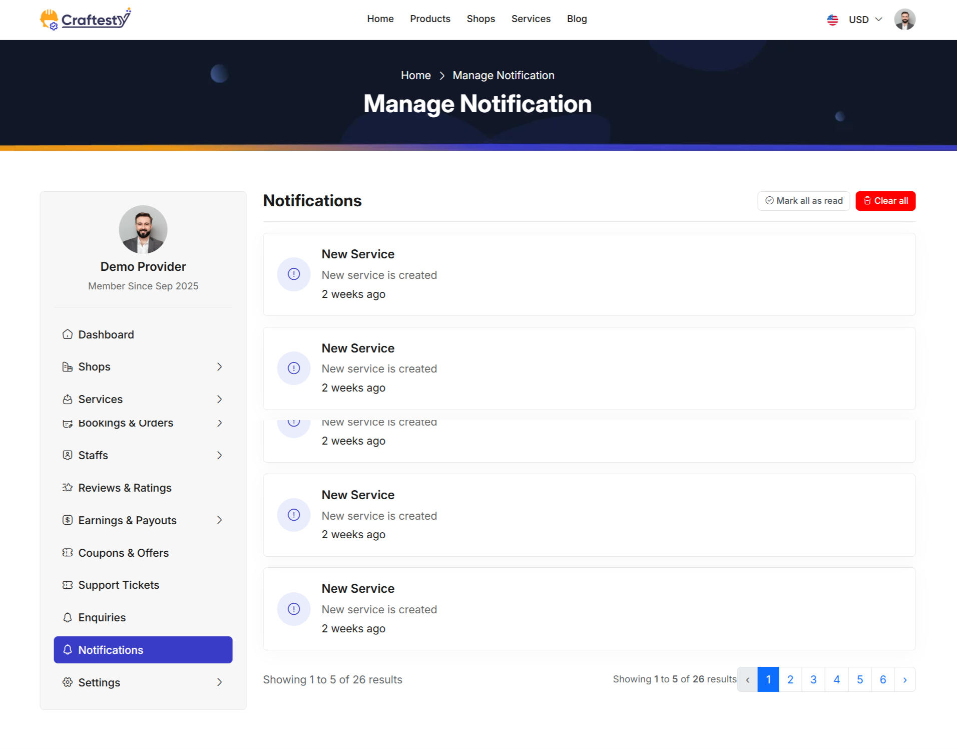
Purpose:
The Notification List interface allows providers to view and manage all system notifications related to their account. Providers can mark notifications as read, delete individual notifications, or clear all notifications. This helps them stay updated on important events such as new bookings, cancellations, payments, or completed services.
Layout:
The interface uses a card-based design with a vertical list of notifications. Each notification displays an icon representing its type, a title, a description, and the time elapsed since it was created. Action buttons are provided to delete individual notifications, while a top-level button allows marking all notifications as read or clearing them entirely.
Notifications are dynamically populated from the server. If there are no notifications, a placeholder card displays the message "No notifications found."
Responsive Design:
The design uses Bootstrap grid classes to ensure proper display across all devices. On smaller screens, notifications wrap or stack vertically, ensuring readability and functionality of action buttons.
Actions & Interactivity:
Providers can mark all notifications as read using the "Mark all as read" button. Individual notifications can be deleted using the delete button. Notifications are visually highlighted if they are unread, and the interface updates dynamically to reflect changes without a full page reload. Pagination is included if the notification list spans multiple pages.
Profile
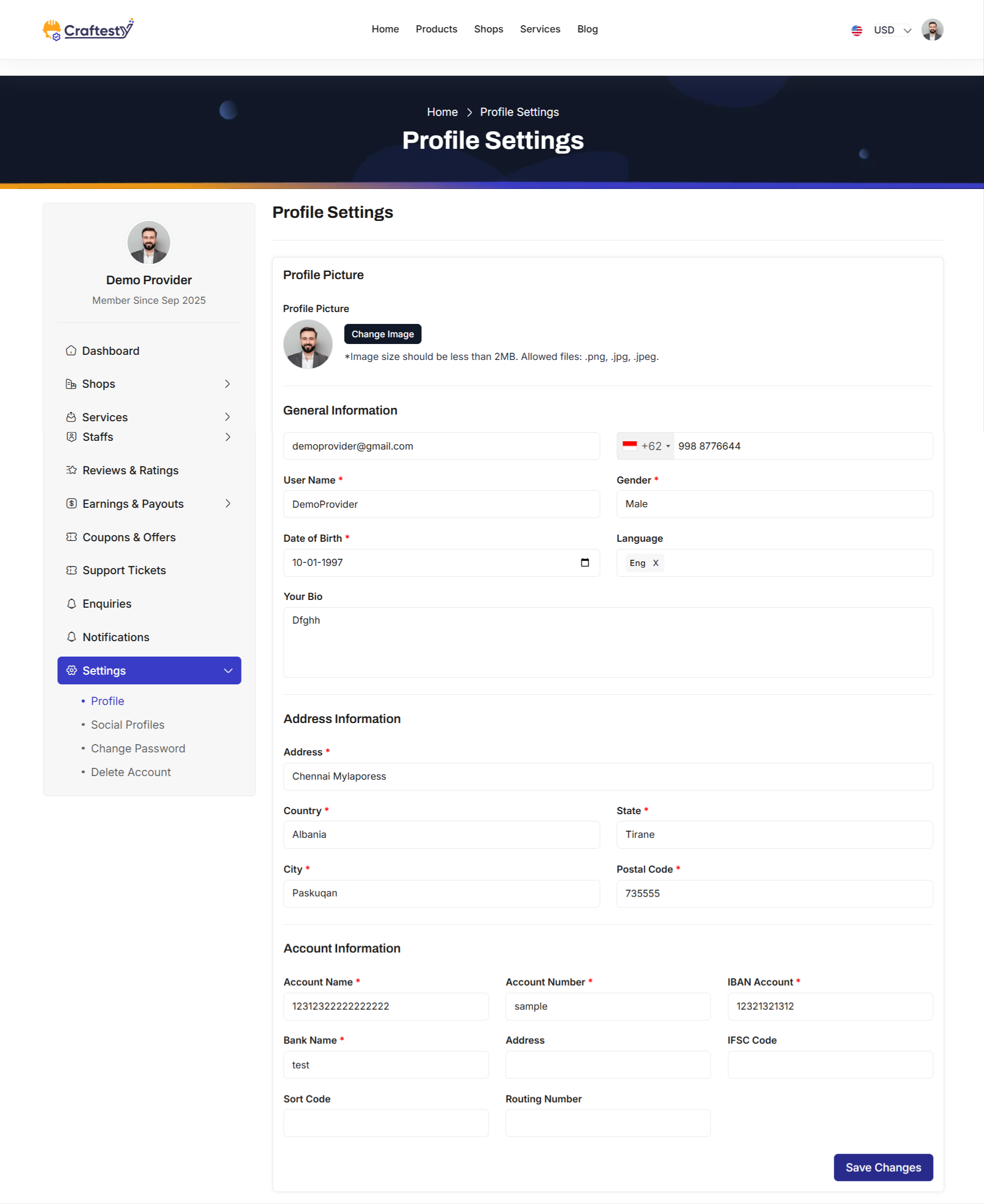
Purpose:
The Provider Profile Update interface allows service providers to manage and update their personal, contact, address, company, and banking information. This ensures that all profile-related data is accurate, up-to-date, and properly synchronized across the system for service management, payments, and communications.
Layout:
The page uses a responsive, card-based layout within a Bootstrap grid. A sidebar menu provides quick navigation, while the main content area displays the profile update form. The form is divided into sections: Profile Picture, General Information, Address Information, Company Information (if applicable), and Account Information.
Profile Picture Section:
Providers can view their current profile picture and update it by uploading a new image. A preview of the selected image is displayed, and an error message is shown if the uploaded file is invalid. Image size guidelines are provided for guidance.
General Information:
This section allows providers to update basic details including first name, last name, email, phone number, username, gender, date of birth, preferred languages, and a personal bio. Input fields have validation, and errors are displayed inline to guide the user.
Address Information:
Providers can manage their address including street, country, state, city, and postal code. The country, state, and city fields are searchable dropdowns, enhancing usability and preventing errors. A currency code selector is included but hidden by default, depending on system configuration.
Company Information (Optional):
If the provider is registered as a company, additional fields for company logo, name, website, and address are available. These fields include image upload with preview and validation for text inputs.
Account Information:
Providers can update banking information including account name, number, IBAN, bank name and address, IFSC code, sort code, and routing number. These details are essential for payment processing and financial transactions.
Actions & Interactivity:
The form includes client-side and server-side validation. Inline error messages appear next to invalid fields. Upon submission, the "Save Changes" button triggers the update process. All sections are collapsible in responsive viewports, ensuring mobile usability. File uploads have previews and validation feedback.
Responsive Design:
The layout leverages Bootstrap grids and flex utilities to ensure the form is accessible and readable on all devices. Sections stack vertically on smaller screens and the sidebar collapses for mobile usability.
Social Profiles
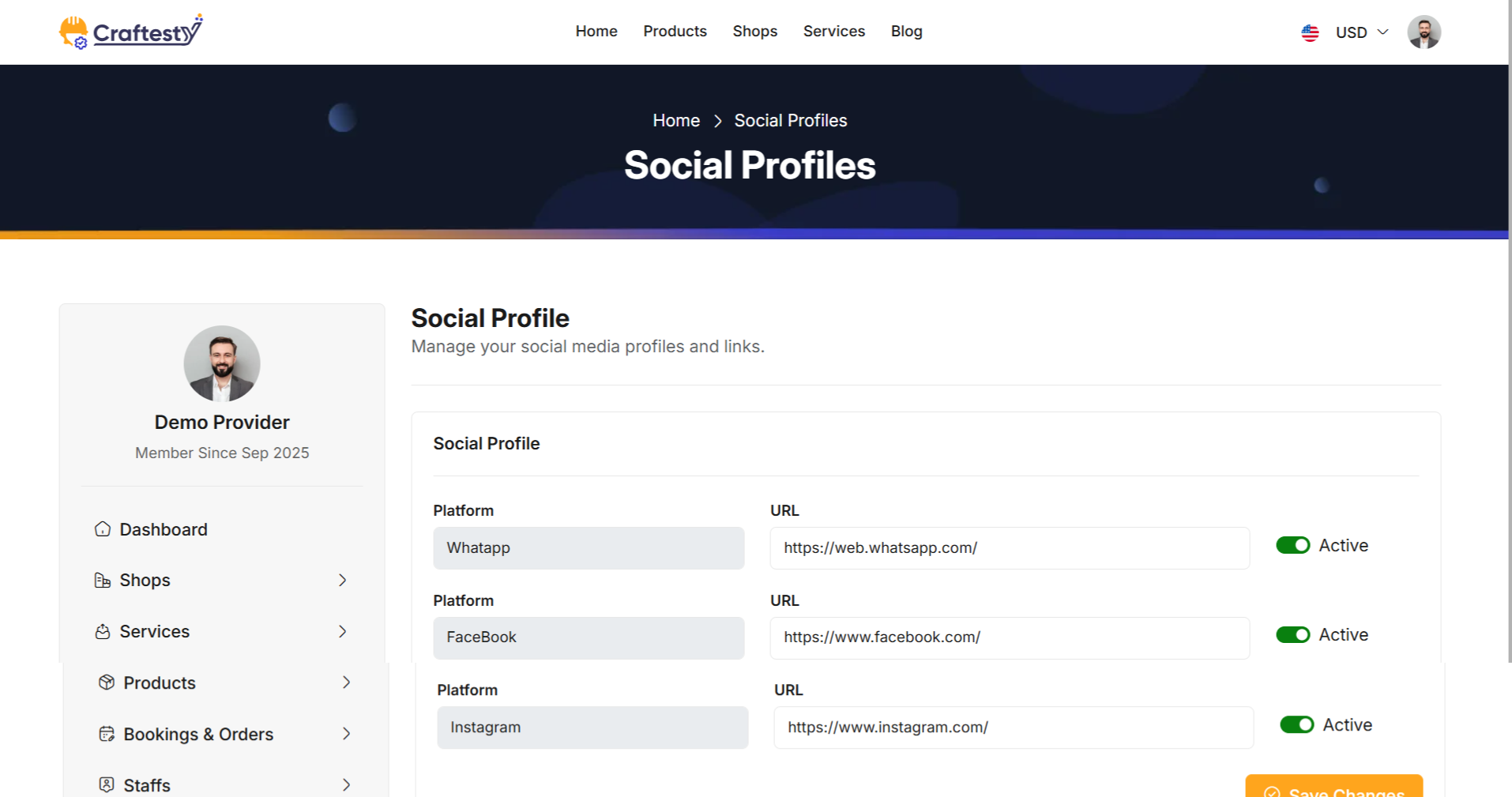
Change Password
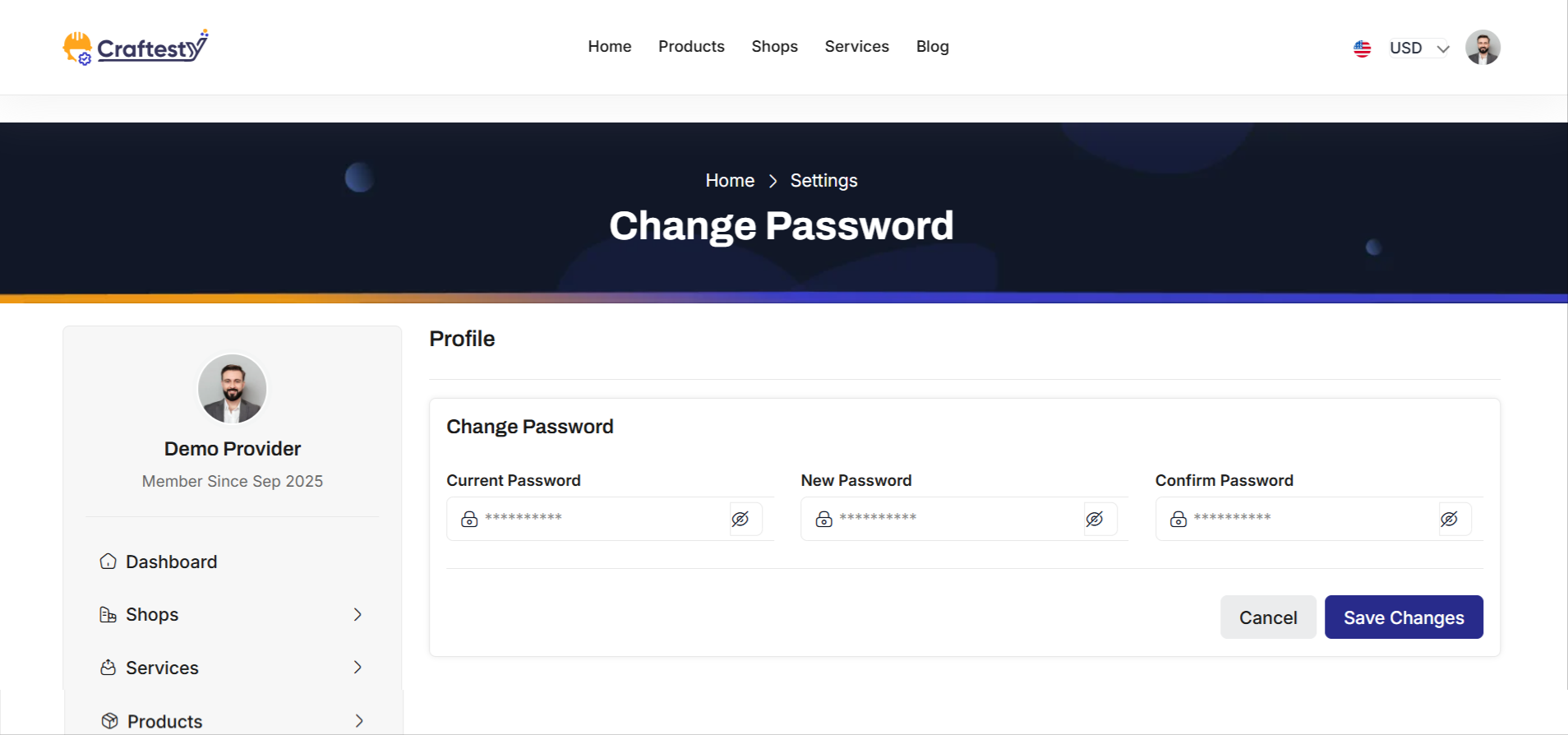
Delete Account

Please note that our respond can take up to 2 business days.
- Availability to answer questions, Answering technical questions about item’s features, Assistance with reported bugs and issues, Help with included 3rd party assets.
- Any customization request will be ignored.
- Please make sure to read more about the support policy.
If this documentation does not address your questions, please feel free to contact us via email at Item Support Page
We are in the GMT+5:30 time zone and typically respond to inquiries on weekdays within 12-24 hours. Please note that in rare cases, the response time may extend to 48 hours, especially during holiday seasons.
We strive to offer top-notch support, but it's only available to verified buyers and for template-related issues such as bugs and errors. Custom changes and third-party module setups are not covered.
Don’t forget to Rate Craftesty!
Craftesty is developed by Dreams Technologies and is available under both Envato Extended & Regular License options.
Regular License
Usage by either yourself or a single client is permitted for a single end product, provided that end users are not subject to any charges.
Extended License
For use by you or one client in a single end product for which end users may be charged.
What are the main differences between the Regular License and the Extended License?
If you operate as a freelancer or agency, you have the option to acquire the Extended License, which permits you to utilize the item across multiple projects on behalf of your clients.
Do you need a customized application for your business?
If you need a customized application for your business depends on your specific requirements and goals, Please contact us.
Customization can be the key to success, ensuring your project perfectly aligns with your unique goals and requirements.
Don't Miss Out on the Benefits of Customization!
Unlock the potential of your project. It's time to ensure that your project isn't just another cookie-cutter solution but a truly unique and effective one.
Discover how customization can make a difference in your project's success. Let's create a solution that's as unique as your vision!
- We'll tailor the application to meet your specific needs and preferences.
- We will upload your website to the server and ensure it is live.

Thank You
Thank you once again for downloading Craftesty.
We hope you're enjoying your experience, and we kindly request that you take a
moment to share your valuable review and rating with us.